
What you can learn from the people who drew 30,000 icons
What you can learn from the people who drew 30,000 icons
Translation of the article “What Can You Learn From People Who Drew 30,000 Icons?” from the creators of the Icons8 service, who have drawn over 30,000 icons over the years of its existence.
By creating icons for 5 years, you will not only draw thirty thousand of them, but also learn about sexism and racism, how designers and developers get along, about trends, … and about Batman.
What does everyone want?
Many people know (and if not, then after this article, they will know for sure) that we draw icons for popular queries. Can you guess which ones? No, these are not UI icons, not settings, not menu icons. These are Batman, Superman, Spider-Man, Iron Man, Flash and others.

In the meantime, there is no need to worry about it. ”
Such orders have literally flooded our system from the very beginning. If other icons from among the most popular queries take 3-4 days on average to get the required number of votes in order to be drawn, then this is enough for a few hours.
And we would not mind if it were not for one problem: no one uses these icons in their projects.
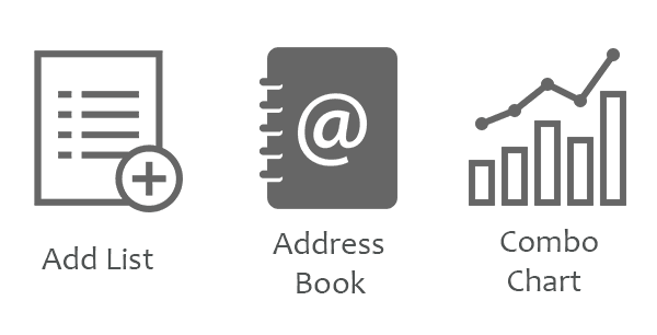
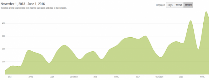
Let’s take three common icons from queries:
And compare them to the superhero icon downloads:
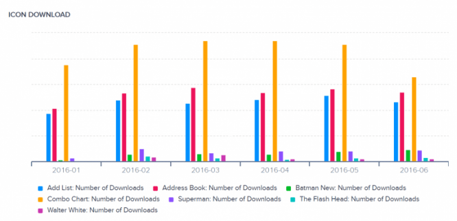
These three icons are not even the most popular among the common ones. Let’s add the “Parameters” and “Delete” icons to the chart:
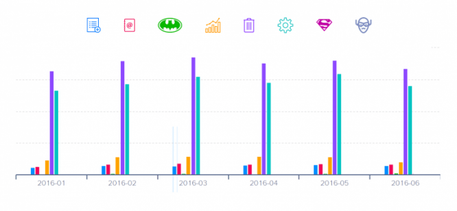
We had to accept the bitter truth: people vote for what they like, but use what they need.
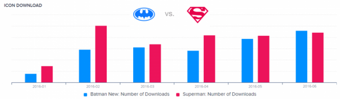
In any case, the already drawn icons are not useless. At least we now know how Batman confronts Superman:
Icons can be racist and sexist too
One sunny morning, we received the following support ticket: “It’s outrageous that among the thousands of icons, there’s one with an African American – and that’s the Racism icon.”

The fact that something can be judged by its absence as well as by its presence shocked us at first. Of course, we are not out of spite.
Note: Interestingly, over the 5 years of existence of the “Ask to Draw” function, we did not have an order for the image of people with different skin colors … Thousands of requests, hundreds of thousands of people using icons, and we learned about the problem thanks to our technical support.
So we took it personally.
Not only is the icon missing, but its name can also be offensive. Another time we received this letter: “I can’t find any icons with a female manager. Can you help me?”
We helped – and made this icon:

But suddenly everything went downhill. The icon was titled “Administrator Female”. This offended the woman who asked us for help. It turned out that not all women have long hair, a tie is a sign of sexism, and the word “administrator” is offensive. We apologized.
But we haven’t changed the name or the icon itself. The name is used for search purposes. According to our research, people search for “user woman” and “woman” or “administrator” quite often, but they never search for “strong independent woman” when they want an icon. If you try, you will be very disappointed. The only thing we did was add some search tags.
This was the decision we had to make – you either satisfy hundreds of people with relevant search queries, or a few people with very specific requirements.
The more you are, the more people look at you. I think the moment people started accusing us of racism and sexism is a real indicator of popularity. We are happy to face such problems until the majority of our clients can get what they want – icons.
These are not just icons
It’s the same:
~ 50 sprints
~ 7,000 commits
~ Unknown number of cups of coffee
10 years ago, there were 3 salespeople per designer, but times are changing. Over the past 5 years, we have moved from a WordPress site to our own rich selection of services.
This lifeless graph of “commit count” indirectly shows the increasing number of great programmers who have decided to tie their future to Icons8.
So now our team has 3 times more developers than designers. The more difficult we got, the more intractable questions arose. That’s why we launched live chat support.
In the end, while waiting for a continuous stream of help-me-do-something messages, we got something very useful that became the foundation of the Icons8 community.
The 3,000 requests that we see in the dialogues, the incredible amount of valuable feedback and the disposition of our clients make us think that maybe we are not the ones who provide support, but the ones who receive it.
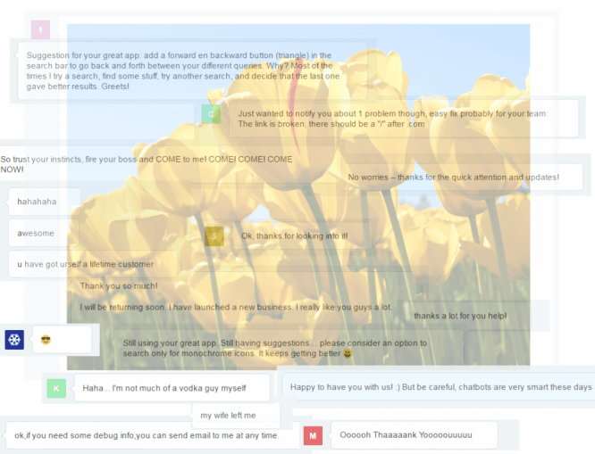
We are all working on one big project: developers, designers, technical support staff, marketers and content managers. The biggest problem that we faced and that still exists is the question: how to organize 20+ people to work in one team. Remotely. From different parts of the world.
We’ve tried every agile methodology we can find. They usually apply to support teams, but in our case, we needed to create a strong bond between designers and developers.
So we chose what worked for us, for example, we began to use ordinary words (such as sprints and stand-ups) in a non-standard way, and discarded the unnecessary.
We have no idea what to call our group of 20 different professionals working remotely, but the word “Tribe” can be a good starting point. A close-knit, helpful and funny tribe.
I should also mention the marketing team here, otherwise they will hate me. So, I mention.
Are trends influencing us?
They literally form Icons8.
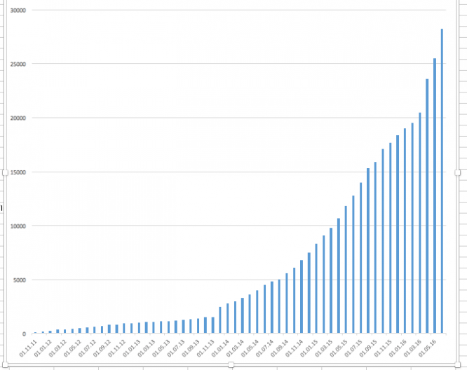 Icons drawn since 2011
This graph shows that for 5 years we have been constantly drawing icons, but it does not show what we have drawn.
November 2011. The world has not yet been taken over by mobile applications. A few years ago, most of the existing applications were for desktops, and Windows 8 icons were the main source of income for a small design company that decided to release a package of 153 icons. The name of this company is Icons8.

September 2012. It became obvious that more and more developers were switching to mobile platforms, and accordingly, the demand for iOS icons was higher than ever before. All the icons that we had, we began to redraw for iOS7 and continued every day to add new icons in two formats – Windows and iOS.

May, 2013. More and more people asked us to pay attention to Android. We did so and started adding Android versions.
November, 2014.Google has launched a new version of Android – Lollipop (5). For several months we drew each new icon for both the old and the new version of Android, but then we decided to completely switch to the new ones. However, older versions are still available on our website and we paint older versions to order.
 People tend to forget that these icons are 24 pixels, not 240 pixels. When zoomed in, they look strange
May 2015. We presented colored icons in our own style. Not that we came up with colorful icons, but rather developed our own guidelines for them. This was the first time we moved away from the “Major League Players” recommendations. You will soon find out if it was worth it.

July, 2015. Windows 10 comes out without any guidelines, except for those that we ourselves have developed:
March, 2016. Another plunge with the phis icons. Also according to our own guidelines.
To be honest, I have no idea what office application would use the House Stark emblem, but we drew it anyway.
We follow trends. But what about our clients?
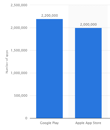
Data provided by s tatista.com
The total number of applications published for the Apple App Store and Google Play is almost the same, but …
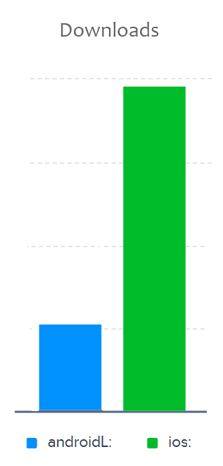
There are almost four times more downloads of icons for iOS than for Android. Why? Choose any of the reasons:
● Complex icons (like the wolf example) look good in iOS at different sizes, while the simplified Android material design geometry can look odd when zoomed in. People tend to make a choice, be guided by how the enlarged preview looks like, rather than comparing icons in small sizes;
● Apple sets trends and actively promotes them, while Google creates an official collection that covers 90% of the usual needs of developers. In a way, this is an old war of trends and practical applications;
● Only recently, Android has started to promote its material design in the form of recommendations, while iOS is more demanding on the “native” look of any application;
Perhaps the fact that iOS apps are more profitable is forcing people to look for more professional graphics assets, while Android developers use regular libraries.
Now let’s take a broader look:
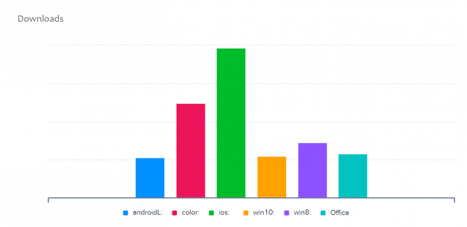 6 months data
Colored icons and recently released office icons are as popular as icons for Android or Windows and are getting more popular every week. However, they don’t follow any trends or guidelines other than our own.
This means that people just like their look. Why, then, do people choose the guided versions?
● they give a natural look to any application
● they look harmonious
● they are easy to replace
Office icons, of course, are not meant to be used only in office applications. It’s the same with iOS icons in iOS apps.
The “total downloads” graph above shows us how versatile our audience is. Some people are really looking for a natural look, while others just choose what they like without being guided by any guidelines. It seems to us that both approaches work. In the end, everyone gets what they want.
findings
As a wise man once said, you will learn more by doing one thing for 10 years than by doing 10 things a year each. Debatable, although absolutely applicable to us. After all, we’ve learned so much just by drawing icons (by all accounts) every day.
Unfortunately, I am not able to describe every story that has happened to us over the years without turning it into an e-book.
Although, judging by our Drawn Icons chart, I will soon have 50,000 good reasons to fill this gap.
About the author: Andrey Burmistrov started at Icons8 as a usability specialist: he conducted interviews and research. But he desperately wanted to share his discoveries with the professional community and began writing useful and funny articles (sometimes both at once) for Icons8.
Translation: Icons8
Bonus: 36 road icons from the Icons8 team
Download the icon set from the link.
…
