“Is one enough?” How many website design concepts to make to solve the client’s problem
“Is one enough?” How many website design concepts to make to solve the client’s problem
At the start of work on the site, clients come with a request: “Give us three or four options to choose from.” However, from the experience of Atvinta Digital Agency, one concept will be sufficient in most cases.
In the article we will tell you why one is enough and in what situations it is better to make more options.
Usually we make only one maximum elaborated version of the concept. We refine and develop it when we move on to designing and developing the design of the internal pages of the site.
We agree on this at the stage of negotiations: now we offer only one solution, and if the proposed idea does not fit at all, we will select other options.
However, after the first concept has been defended, no new options have to be made. We will tell you why this happens.
Why is it important for a client to see multiple design options
Situation: a company contacts an agency to redesign or develop a website from scratch. One of the first stages in the work will be the creation of a design concept. At this stage, designers will work out a visual idea for the client’s business task. And the client will check his vision of the project with the agency’s team and test cooperation on a short period of work.
The client does not yet know the approach of the agency and the team, so he asks for several concept options in order to evaluate the work and be able to choose.
This desire usually hides rational arguments, which boil down to three typical points:
- Distrust of the agency: “Does the agency understand my task correctly?”
- Desire to control the result: “I am responsible to the management for the final result, so I want to influence it.”
- The client wants to get a result in business terms, and does not yet understand how the design will help in this: “I want to choose a design that will work better for the conversion of the site.”
It is obvious from these arguments: it is not the number of concepts that is important to the client, but the understanding that the agency will really solve his problem.
Several concepts at the start give a feeling of confidence that the task will be solved the way the client needs. However, this feeling is deceiving.
Why the “multiple concepts” approach is bad for the problem
Probably the idea for several concepts came to web design from logo makers. In this area, it is common practice to provide the client with several options.
But here it is important to understand the difference between logo design and interface design.
A logo is one element behind which one metaphor is hidden. An interface is a collection of visual ideas and interactive interactions that are linked into a single system. A full-fledged study of such a complex of design solutions for a website will take much more time than a few metaphors for a logo.
Hence the dilemma: in the same time, you can make several sketches of the site or one detailed concept.
And then there will be one of the scenarios:
- The designer will first pay attention to a concept that solves the customer’s task well, and then add a couple of options for the assortment. That is, it will show the client obviously failed ideas.
- The designer will make several sketches of the same design, but will simplify the task in them. For example, it will not consider any important user scenarios or audience segments.
In both cases, the client will choose from potentially “inferior” options. This can lead to the fact that the company will have a visually beautiful website, but it will not work for business indicators. After all, the client is not obliged to thoroughly understand design solutions and may choose not the most effective option. And the designer will shift the responsibility for the result onto the client: after all, it was he who made the final choice.
Will not work.
A good concept is a solution to a specific problem.
The client asks for a solution to the problem. The job of the agency and the designers is to get it right, figure out the best solution, and then justify why it’s the best. Then the concept will suit this particular client, solve exactly his problem and reflect the image of this particular company.
To develop one good concept, you will have to dive into the needs of the customer and site users, research business processes, understand user scenarios, pains, desires and fears of the audience.
So, when we were doing the redesign concept for the American CRM system, we first took demo accesses, tested the main user scenarios and found bottlenecks in the UX. And already on the basis of this information, a concept was built.
For example, we discovered the so-called Zero Data Screens. This is when the user lands on a blank screen with no information, but with interface text: “First select a customer” or “Select a period.” These screens are wasting users’ time and are incredibly annoying. It is better to immediately display the necessary information in a list and place filters to refine the request. This was emphasized in the concept.
Half of the success of the concept is the presentation and work with the client’s feedback.
The concept always has a main direction. It is it that needs to be agreed first of all. During the defense, we demonstrate to the client:
- how individual the concept is and helps to differentiate itself from competitors;
- how much it is tailored to the tasks of the company, which were announced during the briefing;
- how well thought out the patterns of user perception;
- how the site fits into the company’s image and reflects values;
- the team is ready to receive comments and finalize the concept.
This part of the work will be successful if the design team at the agency really understands the client’s wishes and task.
An example is a website concept for a children’s hospital. In design, we have detached ourselves from sites of similar subjects through animated illustrations and minimalistic style. The concept took into account the wishes of the areas that are important for the hospital, which they want to promote. We figured out what is important for the audience of the site – parents – and brought this information to the first screen.
The concept was assembled into a video presentation for the customer.
After the presentation to the client, we collect feedback: what the client thinks about the proposed solutions. This will help develop the design in the right direction on all other pages of the site.
For each comment, we clarify what exactly confuses or dislikes in the proposed solution. If there are no comments, we will find out what attracted attention or interest the most.
When is it worth making multiple concepts
The multi-concept approach works well for US and some European customers. For them, visuals and mood are an important component of the site. At the same time, to select a concept, key images and sketches are enough without detailed elaboration of the grid, navigation, interactions.
But in the Russian market, this approach will work worse: it is more important for the customer to see the whole picture right at the concept stage: how the site will work, whether such a solution will be convenient for users, how much the design corresponds to the business. Visual tricks alone are not enough.
For example, for the Russian manufacturers of UAV systems “Kronstadt” at the concept stage, the interface of the main page was developed: from the grid and text to 3D icons. The concept was designed into a motion presentation to demonstrate the basic interactions of elements and animation.
That is, the client immediately saw what the finished product would be like.
It is important to develop several concepts on the Russian market either for promo sites or corporate sites, where the visual component is more important than interface interactions and UX.
In this case, at the level of concepts, we do not think over the entire interface, but only some of its features and features that set the mood.
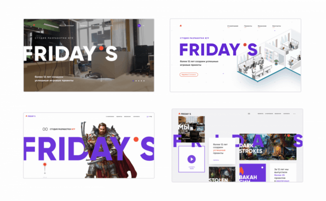
This is how we worked with the Friday’s Games game development studio. For them, we made several concepts, each without detailed elaboration only at the level of sketches and chips. On one, the emphasis was on interactive icons from their corporate identity, which we made in 3D. Another focused on the visualization of their office, the next – on the characters of their projects and large fonts.

This approach was justified based on the task: it was necessary to present the studio to potential employees. And for this – to choose an image that the team will associate with itself.
At the same time, we started cooperation with Friday’s Games with one well-developed concept. At the first concept, we figured out the wishes of the customer, plunged into the topic, studied the audience, thought over the structure of the site and the presentation of information. And at the stage of several sketches, we selected a visual image. At the same time, the logic of the site was preserved and developed in the future.
First concept:
Final option:
Final
How many concepts to make is a matter of agreements with the client and a specific task. It is the correct understanding of the problem and immersion in the problem that will help you find the right solution.
- The client does not care about the number of concepts; it is important for him that the agency makes a design that suits his request.
- Demonstration of a solution can be done with one concept, if you understand the problem correctly.
- It’s not enough to draw a concept, you need to present it, hear feedback and refine the details.
As a result of this approach, the client will receive a design solution to his problem and will understand that you are an expert and at the same time fully take into account his opinion. Then further cooperation on the development of the site will be more trusting, and the process at the design and design stage will be more efficient.
…


