
How to manage user attention with the help of design?
How to manage user attention with the help of design?
The ability of visual content to control user attention is rarely talked about, but it is an important aspect of effective web design. Every visitor evaluates a new site on the first page loaded – knowingly or unknowingly.
Originality matters, but the overall impression of the design is more important. It is affected by white space, font, symmetry, and the relationship between page elements.
Designers want visitors to stay on the page as long as possible and scroll to the bottom of the page. This is why it is very important to focus on the functions first, and only then on the form. This means that the design should serve the content favorably, and not make it a secondary element.
In today’s article, we’ll take a look at how you can improve the layout and flow of visual content on your site.
Pay attention to the composition
Each site element is part of the overall layout. It is this layout that creates the composition, with the whole being more important than the sum of its parts.
Blocks of a page combine to create something whole. The design elements’ job in this case is to create a content flow. All components of the page should lead the visitor to the very bottom of the page.
This is why the relationship between different pieces of content (images, text, buttons, etc.) plays such an important role in design.
Your task is to make viewing the site the desire of the visitor. This is easier said than done. Studying effective examples can help in this case.
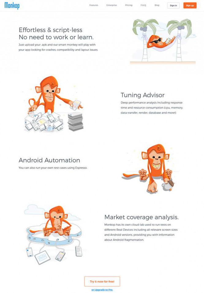
The Monkop home page is a great example of the visual hierarchy of text and visual content. There is a lot of white space between the elements, the font successfully complements the brand’s illustrations.

As you scroll, you will immediately notice a horizontal block highlighted with color, borders and graphics.
Next, two columns are highlighted with images on one side and text on the other, which alternate. This grabs attention and makes the page less monotonous.
A similar concept is used on the Picjumbo site. On the home page, the logo and the button calling to watch the video immediately catch the eye.
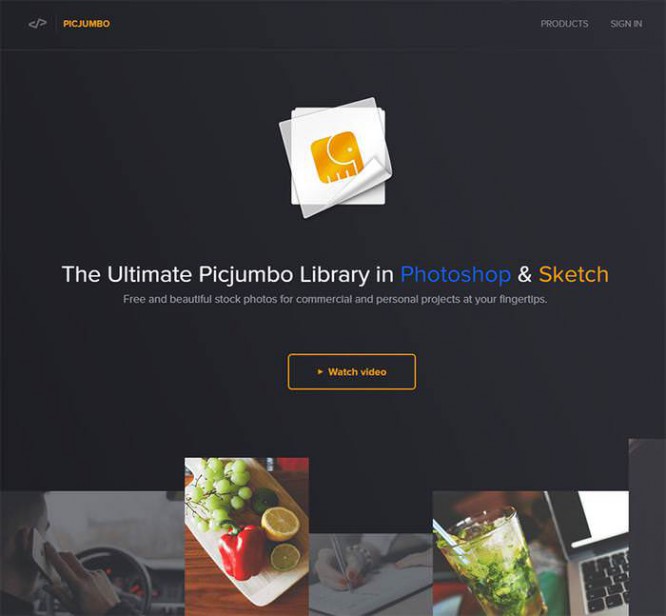
Then you will notice animation that will make the scrolling process more interesting.
In general, the page looks open and straightforward. The content is divided into horizontal blocks with bright font and icons.
Notice how all the elements of the page are in balance with each other: white space, contrast of colors and shapes. All these details play a role in the overall composition. Thus, the sites serve the content favorably.
There is simply no recipe for a perfect page, as all sites are different. For example, sometimes it is better for the navigation buttons to be huge, sometimes to be small.
Study the sites of your industry, analyze their composition, try to understand what unites all the elements into a single whole.
Typography matters
Typography design directly affects the management of user attention on your website. Of particular importance in this case is the hierarchy and style of various page elements: paragraphs, headings, lists, quotes, and columns or tables.
Visual content also affects layout, which is why it’s best to consider natural progression when creating designs. Write content so that it gradually leads to the bottom of the page and draws the user’s attention to each paragraph.
The best tool in this case is your eyes. Learn to notice the difference between typographic elements and evaluate their impact on other elements. Create relationships between sections of the page to highlight the content.
Pay attention to:
- text size
- font family
- color contrast
- relationships between different sectors of the page
- line heights and paragraph edges
- letter spacing and case
Here is a sample Campaign Monitor page. The top navigation links use uppercase letters but are small. All other labels on the page also use only uppercase letters to maintain consistency.
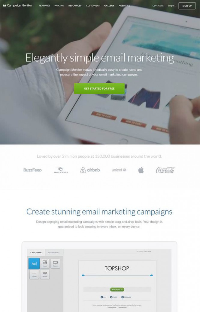
Other headlines on the site are larger and much more visible and grab attention. At the same time, you can immediately see where the heading is used, and where is the normal text of the paragraph.
Campaign Monitor’s typography fits perfectly into the layout. It takes practice to achieve this, but it gets easier and easier over time.
Guiding content
Different types of sites use different methods to manage user attention. For example, landing pages often use small blocks of content, icons, screenshots, and testimonials.
On other sites (eg blogs), users do not end up immediately on the home page. Many follow the link to a specific article. In this case, the title should attract the attention of visitors, arouse interest in the content. Here, copywriting skills play a critical role, so that the reader will not miss a single word.
Let’s compare the design of a landing page and a blog to see the difference.
The Cactus home page follows Apple’s design style in many ways – lots of white space and laconic sans-serif fonts.
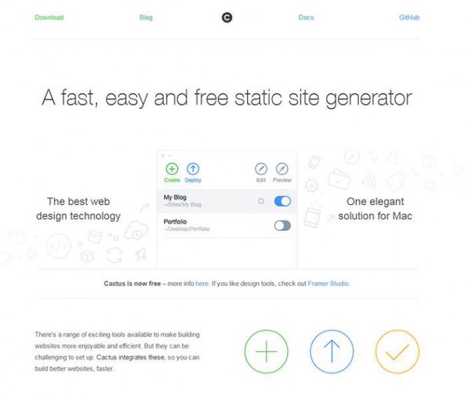
The content is organized into columns of text with simple graphics. Mac users will definitely appreciate this design.
The page is interesting to scroll, unique content, simple icons and alternating blocks of content are pleasing to the eye.
The main purpose of the page is to provide information to existing users and sell the idea of Cactus to potential buyers.
Now let’s turn to the design of The Next Web’s home page. There is a lot more content here.
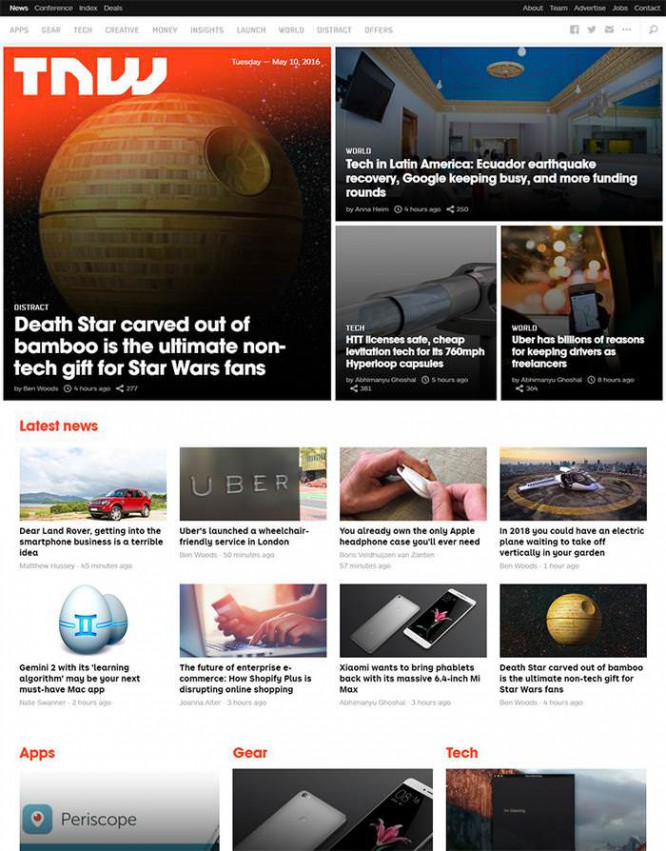
The rectangles create a grid that organizes multiple posts into a single layout. The purpose of this page is to get the visitor to read the content. It is important that visitors stay on the site.
Bright photos and attractive headlines help to interest the user. To make visitors stay longer, links to similar posts are used in the main menu and after the content.
User attention management works differently on each site. But you can learn this by studying your successful competitors.
Trust your eyes
Some design characteristics cannot be explained from an analytic point of view; their use can be beneficial for some sites and unsuccessful for others.
Learning to design is largely a visual process. The way you look at him is critical. You must learn to pay attention to detail to define visual hierarchy. If you see this on other sites, you can repeat it on yours.
Just trust your eyes. Create a list of your favorite sites and analyze each one. Identify the best elements and their impact on the entire design. This will help you evaluate these concepts from a UI / UX perspective, not a user perspective.
Feel free to experiment. No one has ever had success just by reading design articles. They help, but without practice it is impossible to understand what works and what does not.
Learn to analyze website layouts and recreate them. Over time, you will have accumulated a whole library of elements, which will greatly simplify the process of creating new sites.
Source: rusability.ru
…

