
5 tips for email newsletter design
5 tips for email newsletter design
SendPulse’s marketer, Irina Chugai, wrote a review article on the design of email newsletters: what colors scare away readers, why emails shouldn’t contain only text, and how to solve the problem of low open rate of your newsletters.
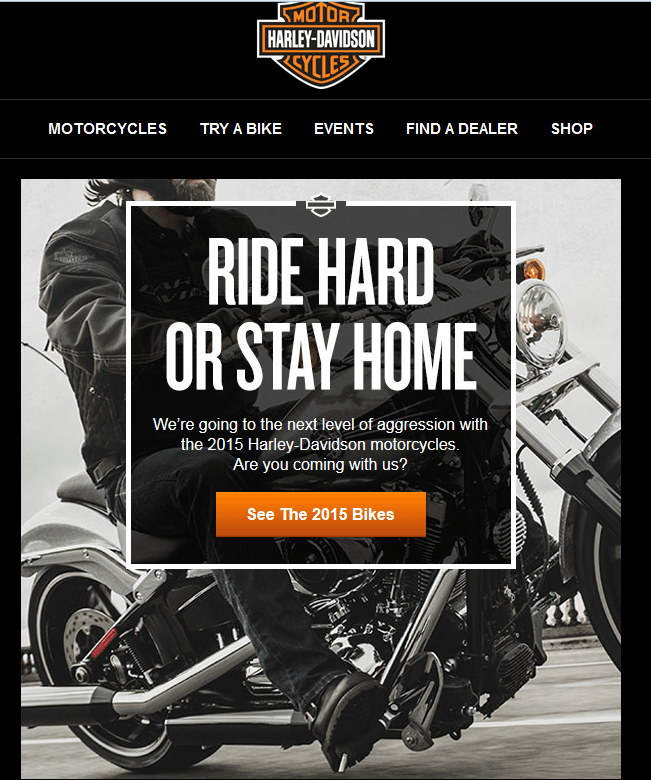
Email is a business card for communicating with your subscribers. Therefore, it is best to develop one letter design style and stick to it all the time. The design of the letter should be the same as on the website, or in a corporate style so that the subscriber immediately recognizes you, if, of course, he is your client.
Let’s take a quick look at the main points and design elements of email newsletters.
Template design
The optimal width for an email template is 600 px wide. And the problem of displaying letters on different devices is solved due to the responsive design. The optimized template provides fewer options for adding a lot of content, but provides loyalty to many users who prefer to view their mail on smartphones.
Simple and flat design is in fashion
Subscribers will love emails with a simple HTML layout that makes it easy to navigate the message. Simple yet stylish, tasteful design is another matter entirely.

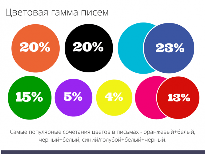
Color spectrum
In modern emails, most often only one or two primary colors are chosen for writing. The fewer colors you use, the better you can view your message and not be distracted from the content. Choose the colors that your brand is associated with.
According to research, the most popular colors are orange, black and blue:
In no case are “poisonous” colors used. Even if they allow you to achieve excellent contrast between the text and the background, it will not be easy to read such a letter. For most users, it will cause a negative reaction, many of them will simply close the letter unread. A gouge-out design won’t work.
Fonts
Recommended font text is 12px, line spacing is 1.5. These parameters will allow the recipient of the letter to comfortably read all the information. If you have to strain to read the letter, then this creates negative emotions that are automatically projected onto the contents of the letter. To avoid this, it is necessary not only to choose the correct font size and line spacing, but also to achieve a contrast between the text color and the background color.
The font you choose should fit the overall design of the letter and give the reader a quick glimpse of it. For newsletters, it is better to give preference to the following fonts:
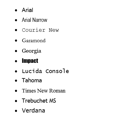
It is better not to use effects such as strokes and others.
Structural elements of the mailing list
Call to action buttons. In order for the client to perform the desired action, he must easily find the CTA button and click on it with the same ease. And for this, the button must be large enough and noticeable against the general background of the letter)
Clickable pictures. At least 10% of readers will click on the pictures, and each of them will have their own motives. Small images are clicked to get a better view, and large images usually lead to the site. In advertising mailings, the correct design of images is especially important.
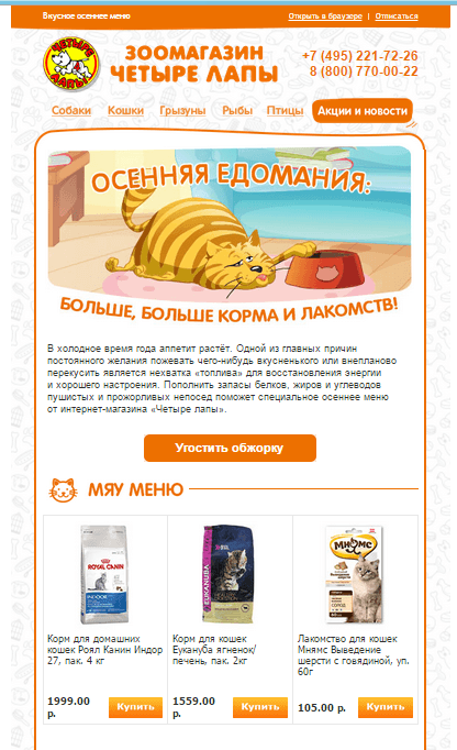
Minimum text. For the most part, this applies to newsletters. Why force users to read huge texts? Light and short letters with minimal vertical scrolling will be much more convenient for readers.
It is important to consider how holistic all the elements in the letter look and how they complement each other, emphasizing the main idea. To make it easier for the reader to understand the essence of the letter, it is important to visualize the text using images, highlighted main phrases, dividing the letter into blocks, etc.
Preheader. Subscribers can skim their mail and one topic may not work. But the duo catchy topic + preheader can really attract the reader to open the letter, even on a mobile device. If the letter appeared without an image, the preheader will still tell the client what is in the letter.
What else can you add?
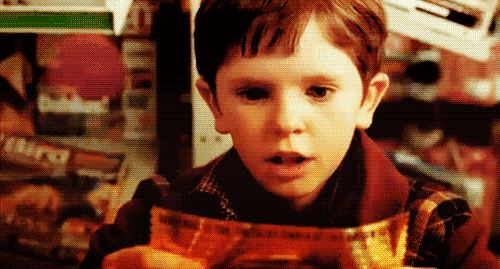
Animated GIFs
Oh yes – they are coming back. And GIFs have made a comeback not only in emails, but also in web design in general. GIF is an effective format because it allows you to quickly grab a visitor’s attention while highlighting an important call to action.
The reason for their return is very simple – the need to “liven up” the letter, add movement and animation to it.
Give it a try, experiment and make bright newsletters!
Source: habrahabr.ru
Cover photo: ShutterStock
…

