
How to learn good design in 6 steps
How to learn good design in 6 steps
Translation of Jose Torre’s article: “How to learn good design in 6 steps.” What’s the difference between good design and bad design?
Eliminating subjectivity of opinions
To my very first post on Medium, they left a comment to which I wanted to give a detailed answer. The reader noted that design is subjective and asked if anyone had tried to formalize the principles of good design. Then I thought, “Why not give it a try?”
Since this all started
There are two parts to the question, the first is the assertion that design is subjective. Personally, I disagree with this approach, but I understand where his legs grow from: people tend to mix design and art, and therefore the properties of one are often transferred to the properties of the other.
Art is subjective, a game with almost no rules. Design is a different matter, the very fact that someone can make a list of principles for it already suggests that this game has certain rules. And if there are rules, then you can judge whether they were applied or not, therefore, the design is not subjective. But to be honest, I can’t say that design is 100% objective: there are always things that relate to personal preference, determined by your culture and experience.
Having a little subjectivity doesn’t mean you can’t tell a good design from a bad one. It just means that you might find a good design ugly, or, on the contrary, you might like a rather lousy design. Let’s take a look at an example.
 The famous Juicy Salif by Philippe Starck
I think almost everyone will agree that this is a stylish design, the main question is – is it good?
 Nope.
Nope.
Why? Because it has so many functional problems that I will not even list them (just go to Amazon and read the reviews, there are many interesting and funny things, or read this). In short, it does not cope with what it is intended for, does not help to squeeze out the juice.
We conclude that good looks are not equal to good design. To help you dig deeper into looks, I’ve compiled a list of 6 principles you can use to tell good design from bad design. There are many nuances in the principles, I will dwell on each in detail.
Based on the aforementioned juicer, you can already guess what will be the first …
1. Is the design effective?
The design is created to eliminate the existing problem. An awkward website, a product for a specific audience, or a new business that needs a logo – anything can be a problem.
This is the first point by which you can judge whether a design is good or bad. If it doesn’t solve the problem, you shouldn’t go further – it’s bad design. It doesn’t matter how good it looks, it doesn’t solve the problem for which it was created.
In my observation, this is the point that causes most of the friction between the designer and the clients or bosses. Designers start working without a sufficient understanding of the problem, trying to do something cool that will look good in their portfolio. They forget that designs are not created to solve their problems, but for people.
For a design to be effective, it is important to understand and feel the same as the client or user. When starting work, ask yourself the question “Why?” until you realize the real purpose for which your design is needed. Sometimes a client comes to you with one request, but by asking a few questions, you understand that he needs something completely different. Only then can you be sure that you are helping in solving the real problem.
If your design is effective, you can move on to the next step.
2. Does the design reflect the tone correctly?
To judge whether a tone is right or not, you first need to understand two things: the brand and the audience.
Brand name
The term “brand” is usually applied to a business, but it is not limited to this. Many things have a brand, for example, each of us has a brand. Your brand is how others perceive you. The same applies to companies and everything else.
Good design allows a company to manage its brand, change public opinion to match the ideal image of the company.
The audience
A company’s target audience can range from immensely broad masses to a very small niche. Once you know what image the company is striving for and for whom the design is being created, it remains to decide what is right for them?
In general, the wider the audience, the clearer and simpler the design should be. Therefore, you can see how many companies, as they grow, lose their “soulfulness”. This happens because some of the design techniques that work for small niches are not suitable for a large audience, they are sacrificed to attract more people. On the other hand, when your audience is smaller and more specific, such features attract people.
This can be seen by comparing McDonald’s to a local burger. They sell the same product, but in different ways.
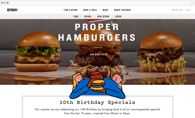 ByronHamburgers
The local burger shop uses modern design solutions, attracting newcomers, take a look at the fun illustrations on Byron’s website. On the other side of the scale, McDonald’s, which communicates with customers in a more accessible manner, reaches out to the general public without singling out or rejecting anyone.
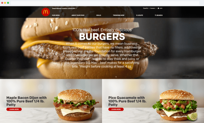 McDonalds
In short, to understand if your design meets this point, you need to know the appropriate tone and whether the design successfully reflects (communicates). If so, then you are one step closer to good design.
3. Does the design stand the test of time?
Good design is time sensitive. Ideally, everyone wants a timeless design, but it’s not always appropriate or necessary. It all depends on the purpose of the design and its life cycle.
For example, if you are creating a web page for a product that will be replaced or renewed within 2 years, it makes sense to use fashion trends to move forward. This will make your design look modern, trendy and relevant. But you need to anticipate trends and their development. There is nothing worse than riding the wave late and being in the position of catching up, not the creator of the trend, they will only laugh at you.
From another point of view, if we are talking about a logo chosen for years and decades, then, of course, it is worth avoiding unsteady design moves, the expiration date of which will quickly expire. Look at the famous redesign of the Starbucks logo, it shows a trend towards simplifying the logo. Conclusion: the simpler the design, the longer it will last.
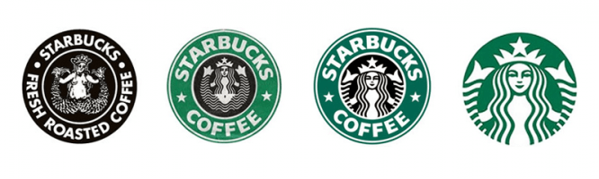 Iterations of the Starbucks logo for 1971, 1987, 1992, 2011
So, in order to get past this point, you need to understand the design life cycle and choose the appropriate solution for it.
Does the design fit its life cycle? If so, let’s continue. There are only 3 principles left.
4. Is there a hitch in your design?
Interference is what interferes with a person reading or using something. The more design clutters, the harder it is for the client to solve their problem with your design. Difficult texts or awkward websites tend to get in the way.
 The case when the text is too small.
You’d be surprised to learn how many times designers have sacrificed the ease of reading and usability of a website for its look and feel.
It is important to carefully measure the amount of information you want to present. Avoid overloading with information as it only adds clutter to the design. To prevent this from happening, you need to be very clear about what your client or user wants. But more often than not, even this information needs to be filtered and made more understandable.
“Wealth of Information Leads to Poverty of Attention” – Marty Neumeier
If the design is good, it is invisible. People easily find what they need.
If the design is visible, it is bad.
Great, there are only 2 points left.
5. Is the design visually appealing?
On this principle, there is always a lot of discussion and conflicting opinions. They arise because of the subjective nature of the topic – because of the difference of opinions, it is difficult to come to a unanimous decision.
Despite this, let’s try to get rid of some subjectivity. To do this, you need to learn the principles that make design visually appealing. They can be found in almost every good design example.
Besides studying theory, you should also enrich your visual culture. You can achieve this by looking at designs collected by the design community on websites and in books. You will begin to notice patterns that appear in good works: balanced composition, great typography, crisp alignment, amazing color combinations, and more.
This is enough to instill good taste in you. And yet this point will always be a little subjective, but since it’s only one of 6, it doesn’t stop you from distinguishing between bad design and good design. As I said at the beginning, good design shouldn’t be to everyone’s liking.
The next item will be final.
6.1 + 1 = 3?
If the design has passed the previous 5 points, you already have a very good design, and this point will help you find outstanding among the good.
To understand that your design is worth more than the sum of all its parts, you just need to look closely. In essence, this happens when a genius idea emerges from the usual combination of good typography and colors that takes design to a whole new level.
 FedEx logo (1994)
A simple but neat example is the FedEx logo. Take a closer look at him. You see, between E and X, there is a small arrow hidden in negative space. This arrow was conceived as a symbol of the speed and precision of the company.
This is what separates good designers from great ones. The good ones rely on technical skills and design principles (by the way, this can be taught to a computer), but the great ones bring new data into the equation. I believe that this is creativity.
Final thoughts
In a nutshell: good design is not only about what is visible to the eye, not only about appearance, it is a combination of thoughtful decisions made with care for the end user or viewer.
Source: habrahabr.ru
…

