How the color of your website affects the psyche of the client
How the color of your website affects the psyche of the client
The RedHelper team translated an article by UC alumnus Nick Rogas, “Evoking More Conversions Using The Psychology Of Color,” that each color has a different effect on the psyche.
Have you ever noticed that fast food outlets use the same palette? Red and yellow shades prevail, few brands that do not use these colors are replacing them with orange, pink and other warm, vibrant colors. This is because they follow Color Theory. It states that certain colors have the ability to evoke certain feelings, emotions or behavior in people. If you know these hidden properties, you can use them on your site to achieve the desired result, like fast food companies do.

It turns out that red acts as a stimulant (inducing appetite, awakening hunger) and draws attention to itself, while yellow creates a sense of speed and urgency. Classic examples are McDonald’s, KFC, Stardog! S. Now think about your own website and its design. With a high degree of probability, in the process of creating it, the colors were chosen without regard to Color Theory, using the usual colors of your brand.
Once you become familiar with this theory, you can analyze how visitors feel on your site and make the psychology of color work for you.
What is Color Theory
An interesting fact that few people know about is that artists have been using Color Theory for hundreds of years. But the history of its application in business and marketing is much shorter.
One of the first modern interpretations of Color Theory was written about a century ago by Albert Munsell. Munsell came up with a three-component model to describe color properties, in which color is revealed using three concepts – value / value (English value), hue (English hue) and saturation / brightness (English croma).
In the past few decades, the use of Color Theory has come to internet marketing as well. Web designers have had to work hard to describe the understanding of how the human brain perceives colors in a digital context.
Why Apply Color Theory to Your Websites
Currently, Color Theory is becoming more and more relevant in the field of Internet marketing due to the growing importance of bounce rate and other interaction statistics. When a visitor decides in a split second whether to trust a site or not, every little thing matters. And the application of Color Theory in practice in this case can have a decisive impact on the mind of the visitor, forcing him to stay on the page.
When creating websites, designers use Color Theory to improve aesthetics, page readability, and more importantly, to get the desired psychological impact. Instead of using colors that just look good, you can base your designs on real-world effects – using the experience of research on how color affects our thinking. By relying on Color Theory, you can maximize user engagement and minimize the likelihood that they will not be interested.
How to choose colors for a website
It’s tempting to use minimal design when designing your website. Modesty is attractive because you can choose what the user will turn their attention to first – highlighting the necessary content in the right places on the page. But playing with color combinations you get one of the easiest ways to make your site stand out from the general gray Internet.
Using contrasting colors will help with this, and your site will appear fresh and interesting to users. Our brains naturally interpret contrasting colors as crisp and bold designs, making landing pages appear more appealing.
How do you find complementary but contrasting colors? Use a color wheel. The color wheel is a proven tool that is used to show the relationship between primary, secondary, and tertiary colors. But do not choose colors that are opposite each other on the color wheel – the contrast will be too aggressive. There are many variations of this tool on the Internet that will help you choose bright, contrasting, but compatible colors.
Psychology of color
Let’s move on to the most important thing in this article – the main postulates of the Color Theory. All the colors of the spectrum are uniquely beautiful, but at the same time, each of them affects the human mood and emotions in its own way.
Mood and emotions
Take a break from business for a moment and think about the colors that you use, look around your site and imagine – what feelings do you want to evoke in the user?
Red
Red is intuitive, the color of physical strength. Blood color. When you look at red, your pulse quickens, a sense of urgency arises; color gives courage, strength and awakens a rebellious spirit – this is one of the most powerful colors. The website of the online consultant RedHelper is a great example of using red in design and accents.

Orange
Construction hypermarket OBI perfectly shows how orange symbolizes the phrase “order here and now!”. The OBI site is a good example of using contrasting colors in site design. Orange is another aggressive color that symbolizes a call to action, although it seems carefree, warmer and safer than red. It is very good when combined with blue.

Yellow
Yellow is the color of youth. It symbolizes optimism and playfulness, creativity and spontaneity. Yellow is a bold color. He is not aggressive, but very noticeable. An excellent example is the website of the Nikon representative office in Russia.

Green
Green is associated with money (for obvious reasons), but this is not the most important thing. Rather, green is a calming, natural color that can associate your site with a sense of security and calmness. Green is a great choice if you want to instill a sense of trust in your visitors.
Subway eatery chain shows how color can be used to complement brand value. In this case, corporate colors are associated with freshness.

Blue
Blue is the color of sincerity. The color of the water and the sky, as well as the main color of the Internet (remember what the default link color is). For this reason, its uniqueness in the online business is not as great as that of other colors. In this color, with a minimum of impulsiveness and spontaneity, it is associated with logic and coolness. A good example is the site of the METRO Cash & Carry wholesale hypermarket.

Purple
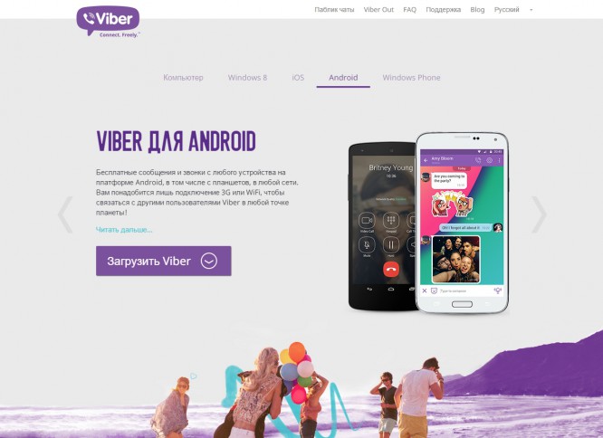
In a way, purple works like a combination of blue and green, giving your page a sense of security and safety. This color carries a slight touch of mysticism, but at the same time it conveys the developer’s honest intentions.
The Viber messenger website perfectly demonstrates how purple evokes a sense of simplicity and honesty.
Pink
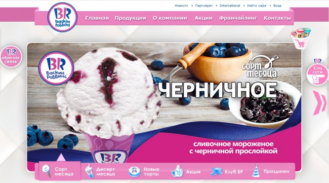
A romantic, feminine color. Pink has a strong effect when used correctly, although it can alienate certain groups of people. Because of its gender associations, pink should be used with caution, as in the wrong context it will evoke a feeling of immaturity, or hint at an intimate or informal relationship. It is unlikely that you will find at least one sports site that uses pink in the design. But for an ice cream parlor Baskin Robbins – just right.
The black
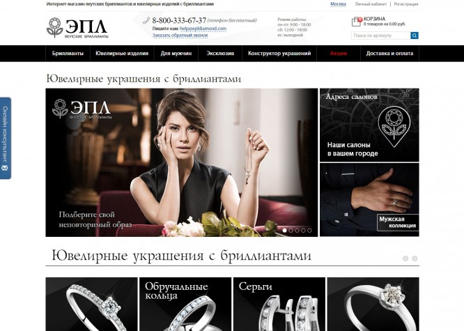
First-class, sophisticated color, luxury color. It testifies to professionalism, taste, makes you feel all the sophistication of the proposal. Regarded as a masculine counterpart to pink, and may slightly alienate female audiences. An eloquent example is the online store of Yakut diamonds EPL.
Color Theory in Website Design
All the text above fits into a simple idea – the right color combination on landing pages has a big impact on the bounce rate and conversion.
Using the basic rules of Color Theory when developing your website design will help you increase its attractiveness to your visitors. In an area where it takes a few seconds from success to failure, using a competent color management strategy, you can significantly increase conversion. Color schemes are one of the most overlooked ways to influence the attractiveness of your website in the eyes of your visitors. Color Theory can help you understand how users feel when they first look at your site. Pay attention to it, by the way. What do your brand colors say?
Source: RedHelper
Cover photo: ShutterStock
…

