
disassembling interfaces from a scientific point of view (# 2/3)
In the previous article, we dealt with the theory – using the basics of psychophysiology, we figured out why the beautiful seems to be convenient. Today we want to talk about the main methods that help to control the visual perception of a person.
These methods can be used in the design of interfaces to draw the user’s attention to the right points, details, information.
The methods are easily scalable — they are equally true for drawing icons and designing large, complex interfaces. But at the same time, they are not universal, and are not suitable for “all types of tasks.” You need to choose and apply exactly what is suitable for specific purposes.
“The magic number seven plus or minus two”
There is a pattern according to which short-term human memory, as a rule, cannot contain and reproduce more than 7 ± 2 elements. If there are more objects, the person avoids solving the problem. Or it reduces it to simpler solutions.
For example, if in an online store a lot of product cards are issued at once by one request, it is highly likely that the user will leave without choosing anything. What if there are many more objects to fit into the interface? You can appeal to the so-called geometric memory, group objects correctly and not forget about the edge effect.
")
Geometric memory
We refer to geometric memory constantly and for a variety of tasks. In order to cross the road, you need to find a zebra with your eyes, and then a traffic light. The gaze, accordingly, is directed to the road, finds the visor, then rises up to the traffic light.
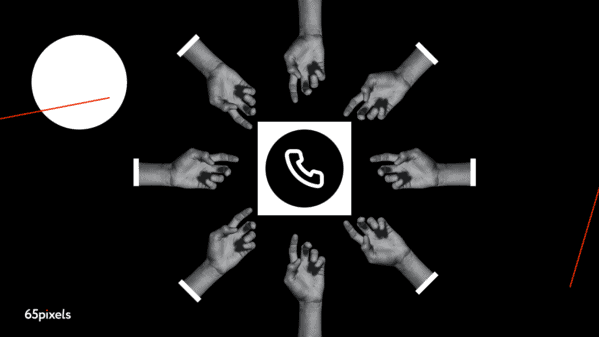
It’s the same with interfaces. Let’s take the simplest and most familiar task: call a person. First we unlock the phone, then we find (most often in the lower left corner of the screen) icon resembling a telephone receiver (most often it is blue or green), we find the phone number in the list or in the search field, click on the call button. Geometric memory helps you direct your gaze to familiar areas of the screen and find familiar patterns.
Memory law: edge effect
Let’s go back to the grouping of objects again. But what to do with objects when there are a lot of them? It seems obvious that if you need to choose any thing or product, it will be much easier to do this in a small sample. Usually search and filters solve this problem in interfaces.
But what if after this step the assortment is huge? This is where the edge effect comes into play. This is a feature of perception in which a person remembers the initial and final elements of the group better, and worse – intermediate ones. Users do not have time to learn where you have what is – information design must be clearly planned and thought out even at the design stage. If designers place important objects (advertising banners, products, links, buttons) at the beginning and at the end of the page, then the “edge effect” will certainly work. Another “life hack” is to divide products into subgroups, divide the list with a banner with other content, or add product pages with an adequate number of products on each.
More focus on data visualization
Infographics grab attention in any design. The only way to effectively present complex data to users is to visualize it. In the interface of products, especially complex ones, for example, banking, there are a lot of numbers, metrics, indicators and other diverse and difficult to perceive data. But if you arrange all this data into a neat infographic, the user will quickly understand this data and will be able to more easily solve their problems. And, as a result, they will use your product more often.
Don’t be afraid to visualize data. Even if at first glance it seems that it is inappropriate, then dive into the style and choose the right visual.
Accessibility design
The mission of accessibility design is to make it easier for people with disabilities to work with a digital product and thereby make it easier for everyone to work with and expand the target audience. Sophisticated visual contrast, subtitles, large fonts – for any kind of content, it is necessary to consider the path of a user with disabilities.
All points of interaction of the brand with the client should be reflected and worked out. When working on product visuals, keep this in mind and try to make your design more versatile for different user groups.
Gestalt principles
When used correctly and appropriately, these principles will help you solve both UX and UI problems. Apply them and over time you will notice that the metrics of the screens or pages that use these principles will increase.
Negative space
Gestalt’s theory is based on the idea that the human brain will try to simplify and organize complex images or structures of many elements, subconsciously arranging parts into an organized system that will create a coherent picture, rather than just a series of disparate elements.
Our brains are designed so that everything tends to see structure and patterns in order to understand the environment better and faster. So if we leave white space around our design, the gaps in the image will create a whole that is greater than the sum of its parts.
Similarity
In the Gestalt principle, similar elements are visually grouped regardless of proximity to each other. They can be grouped by color, shape or size. Similarity can be used to link elements to each other, regardless of the distance between them.
Continuity
The human eye will follow the smoothest, smoothest path when viewing lines, regardless of how the lines were drawn. This follow-up can be a valuable tool when the goal is to direct the visitor’s gaze in a certain direction.
Completion of the image
The principle is that the brain will fill in the missing pieces of a design or image to create a coherent picture. In simple terms, these are complex shapes that can be seen on the logo of Adobe, Sun Microsystem, NBC, USA Network, and so on.
Proximity
This principle refers to how close the elements are to each other. In UX design, the principle of proximity is used to force users to group certain things together. By bringing things together, users will perceive it as something connected.
How shape and background interact
Similar to the closure principle, this one uses negative space. Our brain will distinguish between objects in the foreground of the image. This is really handy when designers want to put an emphasis on focus.
Of course, these are far from all the methods by which we can control the user’s attention. We have described only basic approaches that can work in most situations.
Source: vc.ru

