
Design ways to reduce the visual weight of an object
Design ways to reduce the visual weight of an object
Visual weight is the degree of importance of a scene object.
The more visual weight an object has, the more contrasting it is. And the more contrasting, the more it attracts attention. Visual weight allows us to correctly place emphasis in a scene, showing which object is central to the story and which is not.
Let’s take an example.
Given: three chandeliers.
A task: visually “push” the middle chandelier forward, and the remaining two, respectively, back. To achieve this effect, it is necessary to reduce the visual weight of the outermost lamps, i.e. make them less contrasting.
The dumbest thing to do in this situation is to reduce the transparency of the rear lamps. While the approach is generally correct, it looks very boring and signals creative impotence.

I suggest a 3-step diagram:
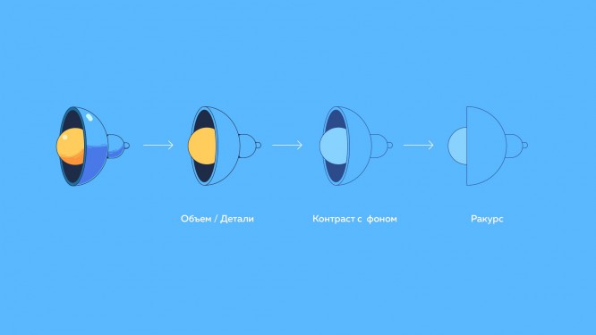
1. Getting rid of volume and details. Shadows, glare, reflexes, small details – all this visually brings the object closer to us. For an object to which we do not want to draw attention, such elaboration will be superfluous.
2. To further distance the object, you need to make its color low-contrast in relation to the background.
3. Next, we work with the foreshortening. The most interesting angles of the object for the viewer are 3/4 or isometric, because the object is visible from several sides. Choosing a boring angle in profile or full face, we deprive our object of audience sympathy.
The result will look much more aesthetically pleasing.

Source: telegra.ph
…

