
11 steps to the perfect logo
11 steps to the perfect logo
We’ll walk you through 11 steps and give you tips on which techniques to use in your logo design.
Working on a logo is a selection process (but not always simplification) based on a clear definition of goals and confidence in their implementation.
LogoArchive has watched designers create new and original logos for more than half a century, and singled out 11 common techniques from a variety of ideas. In these logo design tips, we’ll share what we’ve learned.
01. Combine ideas

Try to find common ground
If you want to combine two ideas, look for similarities in shapes. While weird and awkward decisions can also be found in logo design, interconnection is more universal and consistent with purpose than dissonance.
02. Give static forms dynamism

Rhythm means movement
Use direction, pattern, and repeating elements to give static shapes a sense of movement and make them visually interesting. This can be done through diagonal slices or arrows, radial positioning of objects, changing the thickness of lines, increasing the size or transition from one shape to another.
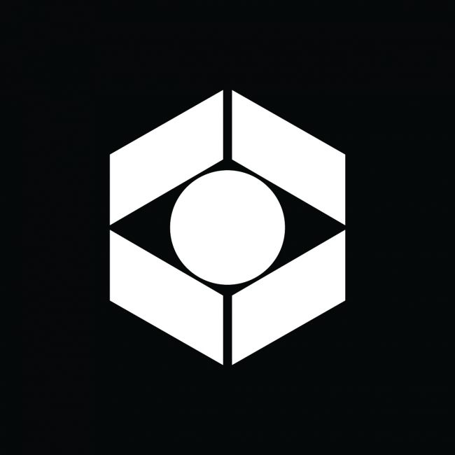
03. Add layers

Design that hides more than meets the eye
Use line weight, negative space, and object saturation to bring out the background image. You can use these techniques to add layering and visual hierarchy within the logo. Sometimes, designers even remove background elements intentionally to create cleaner layers or emphasize a central motif. The search element will engage your audience, and the effort involved can help your logo stand out and be memorable.
04. Learn visual language
Consider your business demographics. Are they narrow specialists or are they aimed at a wide consumer market? Look for connections between brand specificity and form. Take the time to understand the perceptions and associations of your audience.
Originality

Look for the distinctive elements of a specific area
Learn the visual language of the industry you work in. Does it have immutable and specific symbols to rely on? Architecture, for example, has quite a few features that can be graphically expressed. Space, structure, light, shadow, movement, and tension are good starting points to get started on creating a logo that will appeal to a specific target audience. Many of these concepts are repeated, but so far, designers have managed to create something new, different and interesting through the same elements.
Versatility
Some symbols break the language barrier
Arrows mean speed and direction, the globe – internationality, eyes – observation. They are effective tools for expressing global ideas. Quite commonplace, they can still be a good reason to get started.
An interesting solution can come if you have a non-standard vision. You can arrange images, letters, or shapes. The ability to observe and identify common features can help in this – the products of these qualities are the most effective solutions. This level can be achieved through prolonged observation rather than quick viewing.
05. Use negative space
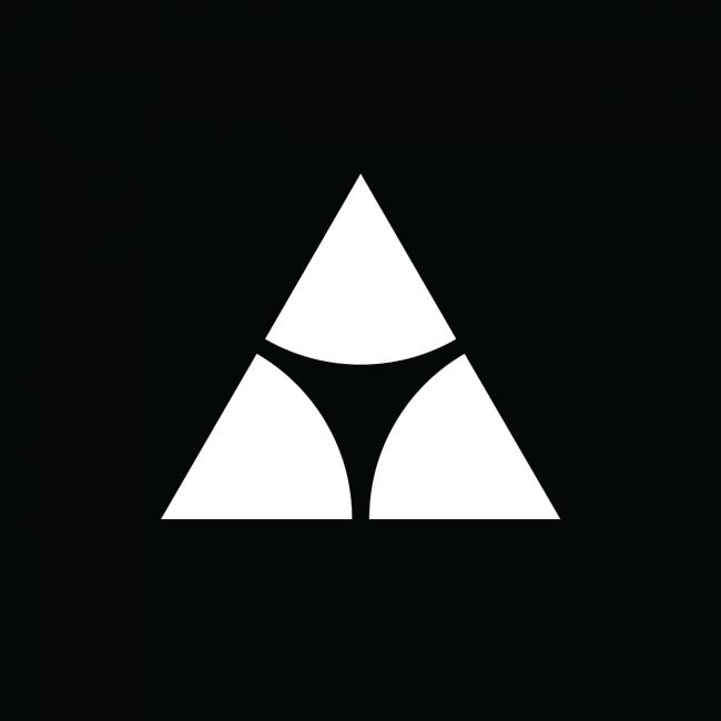
Sometimes silence is better than words
The negative space inside the logo is a meaningful object. Focus on the space that you have surrounded with the form. Does it promote balance or does it provide an interesting contrast to the cast shape? Does it add an additional image? See how negative space can become more visible on the screen or diminish on other media. Consider and use it.
06. Don’t reject abstractness

Thinking outside the box helps create unique and memorable logos
The logo does not have to clearly express the idea, abstraction often appears on LogoArchive. Logos like these create atmosphere and express emotions. Look for images that are relevant to the business and the industry in general, identify them, reinterpret them. It doesn’t matter what exactly people see in them. Leaving room for imagination is important.
People love riddles and the ability to find connections to draw their own conclusions. This is most applicable in art-related logos. This is useful in a creative space. Intuition rather than intelligence, subjective versus objective, are very effective in the right context.
07. Find the matching symbols

Your logo can be based on fundamental symbols
When it comes to choosing a shape, take a look at the brief. What were you asked to convey? What is the best way to express this? The most important thing is to find the best tool for expressing a certain idea. A logo is perhaps the most limited medium in today’s multimedia world, but it has the potential to express the essence of a brand.
What story should you tell? Is there a historical symbol or visual identity associated with the brand? Are there values or legends that support the brand’s uniqueness? In order for the logo to serve as an identification, consider how it can support the idea of the brand.
08. Use contrast
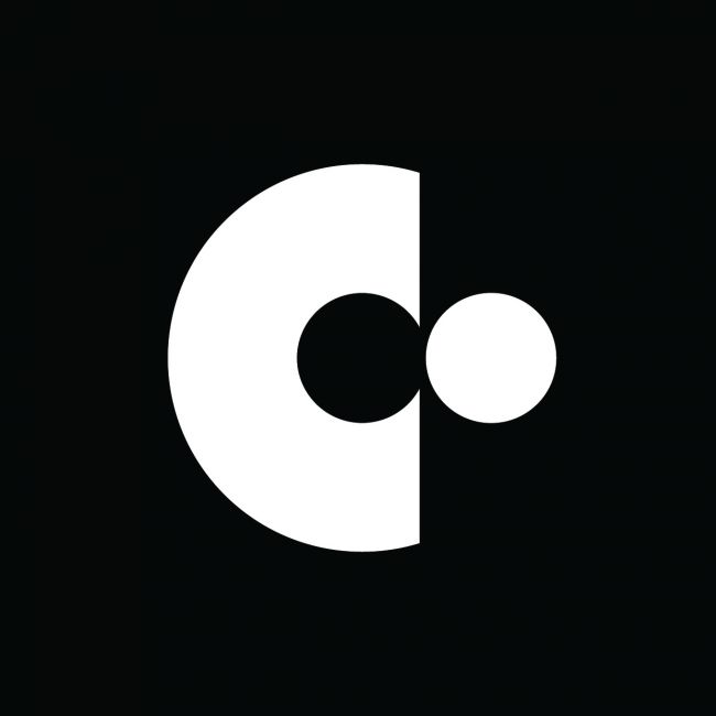
Opposites attract, even in logo design
See how opposing elements can be combined: soft and sharp, thick and thin, static and dynamic, fill and negative space, sharpness and gradient, simplified and decorative. The right contrast can be a very effective tool for grabbing attention, which can help improve memorability.
09. Multiply elements
One shape can be transformed into many designs
Take shape and create something new out of it. This is duality and plurality – creating an image by repeating or combining elements is a good way to bring out the difference and make a simple form interesting. Make the image and font work together, or paint the image with text. Use negative space and similarity of shapes to bring ideas together in a natural and distinctive way. Take two ideas and look for the best way to combine them, while maintaining visual balance and clarity of concept.
10. Get the most out of simple forms

Don’t forget the main designer mantra: less is more
Use line weight, saturation, and grouping of objects to create a sense of light and shadow, depth and structure. Remove the dark elements and paint the shape with light. Use vague shapes that can convey much more than well-defined contours. Build as much of the small as possible.
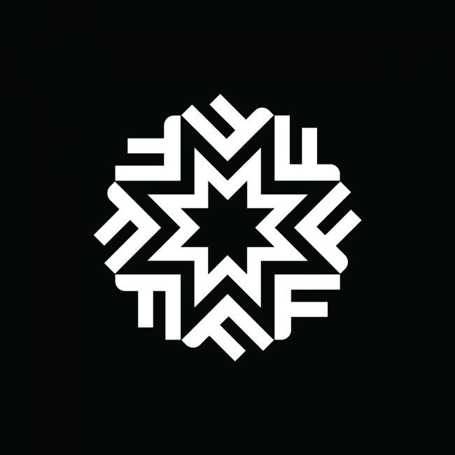
11. Use small details
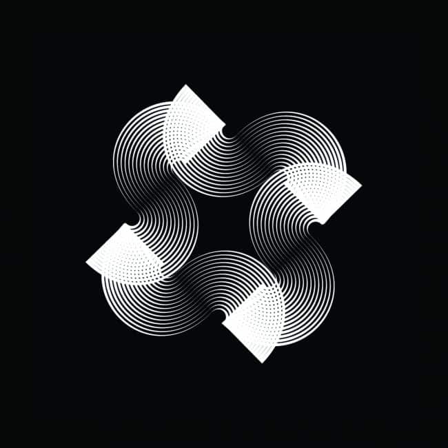
Get the most out of modern technology
Modern techniques and high-resolution screens allow designers to use ever thinner lines, position elements close to each other and create intricate intertwining shapes. Don’t be afraid to use these techniques. It’s worth considering, though, that scalability is a bit of an outdated concept.
In many posts on LogoArchive, logos have very thin lines that accentuate details or add contrast to heavy shapes. But think about how you can scale the logo while keeping the thin lines.
Original: creativebloq.com
Translation: Katerina Sorokina
…

