
Design trend – two-tone images
Design trend – two-tone images
Translation of the article “Duotone Color: Tips & Examples for This Vibrant Trend” on the nascent web design trend – two-color images: how to best use them and why.
With Spotify, the two-tone design is gaining popularity every day. With this effect, the photo immediately catches the eye!
What is a duotone?

Duotone – the use of two colors in the image. The name and technique appeared in the printing industry, where only 2 colors were used for printing.
Duotone is visually interesting and making it is elementary. The effect is created in Photoshop or using an application like Colofilter.css.
This is how the printing technique found its place on the Internet. You may have already noticed this trend online.
Cover photo
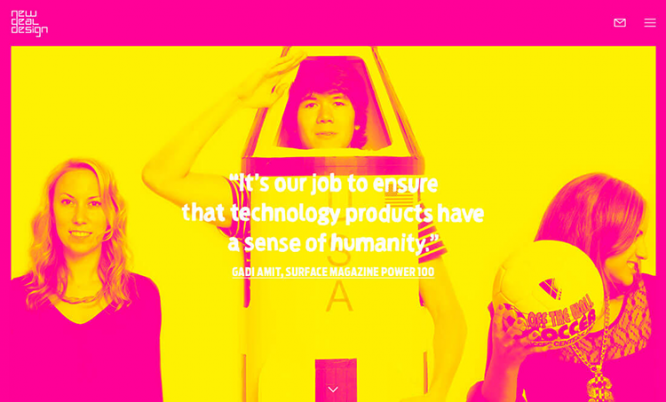
Use a two-tone photo on the homepage – like New Deal Design, which chose bold colors and funny imagery. Don’t be afraid to step out of your comfort zone – use incongruous colors. The main thing is to create a contrasting image that attracts the attention of users.
To achieve maximum effect:
● Choose two contrasting colors. Cool if these are the colors of the brand;
● Take a photo with subjects you can focus on. Landscapes are more difficult to use;
● Use high quality images. Low quality blurry photos are not an option;
● Create contrast;
● Define a place for buttons and text;
● Choose colors that reflect the mood of the photo;
● Add a colored border or parallax effect.
Simple color palette
Duotone – not necessarily something complicated. Sometimes the prime examples are simple in nature.
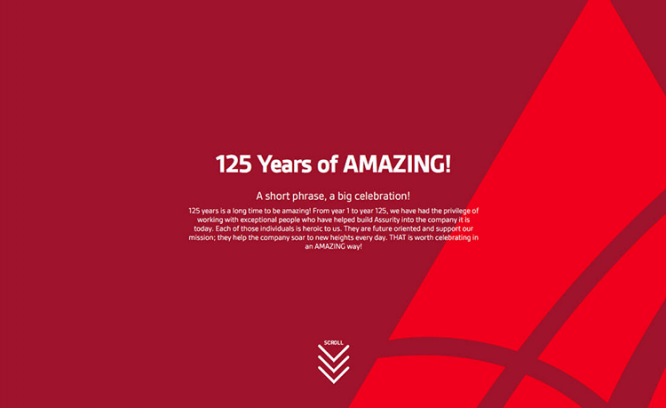
Assurity Life Insurance uses two shades of red and a simple font. A few more semitones appear along the scroll. Red attracts users’ attention.
The trick is that the site is too simple not to be effective. Users are not overwhelmed with elements and are focused on the text. This type of duotone is suitable for formal sites.
Increased readability
Using a duotone, you can create a muted image for the background. The text on it can be placed anywhere. To increase readability, use a solid color underlay for the labels.
Accent
Two-color images work in small spaces too. Use a trend to design navigation, additional images, or for a specific type of content.
The advantage of using technology in a small space is more freedom. You can experiment even if you’re not sure if the duotone will work.
Background
This is the perfect way to use brand colors. And the duotone will also help to make the site more modern without major changes.
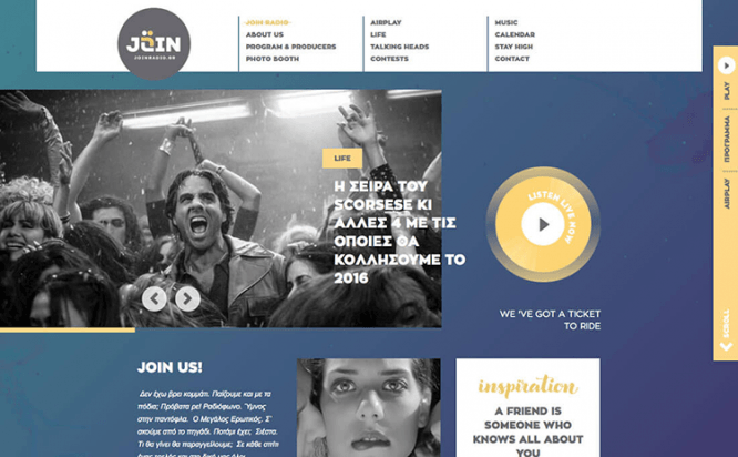
Join Radio uses a slightly noticeable gradient for the background. The colors are in harmony with the user interface. Simple animations and the transition from light to dark make the page scroll.
Duotone – an opportunity to experiment, combine incompatible colors. And the result always looks great and works.
Output
Original doesn’t mean complicated. Especially in the era of minimalism. Get Photoshop (or even a phone app) and get creative with trending designs.
Source: blog.sibirix.ru
…

