
4 popular business card design mistakes
4 popular business card design mistakes
In this article, we will visually examine the most common mistakes that are made when creating business cards, and teach you how to avoid them.
This article will be useful not only for designers, but also for those who plan to create or already have their own business cards.
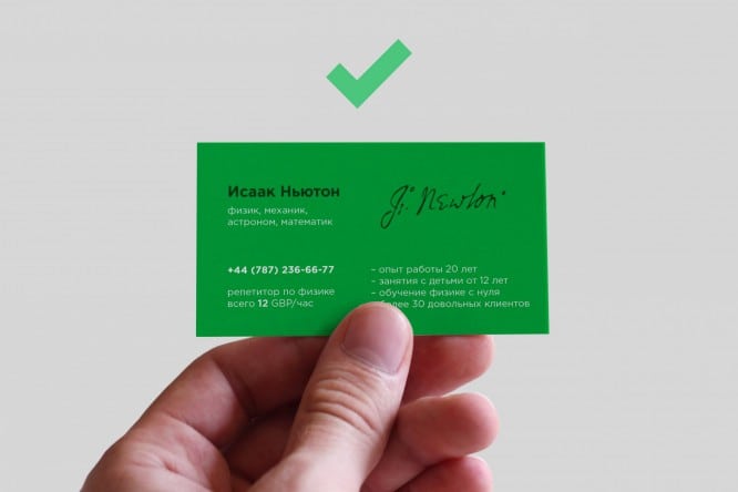
Problems with layout
The task of the layout is to correctly place accents on the business card. In the case of poor layout, the recipient will not understand where to look and what to read first. In addition, without a “grid” blocks of text are often too close to each other or to the edges, which is why the text lacks “air” and it simply “sticks together” and becomes difficult to read.

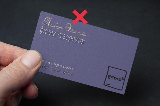
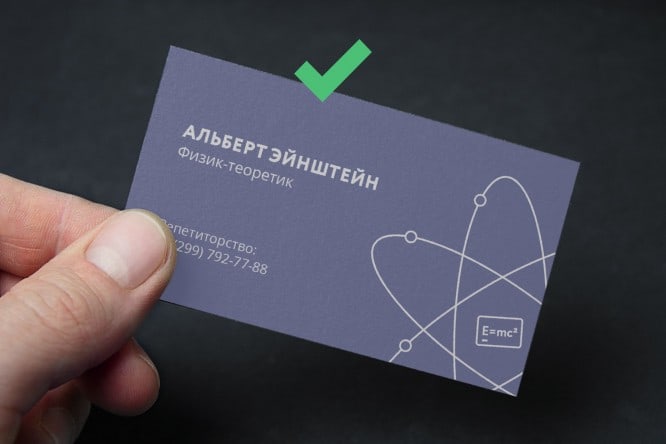
Bad handling of fonts
Here’s a short list of principles to follow when working with fonts:
- It is important to choose the right fonts that match each other, so it is better not to use more than two fonts on one business card – there is less chance of overshooting;
- Effects are not applicable to fonts (with very few exceptions);
- You cannot deform (stretch) the font – the letters should look the way they are intended.
Readability issues
In pursuit of the amount of “DESIGN” per square centimeter on a business card, you should not use as many effects available in Photoshop as possible.
Shadows, imitation of 3D and various textures make it difficult to convey information as simply and clearly as possible. Do not forget that a business card is essentially a thin sheet of paper, and you should not imitate a three-dimensional image or texture on it with the help of effects – the best solution would be to invest in more expensive material.


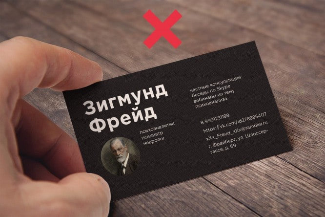
Incorrect business card design
The final paragraph contains common mistakes at the stage of filling a business card:
- Link design. First of all, get rid of “https: //”. This part is optional and looks like garbage on the way to useful information. Also try to keep the “id” of your communities and pages as “/ logomachine” rather than “/ id32754081”;
- Registration of a phone number. Mobile phones have the format “8 911 123 44 55”, and landlines – “111 22 33”. Only optional digits for dialing (area code, for example) are written in brackets;
- Registration of mail. Mailing to @ rambler.ru and “zaychik777” as login is a bad idea (or “banned”)… The best thing is to use mail on your company’s domain;
- Using your own photo on a business card is considered bad form if you are a famous person (entrepreneur, head of a company, etc.). An exception may be managers, the photo on the business card of which will help to distinguish them from other managers of the company;
- A business card in two languages on both sides indicates a desire to save money on a batch of business cards for foreign clients.

Conclusion
Of course, there are exceptions to the rule, but by following these simple tips, you will learn not to make the most common mistakes when creating a business card.
Source: spark.ru
…

