
The Easiest Guide to Iconography
The Easiest Guide to Iconography
Svetlana Shapovalova, editor of Netology, translated Tidjane Tall’s iconography guide, explaining the simplest basic icons and explaining why an illustration is worth a thousand words.
How long does it take for a designer to create one custom icon on average? A few minutes? Ten? An hour, two or three? What if we show you how to make 10 cool icons in less than 10 minutes?

Iconography is a special form of communication. It complements the visual language of the brand, so the custom icon set is much more expressive and attractive than the standard one. Many designers don’t even bother studying iconography. This is most often because it requires one more course in a very long learning process.
So I created a mega-simple guide that can teach you the basics of iconography in less than 10 minutes. And, yes, I’m serious.
Knowing how to create custom icons will open up a huge new world of images for you to use in your projects – it will set you apart from the crowd and give you a competitive edge over other designers.

Initially, I was inspired to create the guide by Morgan Allan Nutson’s GIF, which showed how to create a location service icon in a couple of seconds. The reception seemed to me not hackneyed, elegant and fast.
I realized how easy it is to create custom icons. In fact, an icon is just a certain geometric figure, the result of connecting or distorting basic shapes: rectangles, triangles, circles.
The main thing in logo or icon design is to keep things simple.
With this tutorial, you can create 10 different icons in 10 seconds using simple geometric shapes.
Important: I used Adobe Illustrator, but you will get the same result in any other editor: Sketch or Figma. We added and removed points on the shape with the Pen Tool, selected and moved with the Direct Selection Tool.
Eye (Eye Icon)

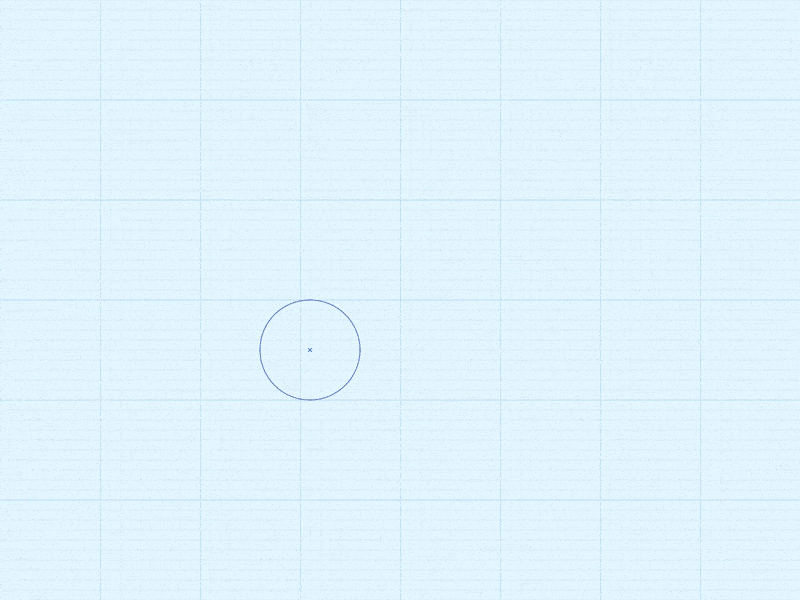
Place four circles on the same axis in the center of the sheet, from largest to smallest. Place a small circle in a slightly larger one and so over and over from smallest to largest. Then stretch it beyond the far left and right points from the center. Finally, slide the smallest (inner) circle towards the edge of the previous one, and you will have a highlight effect on the iris.
Tip: To avoid using white circles, use the Pathfinder panel and subtract two circles from the bottom circle.
Arrow Icon
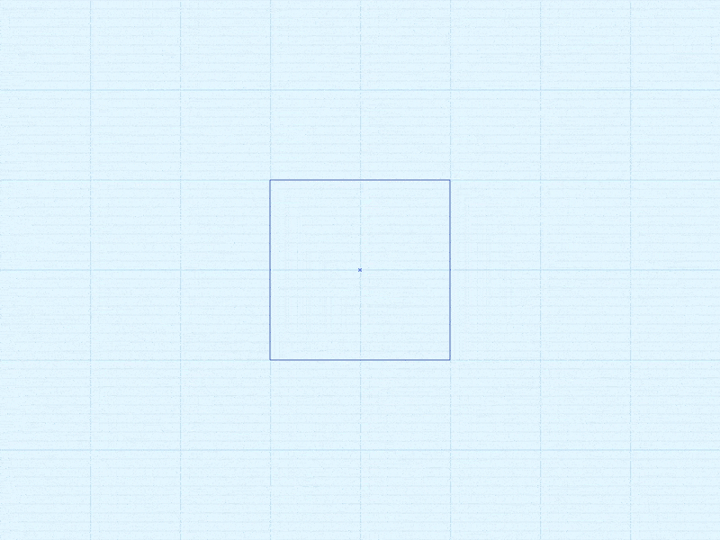
To get an arrow, just add additional dots around the edges of the original square.
Tip: Alternatively, just draw a thin line and give it an arrow shape.
Battery (Battery Icon)
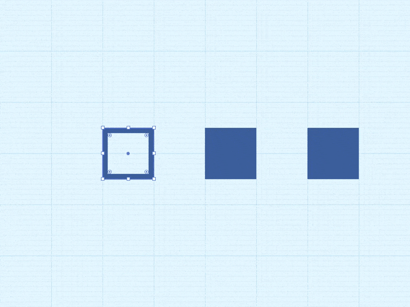
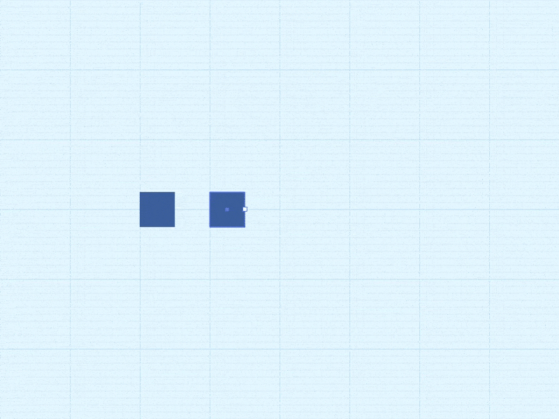
Draw one outline square and two filled ones. Place one of the filled squares inside the empty one and play with the proportions. Leave the second one outside, giving it the shape of the tip of the battery.
Tip: Try different values for outline thickness and padding to achieve the desired visual harmony.
Bullet List Icon
Start with a regular square; copy it and place the copy on the right; give it the shape of an elongated rectangle. Select everything together and make two copies, placing them one under the other at equal intervals.
Tip: replace the squares with circles and the icon will look softer.
Cloud (Cloud Icon)
Draw three circles of different sizes – two identical small and one large. Place the small circles on the same level, and the large ones in the center between and above them. To get the bottom of the cloud, drag out one of the smaller circles.
Tip: To make the cloud look more natural, try different circle diameters.
Forward Play Icon
Draw a long rectangle. Place a point in the center of the left edge, and then delete the bottom and top points. This is a triangle – copy it and place it on the right. The icon is ready.
Tip: to get it done even faster, draw a triangle right away, not a square.
Funnel Icon

Draw a long rectangle. Add points in the center of the left and right edges. Now stretch the top edge wide. Done.
Tip: Place two rectangles on top of each other and just stretch the edge of the top one.
Play / Pause Icon
Draw three long, parallel rectangles. Transform the widest of them into a triangle.
Tip: as an option, immediately draw a triangle, followed by two parallel rectangles…
Position Arrow Icon
This is a modified icon for the location service from Morgan’s GIF. Just draw a square and then drag the bottom left corner towards the opposite corner.
Tip: If you’re working in Illustrator, hold down the Shift key to get a strictly diagonal direction.
Position Pin Icon

Inside the larger circle, create a small one using the Pathfinder panel. Lower the bottom point to the desired distance and sharpen the resulting tip: switch to the Pen Tool (Pen Tool), then click on the point while holding down the Shift key.
Tip: You don’t have to sharpen the corner completely – just round it up a bit by selecting a point and changing the corner radius value in the Transform panel.
Sound Icon

It is done in the same way as the funnel icon, only with a 90 degree rotation.
Tip: just copy the funnel and rotate it clockwise.
Wave (Wave Icon)
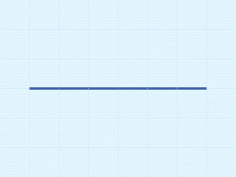
Draw a straight line, then space the points along the entire length at equal intervals. Pull down the changing points and round all corners as much as possible until the line is smooth.
Tip: To make the line even softer, round off the ends.
A good icon is worth a thousand words
An illustration is often said to be worth a thousand words. This is especially true for icons. By replacing words and whole sentences, they optimize visual space, usability and aesthetic appeal.
The ability to create sets of simple and useful icons will always come in handy. In this article, we just showed how easy and quick to make icons from basic shapes.
10 rules of iconography:
- Make icons symbolic and meaningful.
- The recommendation you’ve probably heard hundreds of times already: keep it simple. Don’t sacrifice icon readability for the sake of appearance.
- Work mindfully and thoughtfully. Think carefully before you start.
- Make sure the icon looks correct in different sizes.
- Maintain a consistent style.
- In the vector, please!
- Use different colors carefully and only when necessary.
- Knowing the basics of geometry helps a lot.
- Remember that at first glance it should be clear what this or that design element is needed for – that is, remember about the so-called affordance.
- The language of iconography must be universal.
- In fact, the English alphabet is just a set of 26 icons, while the Russian alphabet is just 33.
Improve your skills and you will see that soon 10 seconds to create one icon will seem a lot to you – you will learn how to cope much faster.
Source: habrahabr.ru
…

