15 design tricks: how to make a banner you won’t be ashamed of
15 design tricks: how to make a banner you won’t be ashamed of
Today we’re going to look at 15 banner design tricks you won’t be ashamed of. For examples, we took the 2015 Webby Awards winners.
There is a lot of hype on the internet about banners. Have they already outlived theirs? Does anyone click on them? Are they already dead? What if there’s a better alternative to banners? And while it is true that there are fewer click-throughs on banners, this is not the end of the popular ad format. Even if you cannot measure the effectiveness of advertising, you will not mind that it still influences the user’s choice in favor of a particular product or service.
Today we’re going to look at 15 banner design tricks you won’t be ashamed of. For examples, we took the 2015 Webby Awards winners.
1. Stick to standard sizes
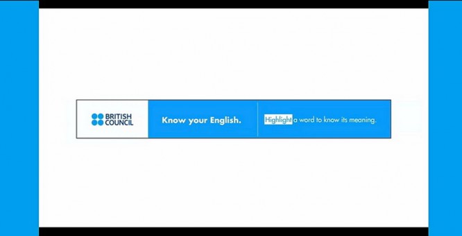
Banner advertising is not a one-size-fits-all product type. You should proceed from the specifications that are needed for the resource you plan to advertise on, and most sites use a set of standard sizes. (This also applies to email newsletters)
Check out Google Adwords, one of the largest banner ad servers on the internet, for the most popular sizes.
Below are the sizes you should choose first:
- 728 × 90 px – full-size banner (often shown at the top or bottom of the page)
- 300 × 250 px – inline rectangle (mostly shown on the right side of the site or inserted into the text)
- 300 × 600 px – half-page block
- 320 × 100 px – mobile banner
2. Stick to consistency
Each banner should contain three elements: branding (logo), message and incentive for a click. The catch is that you don’t have much room for all this.
Create a simple sequence of items. Keep your message short – ideally two to 10 words. What do you suggest and why people should want it. After that add a logo or some other identifier. It should be readable and not too large. Finally, add a reason for the click. Do you have a sale right now? Coupon code? Mail subscription?
Each of these components must be compositionally positioned according to basic design principles in size, space, weight and color to guide the user’s attention from element to element.
3. One banner equals one message
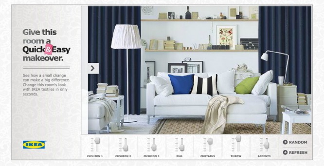
Banner ads don’t have to be a never-ending carousel of messages. And while you can use tricks like animated gifs to show multiple messages in a single banner, this isn’t always the best solution.
First, start with a concept that works like a static picture. And only then you can try to add features or additional functionality. Moving elements shouldn’t be the only thing people see. Your message, message should be the most important on the screen.
4. Remember where the banner will be placed
Where do you plan to place the banners after you make the creative yourself? If you use services like Google, you won’t have much control over your placement. But if you want to place them on specific websites, apps, or email newsletters, you will need to study them and consider their design before making your banners.
Use colors that contrast strongly with the design and background of the site. This will help you stand out from the crowd. Choose crisp colors and fonts that are easy to read. Even if the theme of your banner overlaps with the product line of the site on which the advertisement is placed, choose strong, radically different visual solutions in order to generate the maximum reaction.
5. Use a call to action
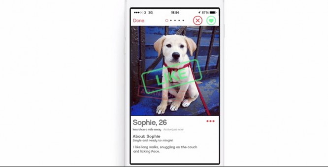
What is the most important task of a banner? That’s right – they have to click on it. Use a Call to Action in every banner you make. Tell the user what to do next.
The user can subscribe to the mailing list, go to the site, get a discount, etc. But you have to convince him to do it. In such cases, direct instruction works great, head-on – after all, people do not want to think a lot.
6. Forget Flash
Now you don’t even need to talk about it, but anyway, just in case – don’t let anyone persuade you to create flash banners. You are wasting time, effort and money.
Use HTML5 instead. If you need to convert some of your old creatives and breathe new life into them, Google has a little tutorial to help you do this.
7. Use the buttons
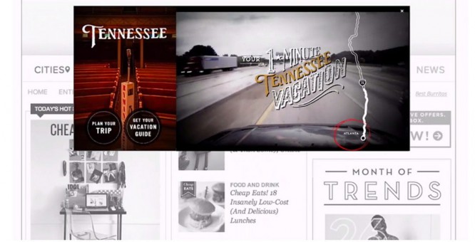
Sometimes it can be difficult to perceive information – we all once faced this. In such cases, simple instructions save the day. And while most users know they can click on a banner, sometimes the presence of a button prompts them to do so. (Yes, it’s clear that the entire area of the banner is clickable, but the button is a great visual signal).
So – insert buttons. You don’t need to be too sophisticated with their design. Simple messages like “buy now” or “learn more” can do a lot to turn viewing a banner into a click and subsequent conversion.
8. Focus on fonts
The smaller the area you are working with, the more important the value of the choice of fonts is. Banner advertising in most cases is very limited in size and fiercely competes with other elements of the site. So use crisp fonts that are easy to read.
According to the rule of thumb, usually two typefaces are sufficient.
- Make great headlines. Use bold, slightly fancy, or colored fonts to grab the attention of your users.
- Prefer sans serif fonts. You can use two sizes or two boldface styles – one for body text and one for buttons or calls to action. Just make sure they are easy to read.
9. Use simple animation
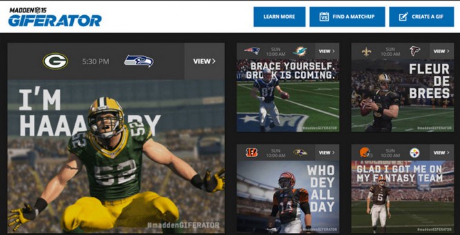
One of the biggest trends in banner advertising is simple animation. For example, a funny character who runs through a banner, or a cute girl who nods or blinks at you from the screen.
What you definitely shouldn’t do is the bright yellow or orange flashing screens from the banners of the past. You don’t need glowing neon texts to grab the attention of users.
We’re talking about little things that will grab attention and make you look at the banner again. A simple animation might just be a little clue that grabs attention.
10. Save correctly
This is an important point. No one will place your ad if the files are too large or the banner is not in the right format. Optimize the size to the maximum. The total file size should not exceed 150 kb, depending on the area of the advertising banner.
After that, make sure that the banner is in the correct format, standard for online advertising. Common banner formats are PNG and JPG for static banners, GIF for animated ones. The SVG format is also gaining momentum and is increasingly being adopted by various ad networks. Forget about SWF (Adobe Flash) – almost everyone has abandoned it now, and even browsers are no longer supporting it. Instead, HTML5 banners have become widespread, which are created using programs such as Google Web Designer, Adobe Animation or the Russian-language online banner designer Bannerboo.
11. Focus on the lyrics
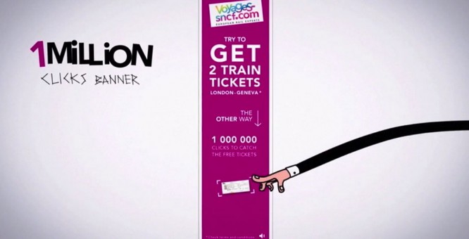
You can of course say that this is not your job, but copywriting is key when creating a banner. While there isn’t much room for copy, you’ll need to work hard to write a good selling message.
You’re not going to cram 100 words into a banner, are you? A good option is to work with a copywriter to help you choose the right message. Choose phrases that answer potential user questions, or come up with an intriguing message to grab their attention.
12. Use brand elements
Banner ads are an extension of any marketing campaign you launch. They should look appropriate. If the shapes and sizes may differ slightly, the overall visual style should be maintained.
Therefore, when creating banners, think of them as part of your marketing strategy.
To keep the overall style, use the same colors, fonts and pictures in all materials. If the banner format is very small, you can hide the logo or somehow interestingly crop the photo, which should be full-size on other media. This is normal. In short, you need to get creative to get everything to play as it should.
13. Use vibrant visuals
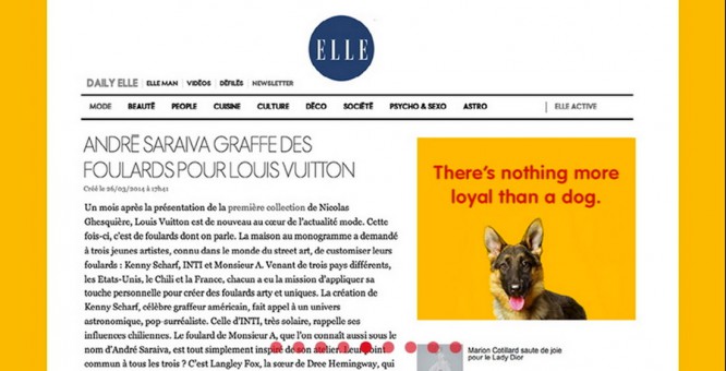
Pictures in banners are usually small, and often very small. You will need to use the most meaningful and detailed images to get the desired effect and reach the user.
If you are using photographs of people, let’s focus on the faces. If you sell clothes, show one item instead of the entire wardrobe. Lean towards simple compositions – a picture and text next to it. Not picture-in-text, and not text-in-picture. The user only has a couple of seconds to see your message. A strong semantic image and strong selling text next to it is your win-win option.
14. Relevant content
There is nothing like a well-designed advertising campaign. If you clicked on a banner because you want to buy a T-shirt depicted on it, the link should lead to it. Users will thank you for this.
Yes, you may need to put in a little more effort to make it work as it should. Landing pages created specifically for an advertising campaign are exactly the option. Stick to a general style on banners and landing pages so that the visitor does not get confused when they click on your page. Study analytics and watch conversion to understand if everything is working well.
15. Be simpler
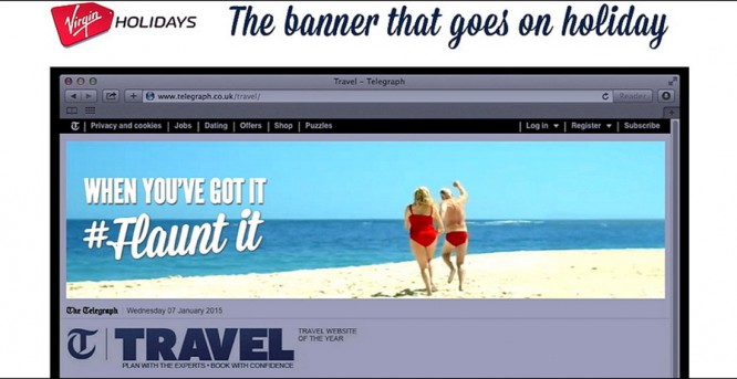
This is a common truth. If you overwork the user with an abundance of texts, animations, colors, facts, you risk losing the original meaning. Be simpler.
In the case of banners, just one at a time will be enough.
- One picture
- One text message
- One call to action
- One brand element
findings
So, banners are not dead yet. (And not the fact that this will ever happen). Banner ads can be an effective way to reach your target audience and increase your brand awareness.
Author: Сarrie Сousins
Translation: Bannerboo.com
…

