
Design terminology. Part 2
Design terminology. Part 2
The Geek studio team has continued a series of tutorials for customers and budding designers on common design terms. After studying the second part, you will be able to communicate with the employees of the printing house in the same language! 🙂
Professional terms in simple understandable language.
Course 2, advanced (course 1). After reading, you will reduce your time for verbal ping-pong.
7 terms, 4 minutes 52 seconds to read.
Links
There is such a program: “Adobe Illustrator”. Most likely, the designer works in it: it is very convenient to prepare layouts in this program. it is possible to link other files inside one file. Linking is putting a third-party file, of a different format, inside the program.

Because physically, the file lies separately – it does not increase the weight of the finished layout in the program itself, and the program works quickly. The layout stores only a link to the required file – a link. There will be no link = the program will not be able to place anything in this place of the layout. How to show something that does not lie at the specified address?
Therefore, if you submit an illustrator (.ai) file for work, make sure that all links that are used in the layout are included in the links folder.
* The layout may not contain links at all if it is a simple vector file, but it is better to clarify anyway.
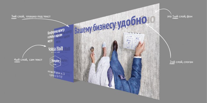
It is especially convenient if the link remains in layers, and not knitted together into one layer, what is the benefit – read below.
Source or file, merged (merged) into one layer
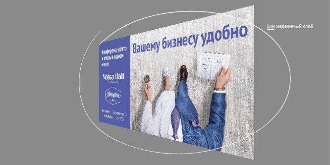
You can make changes to the source quickly and easily: move objects in places, reduce or increase the size of the text, add something to the vacant space. In the downed file – no. Because the source stores all the information in layers (picture below), objects are not interconnected, one can be changed without harming the other. To do this in a knocked down file, you have to circle one object, move it, in the hole that appears finish painting “Patch” from the background. A layered file is a collage of superimposed but not glued objects. A file knotted into one layer is, albeit a good one, but a drawing on a solid sheet of paper.
Layers in the source:
File, knocked down in one layer:
Resolution
And now the riddle, what is it about?
Of course, about the resolution. Resolution is the number of small dots per inch: dpi (“dots per inch”). The higher the resolution, the more you can enlarge the picture, and it will remain in good quality. However, do not chase unnecessarily large numbers in files. Why do you need the quality inside a 3,000 dpi computer file if the printer is at best capable of producing a 300 dpi picture? This is just the extra weight of the file.
Related article: Designer’s Guide: DPI and PPI – What Are They and How to Use It?
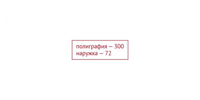
Optimal resolution for printing = 300 dpi,
for outdoor advertising = 72 dpi (although the printers themselves admit that even less, these layouts look at a distance, high quality is not required here, the main thing is to make a color proof before the final print, the printing house provides it for free).
Sharpness
Sharpness is closely related to resolution. In a very simplified way, sharpness is responsible for the distinguishability of details in the image. The degree of contrast between adjacent points. This is especially important when working with fabric textures. Two factors affect the perceived sharpness of an image: resolution and clarity.
Focus / defocus
To get a picture of excellent quality after processing, you need to take care of the high quality of the picture itself. Retouching only “stretches” and decorates the already given frame. Cosmetics, not plastic surgery. Communication requires both high resolution (more points) and high definition (clear boundaries between these points). However, the camera has a limitation and may focus (sharpen) only a specific shot (close object, middle, distant). If part of the image in focus (it has good sharpness), then part goes into defocus (loss of sharpness, blurring), what to do in this case? When a completely sharp shot is needed, photographers create a composite image. Taking different shots in focus one by one, and then combining the image into one picture, where the sharpest details are taken.
Noise
Remember the black and white rattling picture on TV when one of the channels is not working? Now imagine that such a picture is superimposed on the working image, incomprehensible points begin to appear in the shadows, which did not appear due to the texture in the frame and are definitely superfluous. This is noise.
This is due to imperfect technology and lack of light. Usually, noise has a negative effect on the image, as if inappropriately “beats” it into small pieces, but a small amount of noise can increase the feeling of sharpness (picture below). This deliberate addition of noise can be used to artificially sharpen, combat “blurry” textures of not very good quality (grass, bricks, cardboard), or when retouching, when you had to remove the mids and there was too much feeling of smoothness and plasticity.

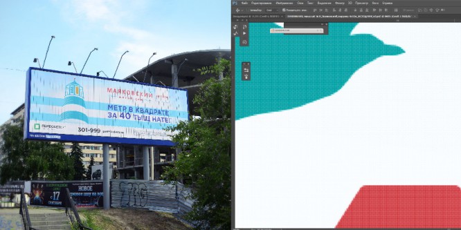
Allowances / bleeds / overhangs
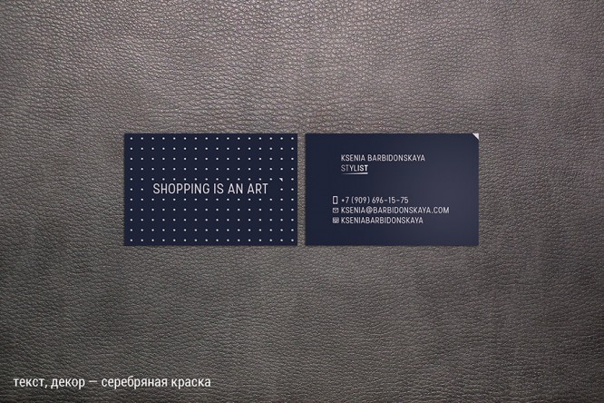
You can see the finished business cards like this:
while the printer and the designer see the layout like this:
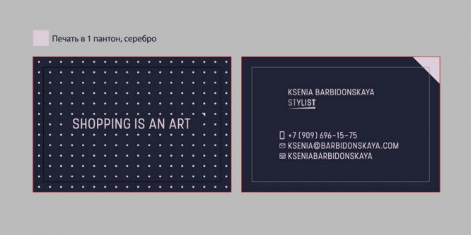
Do you see how much layout has been added around the perimeter? Exactly 5 mm on each side. Added – and there are bleed margins. They are allowances. They are departures. If, after printing, the business cards are cut unevenly (and they will), it will not be striking: there will be no nasty white stripes around the edge: after all, we printed the background with a margin.
What margins should be, the printing house will accurately indicate in the technical requirements, but usually within 5 mm. The information is important, necessary, it is better to clarify it.
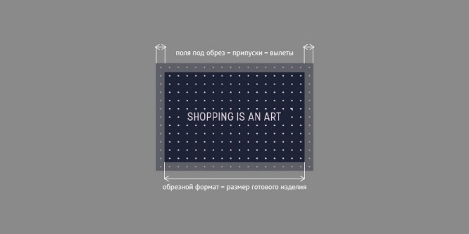
Cropped format
What remains after the fields are cut. He is the size of the finished product.
That’s all 🙂
Source: wearegeek.ru
Cover photo: ShutterStock
…

