
10 stories of how one idea beats any design
10 stories of how one idea beats any design
Graphic designer Vladimir Ayuev told why a good idea does not need decoration, and the best design is the absence of design.
As a person who cannot draw, and, moreover, a lazy person, I am especially inspired by works in which the illustrative abilities of a designer, meticulousness, all external beauty (decor) cease to play a role, and the beauty of an idea, a solution comes to the fore.
I have collected ten works that I see as the standard of design, because there is no design at all – technically, anyone could do it.
Alexander Zagorskiy (Depot WPF)
Packaging design concept for a private label of a supermarket chain.

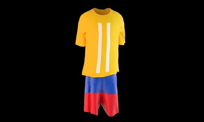
Vova Lifanov (Suprematika)
The concept of an alternative football shirt for Colombia, made as part of a project at WOS.
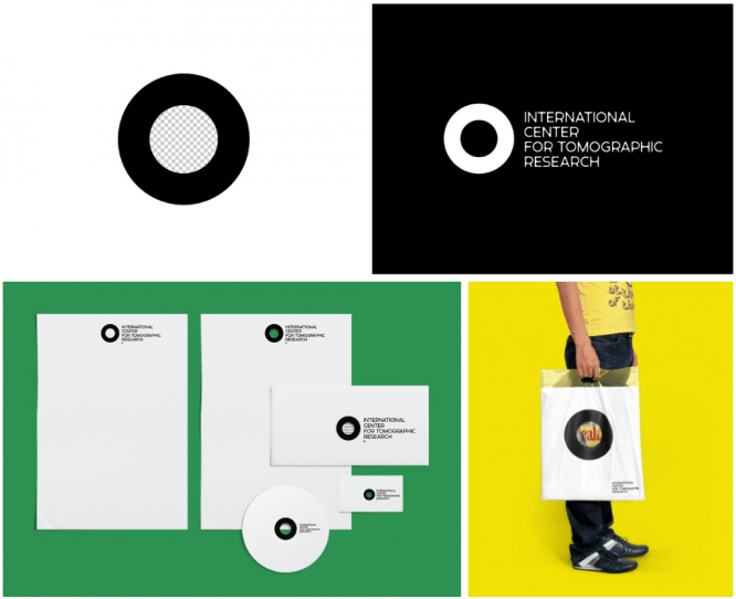
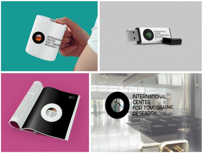
Farhat Kuchkarov / Denis Bashev
Identity of the International Center for Tomographic Research, made in the framework of the agency “Tomatdesign”.
“When developing the idea, we were based on the main function of the tomograph – to show what is hidden from the ordinary eye.
The tomograph does not diagnose or cure – it only allows you to look through the tissues. ” Therefore, the logo is actually a hole.
Anton Schneider (SILA, Yandex)
Bank card design for the competition from Rocketbank.
“PIN memory. Select any 4 digits. Remember their place “

In the context of hundreds of works submitted to the competition, consisting entirely of illustrations and graphic jokes, this card appears to be the personification of a clean and understandable function, which brings the discussion about primacy to several levels up, where the value of beauty has lost almost all significance.
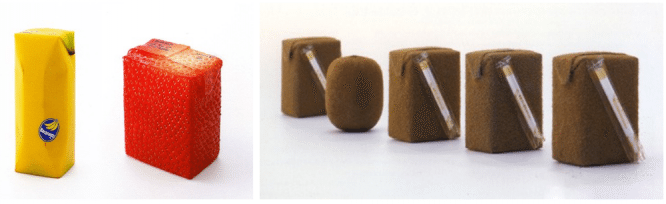
Naoto Fukasawa
Juice packaging design “JUICEPEEL”.
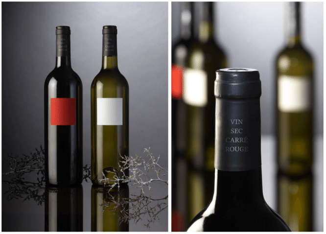
Peter Banks (DesignDepot)
Wine label design “OVG”.
The story is about the fact that in fact almost no one understands wine, but simply chooses either white or red. I like this work separately, because I myself somehow came up with exactly this idea, and then I found out that it had already been done. OK, great.
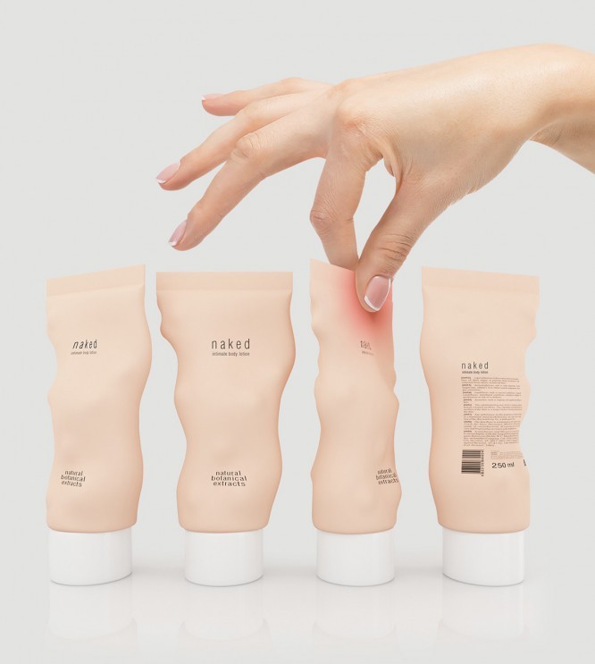
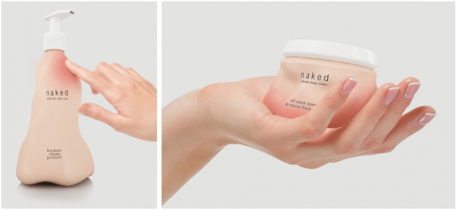
Stas Neretin
The concept of packaging for intimate hygiene products “Naked”.
“As soon as you take it in your hands, a shy blush will appear in the places where you touch it. This playful effect is achieved by covering the packaging with a special thermochromic paint that reacts to the warmth of the hands. Be gentle with this packaging, it is very shy. “
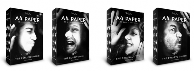
Studio kluif
Blonde Poulain Paper Packaging – A4 Paper.
The work received a platinum award at the Pentawards 2014, and this, by the way, is the authors themselves.
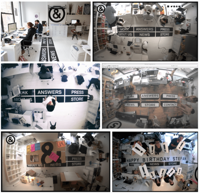
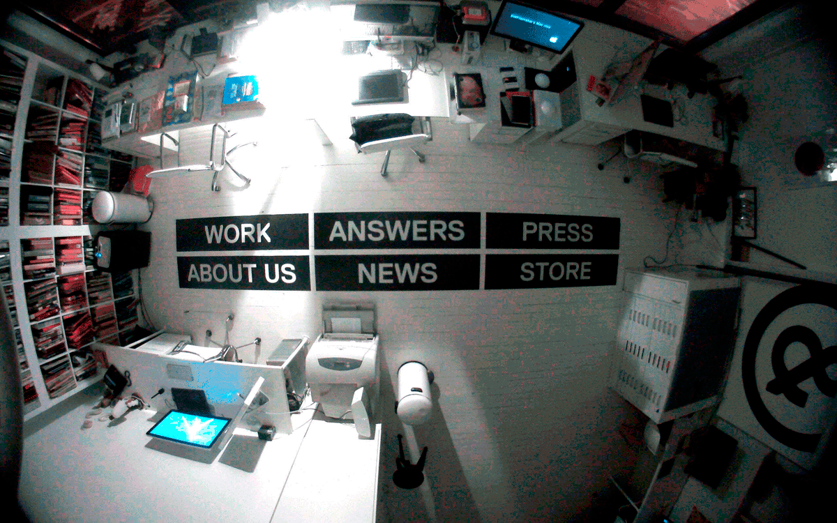
Sagmeister & Walsh
Own studio site – sagmeisterwalsh.com.
The rock star of graphic design Stefan Sagmeister did not bother to dive into the world of web design trends, but made stickers with the names of the site sections on the floor of his studio office in New York, and fixed a camera on the ceiling that broadcasts what is happening around the clock.
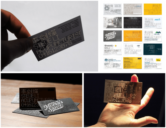
Re
“STEVE LI, ACUPUNCTURIST”.
The search for clients with an acupuncturist (who treats with needles) is based on recommendations. The identity that took the bronze Cannes Lion in 2013 turns the acupunturist’s clients’ business cards into his own.
Author: Vladimir Ayuev
…

