

Why Sometimes Bad Design Works
Why Sometimes Bad Design Works
Every designer strives to create the perfect interface: convenient, understandable, inconspicuous. In this understanding, the ideal interface is its absence. The less the user interacts with the interface, the fewer mistakes are made.
When guided by this principle, the interface is minimized: they reduce interaction time, reduce unnecessary clicks, remove the need to fill in data. But sometimes it doesn’t benefit in the long run.
From this point of view, the interface looks neat, reducing the number of clicks to interact with it.
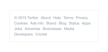 Twitter displays links in the footer with a list of similar elements to jump to any section in one click. But it would be more useful to split the links into groups and make them look different from the main text.
But if the user does not understand what to expect from the interface, then accuracy will not be beneficial. If the lack of an interface leads to even greater errors in understanding, then you cannot reduce clicks and actions – otherwise, the product’s performance will be lost.
Workability of the product
Sometimes, with interface improvements, the product performs worse, so abandoning the interface will harm the product. You can order goods in the online store without registration, but this interface helps the store to remember the person, and the buyer – to order goods in the future. In this case, without a mechanism for recognizing users, the product is no longer as good.
A product won’t survive if its interface isn’t pragmatic. It makes no sense to make part of the interface user-friendly at the expense of the service. Fortunately, what is beneficial to the user is often beneficial to the product. The benefits of a good interface directly and indirectly affect the viability of the product: direct sales, customer loyalty, advertising.
Therefore, the interface must not only cope with the current needs of the user, but also take into account the future, even if at first it looks like an obstacle in the way.
To use the trial version of the product, you often have to enter your bank card details, although this seems unnecessary.
Facebook is complex, but 700 million people use it every day because they see the benefits. Amazon’s site looks imperfect, but it is the largest online store in the world. Visitors have come to terms with this because they are motivated to use it.
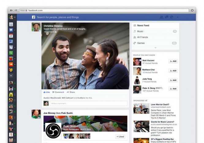 Facebook once changed the feed interface to a simplified one, but this did not benefit the product, and the updates were canceled.
User motivation
In an ideal world, the interface should instantly satisfy the user’s needs. But in fact, often a person himself may not know what he wants. He has needs that the product satisfies, but at a particular second there may be no motivation to use the product.
Then the interface motivates to use the product: it shows additional products to those in the basket; asks for an email address to send a discount coupon or account details to renew services automatically.
Dark patterns
Product performance and user motivation have nothing to do with dark patterns. Dark patterns are used when the interface is deliberately made bad and confusing to deceive users. They coerce the user to act against their own interests, hide important details, impose services or mislead.
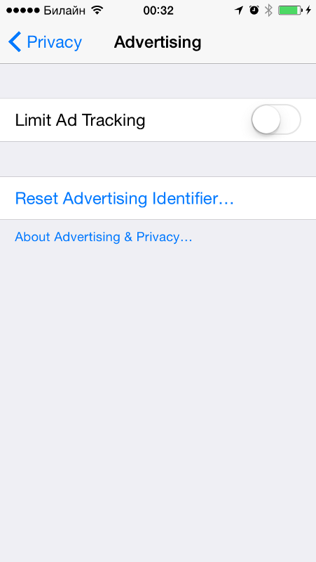 A classic example of a dark pattern: the double negation of “enable tracking limitation” is confusing. In the off position, user tracking is enabled.
See darkpatterns.org for a large collection of patterns.
The meaning of a useful interface is in the balance between user friendliness and product usefulness. In each case, the usefulness of the interface depends on the context – sometimes it is better not to have it. Sometimes, on the contrary, you shouldn’t throw out unnecessary things from the interface. If the interface meets the user’s expectations, then the number of clicks and interaction time does not affect the feel of the interface.
Source: river-city
…
