What you need to know about typography in email
What you need to know about typography in email
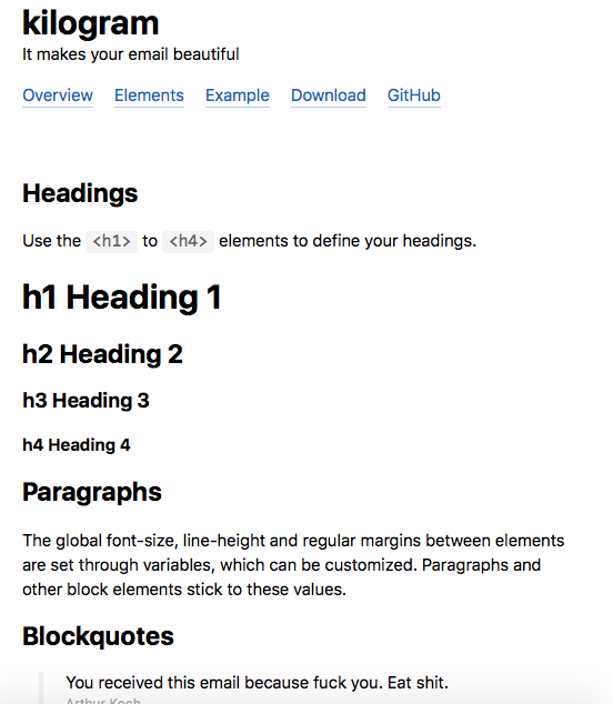
Arthur Koch, a creator and typesetter for emails, spoke on a blog on Medium about why typography in email newsletters is so important and should never be forgotten.
At the moment I am working on a completely new version of my wonderful framework for typesetting letters and typography is a very important aspect. I’ll tell you about the main points.

Plain / text
There is a widespread belief among the tech-savvy population that html emails are to die for. But this opinion has several disadvantages:
- We cannot limit the line width for a more comfortable reading of the letter.
- We cannot use social media icons and photographs that facilitate communication with the reader.
- We cannot send marketing bullshit
Limiting line length while maintaining responsiveness without media queries
... |
Fonts
Each platform (from which the letter is viewed) has its own default fonts, which is not always convenient and appropriate:
- Windows: Times
- Windows Phone: Segoe
- iOS and OSX: Helvetica on older versions, San francisco on new
- Android: Roboto
Leaving this set native is not very practical, since the Times gets out of the ordinary by the presence of serifs. Therefore, as a standard solution, usually the family is chosen Arial, Helvetica, sans-serif; But this option is rather stupid, since Arial is present on all platforms, and Helvetica is not present on Windows at all. Therefore, we will not get Helvetica anywhere.
I suggest using a more interesting option:
font-family: '-apple-system', 'roboto', Helvetica, Arial, sans-serif;
As a result, we get conditional nativeness without the disgusting Times.
Formatting
Text formatting should be set for block elements of headings, paragraphs, lists, and table cells. You can format inline elements, but you should avoid it, since some antediluvian clients work this moment poorly.
When specifying formatting, it is important to specify the maximum number of styles for elements in order to avoid native surprises.
Headers:
h1,
h2,
h3,
h4,
h5,
h6 {
    font-family: '-apple-system', 'roboto', Helvetica, Arial, sans-serif;
    display: block;
    font-weight: bold;
    Margin: 1em 0;
    text-align: left;
}
h1 {
    font-size: 24px;
    line-height: 27px;
}
Blockiness is set for this because, for example, in the light version of gmail, headers are inline. Margin is capitalized to bypass the “cut” of this property in some versions of Outlook.
All of the above also applies to paragraphs of text.
Links
The link looks like this:
Click Me
This design protects links from being painted in the native colors of email clients.
Inscriptions
It is preferable to indicate text styles with short html tags like , , while describing these faces inline using CSS
Bold Text Italic TextDeleted Text
On modern platforms and email clients, the font-weight can be varied from 100 to 900 if the font allows it. For older platforms, it is recommended to leave the fallback:
font-family: '-apple-system', 'roboto', Helvetica, Arial, sans-serif;
font-weight: normal;
font-weight: 300;
Lists
We can use standard bulleted lists in letters with only one limitation. No need to try to format or hide bullets. It won’t work half the time. If it is necessary to make colorful lists, they need to be imitated with a complex transparent table.
Alignment
You can align block elements in the following ways:
Centered Text
Centered Text
Centered Text
Centered Text
Centered Text
Centered Text
And inline and tabular like this:
Centered Text
....
Right alignment is generally undesirable for the simple reason that it doesn’t fit in responsive emails. The problem will have to be solved by media queries. And to typeset letters on media queries is amateurishness.
There is only one pertinent example of the use of right alignment – tabular data:
| Black Dildo | 80 USD |
Block model
There is a legend that letters need to be typeset exclusively with tables, but this is not the case. One has only to follow a number of rules:
- Formatting for block elements and table cells
- Vertical Margin (capitalized) for block elements
- padding for table cells only
- All styles are inline
Questions?
Let me know if you have any questions, I will answer without problems. And with a large number of them, I will be happy to write an FAQ.
Source: medium.com
…


