
What to write in mobile onboarding
A bit of species theory
Onboarding is getting to know a product or feature. For instance, the best web hosting services offer users a wizard or self-guided tour of their features. It appears in two cases: when a person opens the application for the first time and if something has changed and needs to be told about it.
The task of onboarding is for a person to understand everything about a product and start using it. There are four types of onboarding. Now we will deal with them.
Instructions
Onboarding explains how to use the app and what awaits inside.

The app tells you how to order and receive food.
Onboarding shows what will happen if you start using the application.
Steep an option when the text is not really needed. Focus on 360˚ photos: what they brought in the boxes, what the food looks like and how much fun it is to cook as a family.
In my experience, if there is a chance to make an interactive one, you need to do it. It’s more engaging than stock illustrations and captions.
Personalization
In onboarding, they ask what problem a person has come with and how it is convenient for him to solve it. Then the application configures the desired tariff or profile.
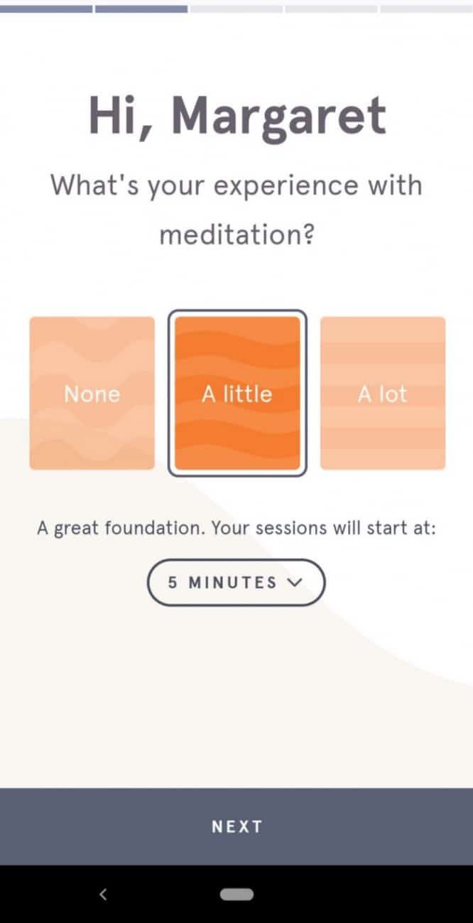
The meditation app asks why and how much Margaret wants to meditate. At the end, he shows the lesson plan and sets a reminder at the right time. Very comfortable and humane.
This often happens. And it often leads to screen clutter and poor UX. Here is an example that has collected all the mistakes ↴
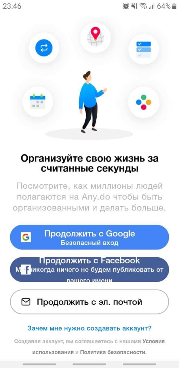
It seems that marketers intervened in onboarding and asked to put all possible fields for data collection: mail, google, facebook.
At the same time, the text in onboarding is still needed. So they wrote common phrases that do not say what awaits the user in the application.
I will not talk about the fact that the text does not fit the buttons and there are three more links on the screen (why?). It can be seen as it is, and it’s terrible.
Elements on the screen create a sense of clutter and do not help onboarding.
Standard – picture, text, progress bar and a button to register. This is easier to do and works for almost all scenarios.
But, you can do it differently: video, GIF or bot.
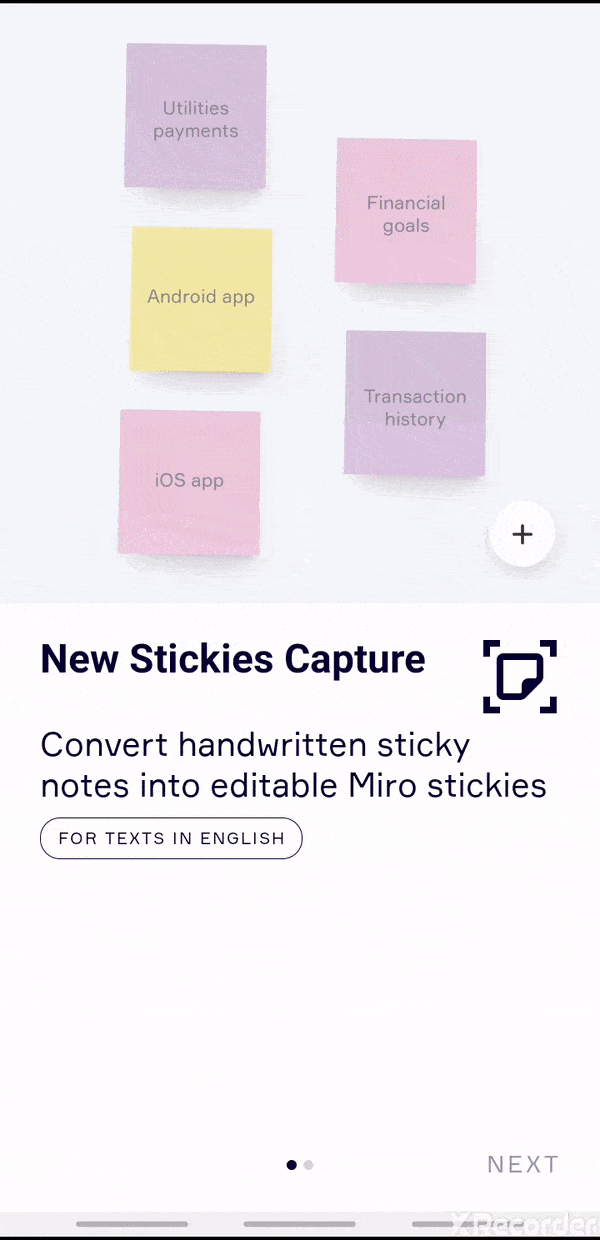
Before you get to the board, the guys show gifs with new features. It is immediately clear how to find and use them.
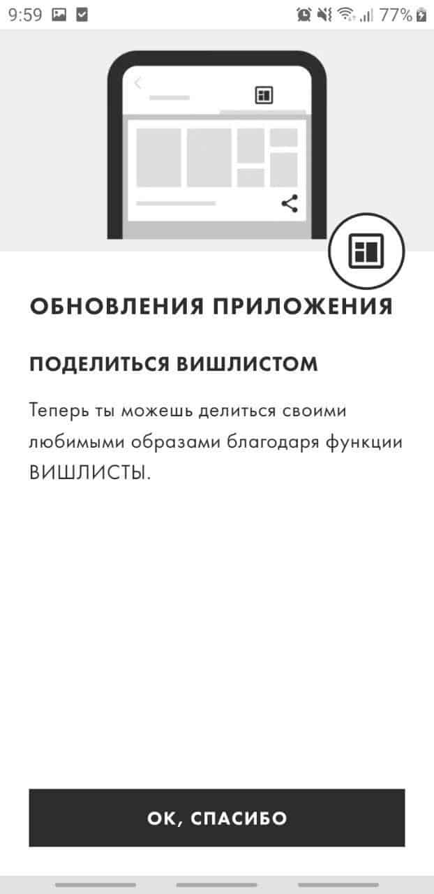
When you open the app, it informs you about updates. The text, of course, is not the best here, but thanks to the pictures everything is clear: you have a wishlist, now you can share it via a link.
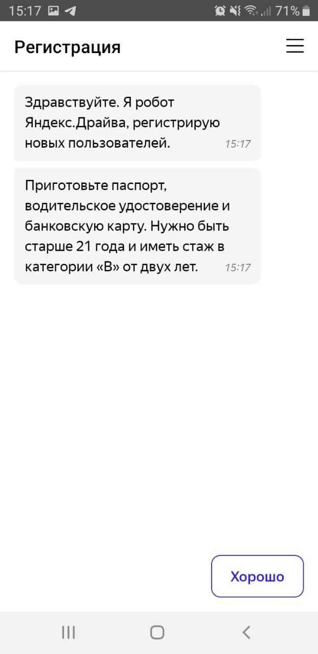
Drive onboard (and register at the same time) using a bot
True, there is only one answer and you cannot add your own. And you won’t be able to skip onboarding either – this is the condition of the service.
First you need to decide on the priorities: when we show a message, for everyone or only for some groups.
Exemplary designers and writers can even put together a priority chart. In it, write scripts when a person sees a message, what will be written there and how it will look.
Usually, onboarding about new features in an application is a popover: a message on top of the main screen. It does not cover the entire work surface and is convenient to hide.
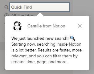
For example, Notion talked about a new search. And a day later, in the same corner of the screen, there was a new onboarding – about how they store updates.
In my opinion, Notion did the right thing: they gave information in portions. This makes it easier to remember what has changed and where. And there is no desire to flip through the messages to get to the product.
Here’s a bad example of onboarding. They show two features at once, a lot of text, it is not clear where to look.
Onboarding can be anything: illustrations, text, GIF or chatbot. There are no clear rules for the text either (?). It all depends on business objectives and tone of voice.
The main thing is to show how the application works and what is the use of it.
When communicating new features within apps, think about priorities: when, to whom, and under what conditions to show them.
Source: Ira Motorina

