
What logos will look like in 2017: 14 major trends
What logos will look like in 2017: 14 major trends
The experts of the Logaster.ru service made a prediction about what trends will be popular in logo design in 2017.
Logo design undergoes endless changes and is heavily influenced by fashion trends. After analyzing the trends of the outgoing year, the Logaster experts made their conclusions as to what the popular trends in the field of logo design could be in 2017.
Simpler doesn’t mean worse (Minimalism)
In 2016, the desire for minimalism was more clearly observed in many well-known companies than ever. The absence of effects or the minimum number of them, simplification of the form, the correct placement of accents – such a simplification of the logo “refreshes” the logo and increases its usability on various platforms.

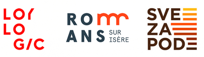
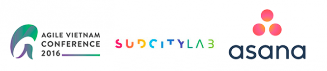
We will build a logo from letters (Letter stacking)
This trend emerged in 2016, and due to its novelty, it is unlikely to cease to be popular in the next couple of years. An original visual composition created by vertical or horizontal placement of the inscription is an excellent opportunity to place a rather long phrase or phrase on the icon. The block layout and additional graphic elements that are acceptable for use slow down the reading of the text and, accordingly, increase its memorability for the company’s clients.
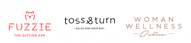
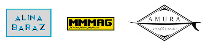
Classic text is always in fashion (Text logos)
And this is really so, because one of the oldest trends still holds its position, thanks to which more and more interesting and memorable logos appear every year. Of course, minor changes are inevitable: in 2016, designers experimented a lot with fonts, styling, kerning, and simple effects. This trend is likely to continue next year.
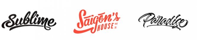
Sophistication for Connoisseurs (Lettering)
Lettering is not appropriate for all logos. But when developing an identity for establishments such as cafes, restaurants and hotels, this trend is among the leaders in popularity and efficiency. This sophisticated and sophisticated style is a kind of classic, so it will remain popular in 2017.
Why complicate things if you don’t have to (Flat)
This style is similar to minimalism, but at the same time provides more room for imagination. The main condition is no congestion from 3D images with various textures, gradients and patterns. Flat design is clear, simple and neat graphic compositions that make the viewer feel comfortable, simple and understandable. Keeping pace with minimalism, Flat will also be relevant in 2017.
Risky But Effective (Gradient)
Despite the growing popularity of simple and concise trends, the use of a gradient is still practiced by some large companies. In 2016, interest in this trend increased due to the influence of Apple (https://designshack.net/articles/graphics/is-the-gradient-making-a-comeback/). Nevertheless, even in the gradient, a riot of colors of all colors of the rainbow was replaced by more muted and restrained tones, as well as palettes from material and flat design.
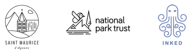
Line art
Another offshoot of minimalism is Line art. The logos created within its framework are a graphic or text-graphic composition, in whole or in part, created using a continuous line of a certain color, usually dark. Many people fell in love with such simple illustrations in 2016 and, quite expectedly, will remain popular in the near future.
Stenciled Typography
Stencil typography both looks attractive and gives you a lot of freedom to choose the design that’s right for your company. Such a logo is well remembered due to a clear visual hierarchy, so the style will certainly be in demand next year.
Maximum contrast (Black and white logos)
In the not too distant past, designers have experimented quite boldly with palettes, but 2016 has shown that an elegant combination of black and white is a classic win-win for a well-designed logo composition. And despite the color restriction, this trend will remain popular due to the actual freedom of design thought regarding the form and content of the logo.
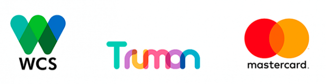
Overlapping colors – another gradient transformation (Overlapping Gradients)
This gradient-related trend emerged in 2015-2016, and it is highly likely that it will take one of the leading positions in the coming year. Until recently, a design trick of overlaying colors and the resulting gradient was used to create animal logos. But, as the experience of Mastercard demonstrates, this style is very suitable for large reputable companies, provided that the composition of the logo is carefully compiled and the emphasis is shifted towards inscriptions or geometric shapes.
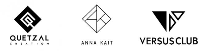
Geometric figures
Since we are talking about geometric shapes, we cannot but pay attention to the appropriate style, which has been in demand in design for more than a dozen years. Compositions made using simple geometric shapes will remain in trend, and the good old black and white colors will most likely remain popular.
Framed text
If you take a simple geometric shape and put text in it, then such a simple technique can be much more successful in attracting the attention of potential customers. This style is convenient because, in addition to the text and the frame itself, reasonable use of additional decorative elements is permissible.
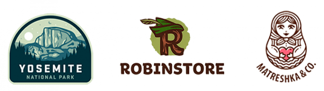
Handmade logo
Logos whose composition mimics a hand-drawn design will always be on trend, and 2017 will be no exception. Various styling options (grunge, vintage, etc.) allow you to achieve uniqueness and originality that will increase brand awareness as a whole.
Negative space
It’s no secret that those logos that contain a graphic rebus are best remembered. You look at the logo and see one image or an inscription, but if you take a closer look, note individual details (or take a look at the entire composition) – and you are surprised to notice that the logo is not so simple and primitive. This is exactly the case when explaining is more difficult than just showing. There are not so many successful logos in this style, but each of them is a small rebus, ready to reveal itself to the interested viewer. Obviously, there will always be people who like to solve the riddles in the identity, so if you have ideas for a really interesting logo in the style of negative space, there will be those who will appreciate it.
Given the fact that everything described above is just speculation based on 2016 trends, next year may bring some pleasant surprises in the form of new trends and styles. So don’t be afraid to create and invent, what if your logo will become the basis for a new trend?
Cover photo and article: ShutterStock
Source: logaster.ru
…

