
What is important to focus on in design
What is important to focus on in design
Let us tell you a secret: there is a foundation in the world of design as well.
To be strong, you need a solid idea and a clear understanding of what to concentrate on. Do you know these focal points? If not, our article will be useful to you.

Key features
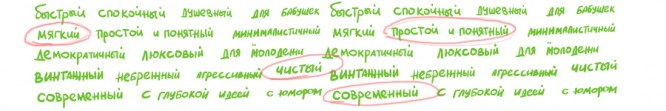
Any brand can be described by key characteristics.
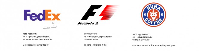
Coca-Cola is a family-friendly, cozy, about warm relationships, love and friendship.
“Pepsi” – youth, about parties and concerts.
Each company has these keywords, the main thing is to take a closer look. What can a company tell about itself through a logo?
If the characteristics are misrepresented through the design, it is much more difficult for the consumer to find your brand and relate to them. So, a potential client may pass by, thinking that “They are clearly not for me,” although your proposal suited him.
Therefore, first of all, make your list of key brand characteristics.
How should your consumer feel?
If the characteristics are misrepresented through the design, it is much more difficult for the consumer to find your brand and relate to them. So, a potential client may pass by, thinking that “They are clearly not for me,” although your proposal suited him.
Therefore, first of all, make up your list of key brand characteristics.
How should your consumer feel?
Logo is the head of everything
The foundation is ready, the characteristics are determined. It’s time to start building. Why is the logo the cornerstone of this idea? By itself, he does not sell anything. And this is important to understand. But, however, remember that after the logo, you will need to create a whole package of elements. To make it easier, the logo needs to be developed. such that it is easy to compose all other terms from it: pattern (corporate seamless pattern), visual concept, etc.
This is not possible with any logo. Let’s take a couple of projects as an example.
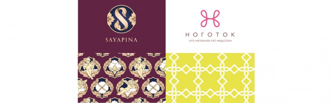
Pair of “Sayapina” logo pattern:
- much more detailed. Details = time;
- there are no elements in the pattern, just duplicated from the logo. Each element of the pattern was drawn separately, especially for it;
- The logo emblem cannot be divided into parts and you cannot get details from which you can make a pattern by simply rearranging them in places.
Pair of logo-pattern “Marigold”:
- few details;
- the loops are directly borrowed into the pattern from the logo;
- a pattern with a simple grid (pattern construction scheme). Dividing the emblem into pieces gave us half of the pattern.
In terms of time costs, these pairs are very different. And do not be so simple for “Marigold” in form we can’t get the logo out of it by rearranging the pattern.
To buy time on the pattern, we need to develop and agree on a logo that:
- simple in form;
- has a small amount of detail;
- symmetrical or has a special characteristic element (loops at the letter “H”);
- easily and beautifully divided into parts.
That’s why the logo in this story is the head.
This is not to say that fewer details are obviously better or worse. It all depends on the goals and values of the company (which we defined above). For example, if you are selling Baroque antiques, modern simplicity and cleanliness are unlikely to appear in your key characteristics (although, who knows?), But if you are dealing with cosmetics, delivery, modern housing or paint materials, cleanliness and simplicity will be just that. that people will easily relate to you.
The recipe for the pattern: take a logo that is simple in shape, divide it into parts, and beautifully connect them together.
Descriptor (signature under the logo)
The descriptor is important.
Why:
- it appears in almost all layouts;
- it helps convey value.
You can write “Wine shop”, or you can write “Wine boutique”. Both tell us that before us is the place of sale of an alcoholic drink, with a strength of 9 to 22%. But the “Store” says only about this, and we immediately become on a par with all the Okey-Pyaterochka-Magnets (where is it easier for the buyer to go). But the “Boutique” conveys the idea of the price range, status, about WHY I should go there after a working day, and not walk to the next house. Profit? Profit.
You can do without this, but if there is an opportunity to think, do NOT broadcast the benefit unnecessarily, why not use it?
Recipe for a descriptor: make it useful. Think of the key characteristics of your brand and add one of them to your line of business.
Visual concept
The logo, pattern and descriptor are good. There is one more important element left.
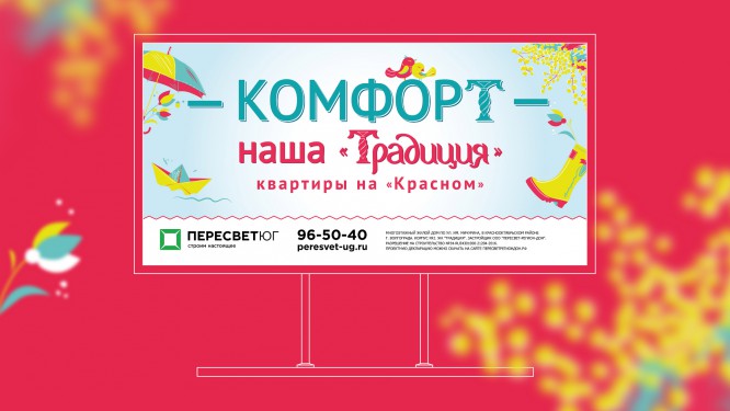
You may not need outdoor advertising in the future, but sampleHow to work with the created elements (logo and pattern) is needed right away.
Why: if you initially create a real layout, it will set a template for working with elements. Over time, all new layouts will continue to be made according to his template. If this template is not specified, the emphasis in the design (key characteristics) may shift. What happens when a house is built by 33 architects in turn? That’s the same.
It’s especially nice to find an idea so that even without a logo, people can easily recognize you.
Advertising without logo branding has been proven to have a greater impact. Because it muffles the vigilance of the consumer, his “filtering” of advertising noise. For example, you can create a logo in which the emblem (we have a carved letter T) is included in the text part.

This opens up some very interesting possibilities. A carved letter from the logo, then you can insert it into words instead of the usual one, and even without the logo, you get a recognizable message. At the same time, space is saved, and the inscriptions grow. We get a double benefit 🙂
results
Let’s summarize. At the end of the work, we should get:
- a list of key characteristics of the company (this is our magic wand, Ariadne’s thread. Each developed element must correspond to this list);
- logo;
- useful descriptor;
- visual concept (prototype for further design of printing and outdoor).
Strength: Integrity of the elements.
Everything was done at once, so everything is permeated with a common thought.
The key characteristics were dictated to us by the logo and descriptor. And the logo itself, in turn, formed the basis of the pattern.
findings
Quantity is not everything, the value determines the correct choice of elements and their consistency…
When each element logically follows from the previous one, we get a harmonious, coherent idea and a solid basis for further work.
Source: wearegeek.ru
…

