
Visibility in tables
Visibility in tables
Visibility is a typesetting property that helps the user to grasp the essence without reading the text or reading to a minimum. He looked – and everything is clear: what is at stake, what is most important, in what order to look, what is the conclusion from this.
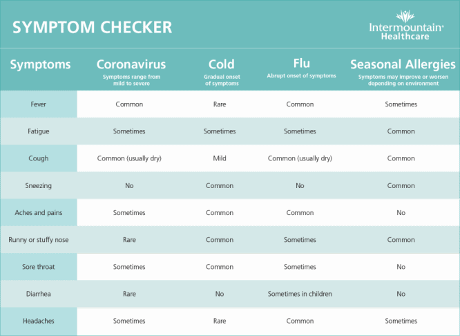
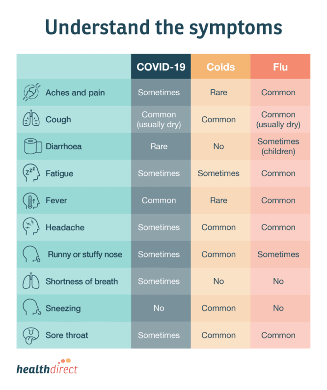
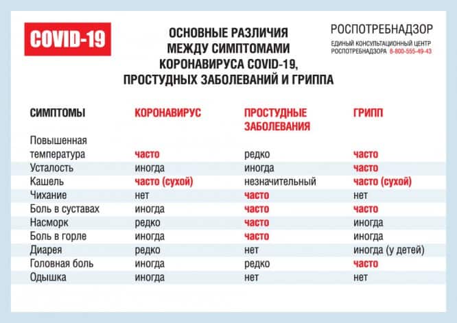
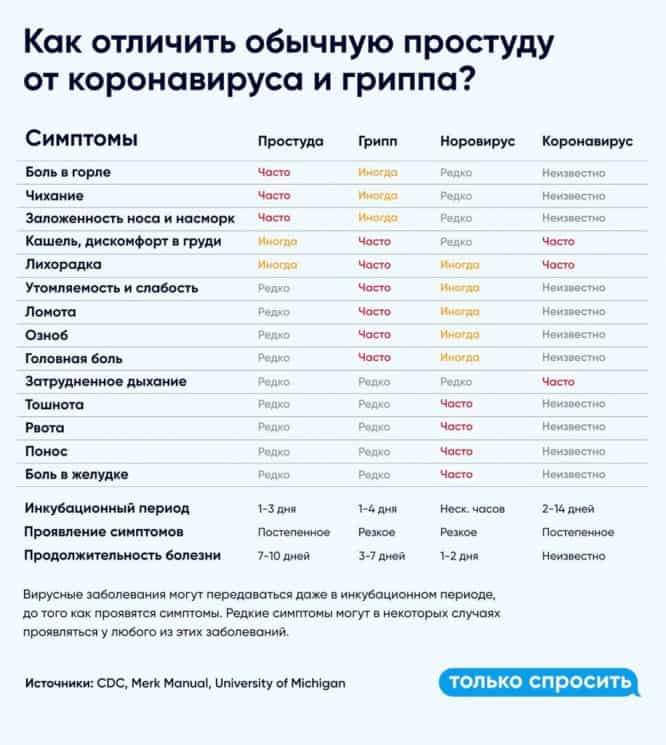
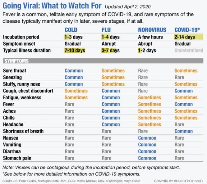
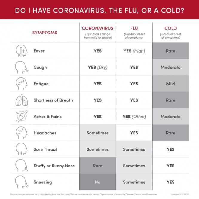
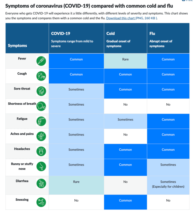
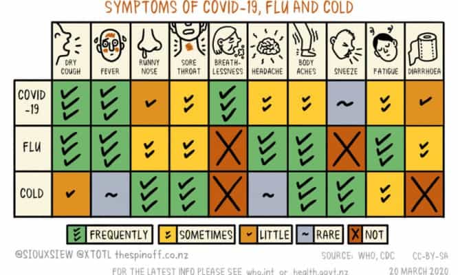
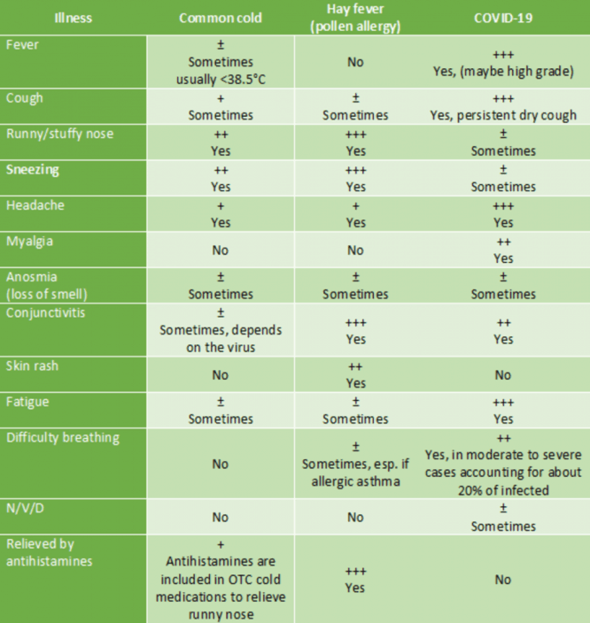
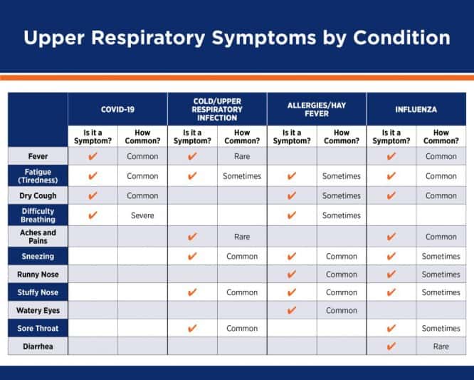
I will talk about clarity using the example of tables. Now on the Internet you can find a huge number of tables that compare the symptoms of coronavirus, flu, colds and allergies.
These tables are addressed to a very wide audience, so designers try to make them as clear and intuitive as possible. Most often, icons, illustrations, color and legend are used. In some cases, these techniques really help to quickly understand the data and grasp the essence, in others – they only add noise and distract from information.
Let’s see how it works.
1. Icons
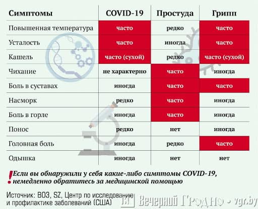
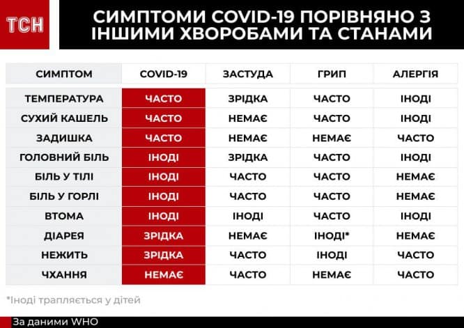
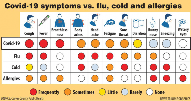
Many tables are full of icons, most often used to illustrate symptoms.
Problem number one: the icons are difficult to distinguish from each other, most of the head is depicted:

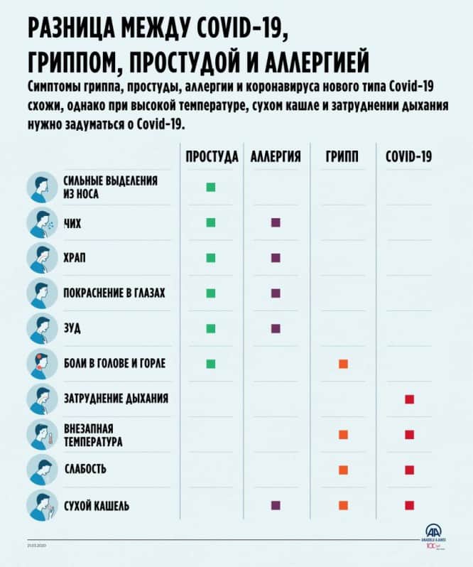
There are generally ten identical heads, and the differences, that is, the symptoms themselves, are hidden in small details:
The same, only in a different style:
Problem number two: deciphering an unfamiliar pictogram is more difficult than reading a word or two. Try it yourself:
 Answer at the end of the article
It turns out that icons do not simplify or speed up the perception of the table in any way, so they are simply not needed here.
2. Background illustrations
The pictures in the background are descriptive only in the sense that they can suggest the subject of the message. Seeing the table from afar, you will most likely guess that it is about the coronavirus, or at least something medical. At the same time, the image does not illustrate specific data: the same image can be placed on other tables dedicated to infections. Therefore, before us is not an informative, but a decorative illustration:
Often, pictures are simply used to cover free spaces on the layout, a classic of amateur layout:
3. Color
It’s one thing to colorize the layout “for beauty,” and it’s another to color-code it to help the reader figure it out.
Step one: determine which element or element property to color code. Below are bad examples:
The coronavirus column is highlighted in color, but it is not difficult to find it anyway:
Each column is highlighted in color:
Each symptom is highlighted in color:
Every second line is highlighted in color. It may seem that the symptoms on the plaques are somewhat different from the symptoms without the plaques. Spreading often leads to the following distortion of meaning:
Everything is highlighted in color:
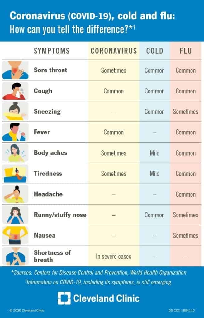
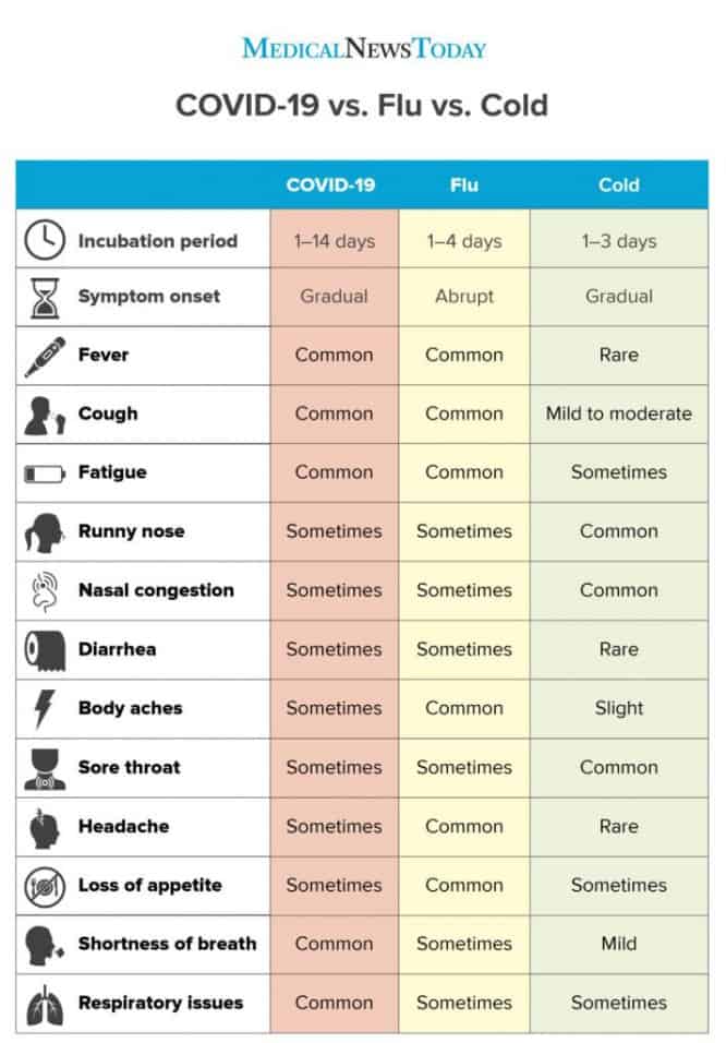
It is much more useful to indicate the frequency of a symptom with a color. This is a key property and is invisible on a cursory glance: words often, sometimes, rarely outwardly similar to each other.
The two accent colors work well too. Please note that the word itself is filled in, not the entire cell – this is quite enough:
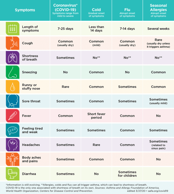
Step two: choose the right color scheme. Here orange Sometimes the first to catch the eye, although blue is more important in meaning Common:
At first it seems that the darker the cell, the more common the symptom, in fact, the opposite is true:
Step three: don’t overdo it. If you fill in all the cells, the selection efficiency drops dramatically:

In the next example, cells of the same color begin to form a pattern, but there is no point in this pattern. Like striping, random links distort the data structure:
4. Symbols
In some tables, instead of words often, sometimes, rarely there are symbols. Designers love to do this: come up with a clever cipher, and write a hint below in small text:

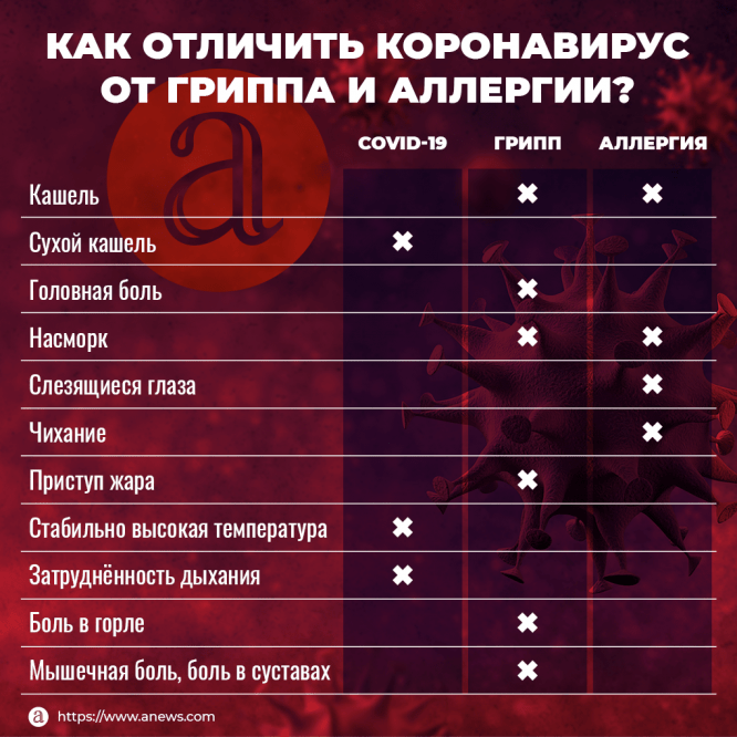
The following layout looks very cute, but confuses the reader. There is a complex system of checkmarks and crosses, and non-obvious color coding. The case when an illustrator shouldn’t be trusted with a design task:
Less confusing, but still awkward:
Simple symbols work better than complex ones, but worse than text:

Icons along with words are overkill:
Another useless duplication:
Answer at the end of the article
This is what the icon author had in mind:

Source: Awdee
…

