Top 25 web design trends of 2017
Top 25 web design trends of 2017
Most of the trends wander from year to year and have already become an integral part of modern website building. This is especially due to the development of mobile technologies, communication channels and the improvement of devices.
For example, such a trend as website mobility has become mandatory. The commercialization of the Internet also dictates its tough terms to designers and web developers. At the same time, some of the trends are weakening and becoming less popular, but still remain quite active. Fashionable hobbies characteristic of a short period also appear. For example, last year these were icons with a long shadow of the depicted objects.
Geometric patterns have become popular this year, we will also look at them. So let’s go in order.
1. Mobile, responsive design
Today, perhaps the most important and mandatory trend. The site should look equally good on all resolutions of monitors, laptops, screens of mobile smartphones and tablets. Search engines, by the way, very closely monitor how well the site is adapted to various devices, and based on this determine the place in the search results.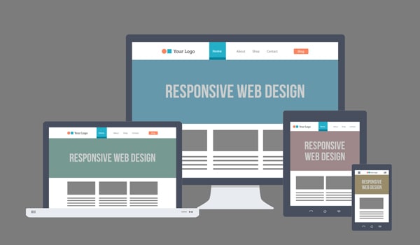
2. Active typography
For several years now, one of the most popular trends. Large fonts and typography on a website are two things. Firstly, aesthetic – beautiful lines, curves and lettering are in themselves an adornment and decorative element. And secondly, this is functionality – with the help of a large font, you can clearly and emphatically convey the main idea to the visitor.
3. Widescreen video
The full-screen video on the background of the site undoubtedly grabs our attention immediately. This is a good trick to keep the visitor interested. The modern development of technology makes it easy to embed videos on the site, which means that designers will increasingly use this technique. However, there is one nuance, it is interesting to watch the video only the first time, the second and third time it is already boring. Therefore, this technique is only effective for new visitors.
4. Large photography
The big picture on the background of the site remains the most popular and demanded trend in web design. It always looks impressive and impressive. And the originality of the photo allows you to make the site memorable and stand out among others. Examples of using large pictures and widescreen videos on the background can be found in the Top 15 Most Original Sites for December 2016 by DesigNonstop
5. Cinemography
A good alternative to widescreen video and large background photography. Cinemagraphs are photographs in which minor repetitive movements occur. Usually they are presented in gif format and give the viewer the illusion of watching the video. For more information on cinemagraphs, with lots of examples, check out The Fascinating Cinemagraph Movement by Kevin Burg and Jamie Beck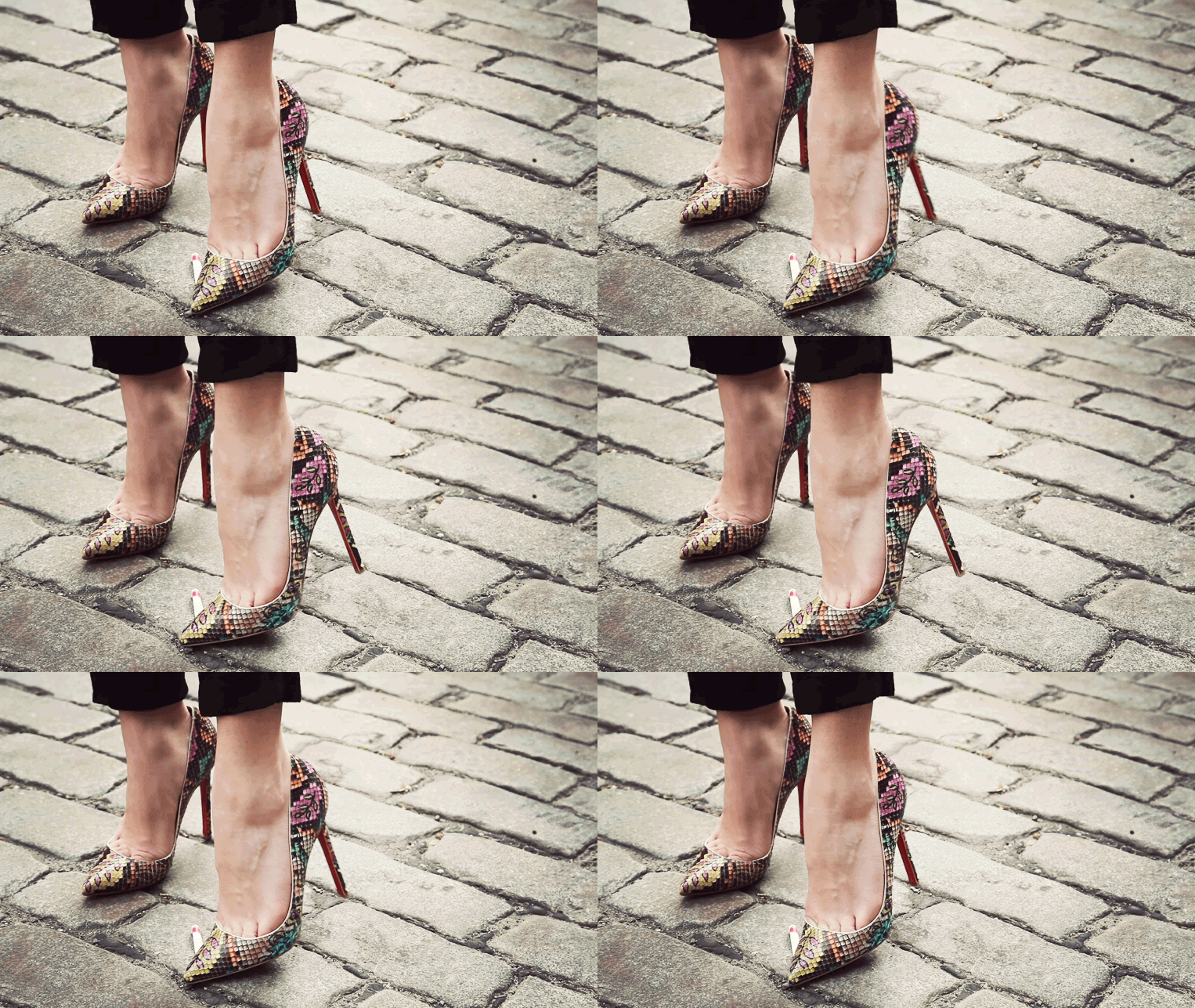
6. Flat design
Another powerful trend in recent years. Flat color websites are neat and clear. But, recently, a new kind of flat design has appeared – Semi flat. This is when the entire design is done in flat color, and only one element has a shadow, gradient or texture. Typically, this element is a button, which is given volume or bulge to attract the attention of visitors.
7. Microinteraction on the site
Nowadays a lot of attention in web design is paid to microinteraction of functionality and design of a website with a visitor. The essence of which is that the visitor can clearly see the result of his action on the site, whether it is adjusting user settings, clicking on a link, confirming an operation, interacting with active icons, buttons, switches, counters and other elements.
8. Animating objects
The capabilities of modern html5 and css3 allow you to use a large arsenal of visual effects on the site. This makes interaction with the page more interesting and exciting for the visitor. So in the new year we will also see the most unexpected interactive micro-movements of objects, as a rule, reacting to the movement of the mouse. Perhaps we will see examples of more complex animation.
9. Vivid color schemes
Popular trendy colors of 2017 favor brightness and saturation. Interesting original shades of scarlet, mustard, yellow, emerald, deep blue, as well as red, lilac and chocolate colors will help your site stand out and acquire its own unique style.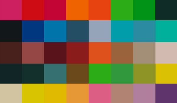
10. Scrolling the site
Since site scrolling is ideal for mobile devices, its presence will be significant in 2017. The only thing is that scrolling does not leave room for user interaction, and therefore, one feels a certain fatigue from endlessly loading content. Perhaps the trend will turn towards a combination of simple controls with scrolling.
11. Parallax effect
Parallax is the change in the apparent position of an object relative to a distant background. In web design, this effect is used when scrolling a site, when objects and the background scroll at different speeds, resulting in the illusion of three-dimensionality. The trend is fairly stable, so we will see parallax sites more than once.
12. Modular design
The modular design, or card interface, consisting of self-contained blocks of meaning has been popular a while ago. This trend is very good for mobile devices as the blocks line up well for any screen resolution. But on large sites, they look pretty much the same and are difficult to hierarchy and structure.
13. One-pages
One-page websites, landing pages, landing pages have become an integral part of the modern Internet. You can read more about what a landing page is in the article 20 characteristic features of a modern landing page with examples and Modern Landing Page: history, trends, development prospects. In 2017, landing pages will have an increased emphasis on the button that calls to action – order, call, sign up, etc. Anything else that distracts the attention of a potential visitor will be cut off.
14. Graphic advertising
I would also like to note one thing that I remember last year, and most likely the trend will continue in 2017. In connection with the commercialization of the Russian Internet and the growth of online commerce, the demand for graphic promotional materials for advertising and promotion has significantly increased – banners, teasers, cards, flyers.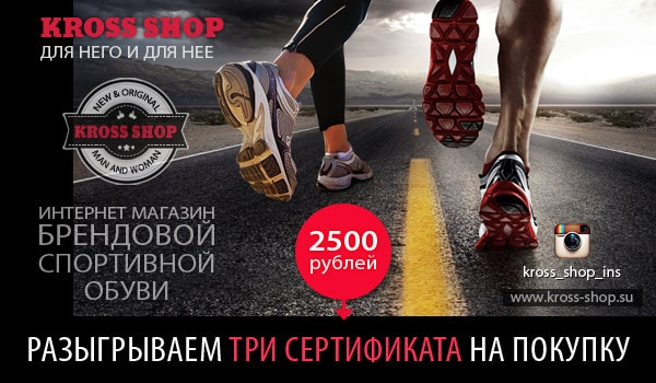
15. Automation of typical processes
All standard solutions and procedures on the site are gradually being replaced by automated processes, which eliminates the need to communicate with the support service or online consultants. In this regard, the popularity of various applications and extensions is growing. Now you can buy a product or service, make an order, make an appointment, book a seat, transfer money, fill out a questionnaire or take a test – all this can be done online with a few mouse clicks.
16. Infographics
Graphical presentation in the form of infographics is still popular and in demand. Accompanying the text with a beautiful picture or icon, combined with stylish design elements, make infographics aesthetically attractive. Comparative infographics are especially visually visual and interesting – like it was-now, yes-no, pluses-minuses, it is possible-not, etc. You can also use infographics to tell a step-by-step story or present boring statistics vividly.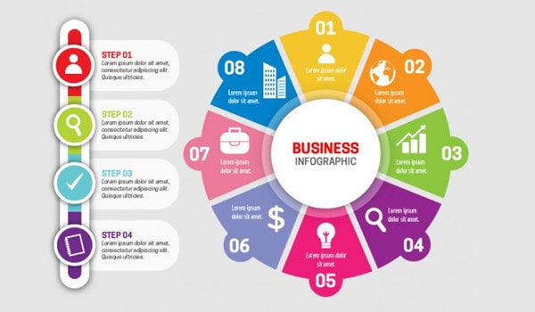
17. Hamburger menu
A hamburger menu is a visual icon made up of three horizontal stripes, usually at the top in the corner of the site, which opens or slides out from the side of the full menu. Many experts predict the fading of this trend, for the reason that most inexperienced users simply do not understand the purpose of this icon. Therefore, web designers are leaning towards simplified navigation. But, nevertheless, we will repeatedly see the hamburger menu on newly created sites.
18. Icons
Icons, as a way of presenting information and a visualization tool, have been and remain one of the most demanded and favorite trends for designers. It is enough to put the appropriate thematic icons near the blocks with the text – and now the whole text acquires logical and visual ordering and structure. So, in the coming year, we continue to actively use icons.
19. Letterstucking
Letter stacking is text in a square. In fact, this is an example of a difficult creative decision – you need to present a long text in the volume of a tiny space. At the same time, it should look beautiful and original. This year it is also fashionable.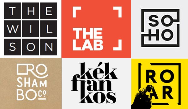
20. Blank button
Due to space and space savings on mobile devices, an empty button appeared some time ago – a large inscription with a square stroke around the word. Such a button gives an overview of the background behind the button while maintaining its functionality as a full button. Plus, as a design element, such a button looks stylish and neat.
21. Refusal from stock photos
Some experts notice that there has been a refusal of designers from stock photography. Since modern devices allow you to quickly and efficiently make a photo yourself, you can avoid stock depersonalization and unification and make your own unique photo and create your own unique design.
22. Unusual angles in the photo
The search for interesting angles in photographs has become available to any owner of a smartphone with a camera. In this regard, creativity when creating a photo is off scale and we can decorate the site with a unique picture with an unusual viewing angle or foreshortening.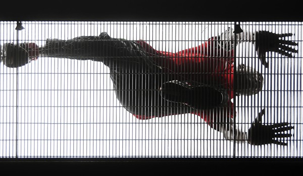
23. Carousel
The carousel slider, which entered the design life a few years ago, is still popular and relevant for website design. With the help of a wide slider, it is convenient to rotate the main news, as well as present current promotions, collections and other relevant information that the visitor sees immediately upon entering the site.
24. Self-playing audio and video
This trend is a hello from the 2000s. I remember then it was fashionable to play a sound when entering a site. Moreover, many were annoyed by this trend. I can’t say that the audio accompaniment makes me happy, but perhaps moderate use will be unobtrusive. Well, self-playing video is more a tribute to advertising, as for me. Well, plus the desire to keep the attention of the visitor in the feed. Not the nicest trend, but commercially necessary.
25. Geometric patterns
Well, we will end our review of the short-term fashion trend in the form of various geometric patterns and patterns. They became unexpectedly popular at the end of last year. Well, another way to make your website design stand out and unique.
Source: designonstop.com
…


