
4 basic laws of perception in design and infographics
4 basic laws of perception in design and infographics
The Gestalt theory is more than a hundred years old, but it does not lose its relevance and is applied in new and new areas. It is based on the theory that the gaze (and the mind) perceives an object as a coherent structure before it begins to distinguish between individual components. That is, a holistic image is not just the sum of separate parts, but an independent object.
The theory works thanks to the design of our brains, which by nature tend to create order out of chaos. Laws work in 99.9% of cases, because they are innate for every person. Knowing them is useful for a designer, because helps to organize visual objects efficiently for perception.
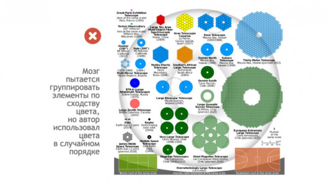
1. Similarity
You can create similarity (or contrast) in infographics using color, size, or shape.
In the process of cognition, people tend to group objects that have similar features. Moreover, this habit lies deeply at the subconscious level, tk. is one of the basic functions of the brain. Psychologist Paul Bloom says: “To survive, any creature needs to be able to learn. And part of successful learning is learning to make statistical generalizations based on limited experience. You ate an apple, the second, the third – they tasted good – and you conclude that you can eat apples, that all apples are delicious. And when you are hungry, you are looking for apples, this is adaptation, this is rational, this is expedient. “
The smallest child knows how to generalize everything that he sees around him – edible and inedible objects, his own and strangers, over time, generalization becomes more complicated to categorize people by gender, age, race, profession, etc. [1]… Moreover, objects that are outwardly similar are subconsciously attributed to similar functions (internal similarity). So, similar elements form groups, that is, two objects (people) that are somewhat similar to each other, even outside our desire, will be perceived as a group, as a common whole.

You can create similarity (or contrast) in infographics using color, size, or shape. Designers also use the same background for what they want to combine, contrasts to make the main elements stand out from the group. But good designers keep in mind that there shouldn’t be too many contrasts on one screen. it will be distracting and difficult to understand.

2. Proximity
Group only what supports the overall logic of the infographic
The subconscious mind groups elements that are close to each other. According to this principle, objects located closer in space are connected. And vice versa – objects “scattered” in space are perceived as different. This is due to the natural “laziness” of the brain, or rather the unwillingness to spend extra energy. It is easier for gray matter to process one piece of information – one visual stimulus than several (albeit small) stimuli, so it avoids cognitive overload and combines close elements with each other.
An example from the field of manipulation of consciousness – a photo of a politician is posted in a magazine or on a news site, surrounded by positive photos (nature, children, happy people) and his rating is growing, because viewers attribute positive qualities to him without realizing it [2]…
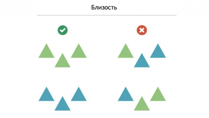
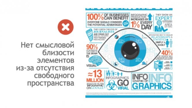
This rule is also implemented in the composition – the images must blend harmoniously into the background, leaving free space around. Related items need to be kept together and vice versa. This not only reduces the risk that the viewer will not understand the connections between the common components, but also forces the brain to compare, look for similarities and connections between the objects the author needs. The main thing for the designer is to correlate the action of this pattern with the priorities of information on each separate infographic screen, that is, to group only those that support the general logic of the infographic.


3. Simplicity
And cut off everything that complicates the composition and distracts from the contemplation of harmony
The brain perceives and analyzes unusual or complex images using the simplest and most even shapes possible. Psychologists say that most people consider the average person the most attractive. That’s right – we naturally love faces that do not contain unusual features. [1]…
The law of simplicity is also called the law of “good” form – a person gives subconscious preference to the simplest and most stable figures. They are archetypally associated with a stable position in space. The subconscious mind does not expect any dangers or surprises from simple, understandable, symmetrical figures, therefore it can calmly focus on the content of these figures. By the way, the brain takes less time for simple figures, which means that the necessary information reaches consciousness faster.

In infographics, this means that the screen is perceived completely and the whole composition should fit into simple shapes – a square, a circle or a triangle. The effect is also achieved in the following way: to simplify the graphic form as much as possible at the first perception. And only then complicate it, gradually adding new and new elements, if it is really necessary. Having created an infographic, you need to analyze it from the standpoint of this principle. And cut off everything that complicates the composition and distracts from the contemplation of harmony.


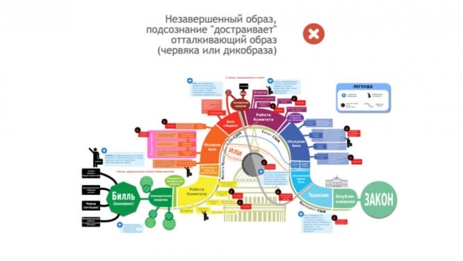
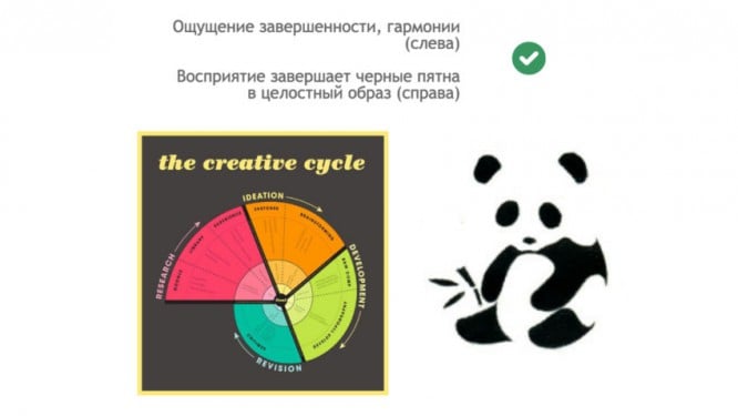
4. Completeness
Perception features “automatically” will complete the picture
Like all of the above laws of perception, this one is due to the fact that our internal processor “reads” everything simple faster and more willingly. Only in this case experience works faster. Indeed, first of all, during perception, a signal is sent to that part of the brain where information about the past experience of a person’s interaction with this or that object is stored. That is, recognition occurs (if possible).
And as soon as the separate parts “hook” a familiar object in the subconscious, the missing information complements the image. So, for example, a child sees a bear or a duck in a shapeless spot. Or remember the children’s exercise, where many points are given and you need to connect them in order to see the whole image.
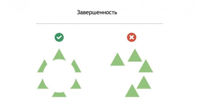
And in infographics, the viewer subconsciously looks for familiar images, complementing or excluding elements that interfere with this. The law can be used in such a way – to mark the boundaries or to “hint” in separate parts at an object well known to people – and the peculiarities of perception “automatically” will complement the picture. The key point here will be the reliance on the image that is necessarily familiar to the viewer, because what was not previously perceived will not be recognized and supplemented.
Source: infographer.ru
…

