

Top 10 web design trends 2021-2022
So this year ends, more than a month is left until the new year, however, this is not a reason to relax. For many designers, especially those into freelance web designer, the last month of the year is very busy, and it is becoming more and more difficult to create an actual design. So, I invite you to enjoy this article, because in it we will talk about the trends of the outgoing 2021, get inspired by the work and just have fun 🙂
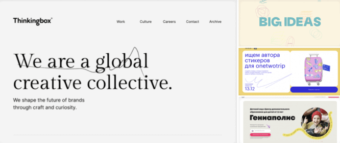
1. Text gigantism
One gets the impression that, over time, the typography on the site is getting more and more. And this is quite fair, since the headline is what they pay attention to in the first place and the more it is, the more it will shout about itself.
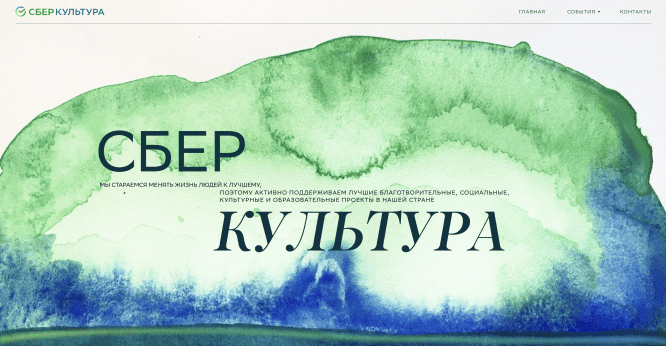
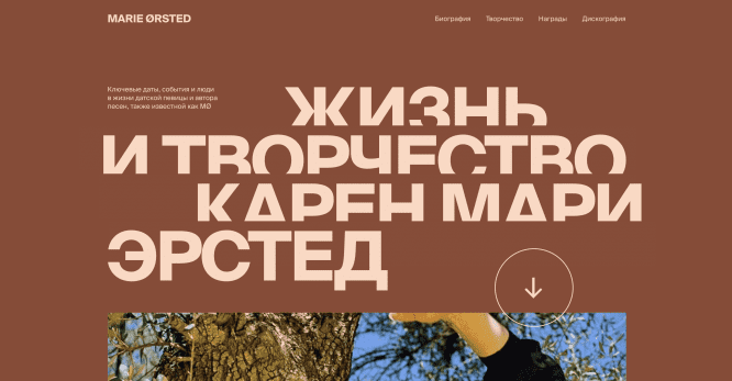
If we talk about exactly what the text should be and its size on the site, then everything is ambiguous. However, you can definitely emphasize the fact that the shorter the headlines, the more they can be made, and therefore add more emphasis. There are certainly good examples of using long headers, which in turn play a key role in frame composition.
Therefore, the font size on the site will grow exponentially in the near future, and this is inevitable.
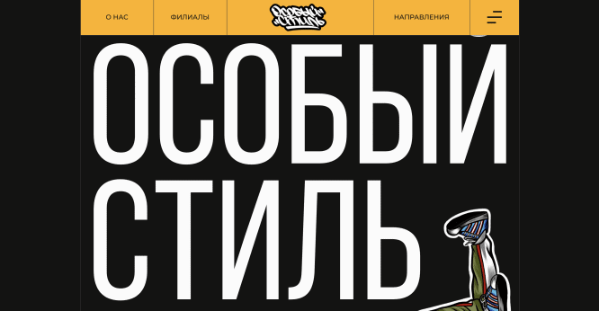
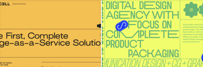
2. Brutalism
IN ITS Roughness and unwillingness to look comfortable or easy, brutalism can be considered as a reaction of the young generation to lightness, optimism and lightness of modern web
Pascal Deville
This is one of the brightest trends in web design in recent years. Brutalism is a bold, gritty, raw style that does not strive for perfection, it is an echo of the first sites of the early 90s. This style is often referred to as “anti-design” because of its rudeness and sloppiness.
This style has its own specific principles that should be understood. For example, the fact that the functionality is ahead of the appearance. In brutalism, there are no soft shapes, shadows and the like, there are only rough shapes, special visual errors, there is no animation, symmetry and color compatibility. If images are used, they are often in black and white and are not processed.
Therefore, this direction is gaining more and more momentum, since brutalism attracts like something new and paradoxical.
3. Retro nostalgia
Remember what we experience when we look at old photos, games, things. We are covered with a warm feeling of nostalgia. Designers love to play on the feelings of users, therefore, take advantage of these tricks in web design.
Many things can cause nostalgia in design, for example, the use of noise, textures, bright colors like in old games and fonts that are inspired by the Soviet past. All this can evoke emotions, and therefore work for the benefit of the client.
Therefore, if you know how you can hook the audience of the site you are creating, carefully analyze this moment and make a cool product.
4. Authenticity
Unfortunately for designers and to the delight of users – sites have become very diverse and to stand out you need to do something truly unusual. Because of this, authenticity is a new trend, born from a variety of different visual solutions. Basically, this trend describes well the whole situation in the modern design world.
Authenticity means being beyond everything, the more unusual the better. This is the ability to combine the incompatible, to make the user bewildered by what he saw. Also, it is working with meanings, ideas and presentation of information.
So, designers will have to look for more and more crazy ideas so that their projects cause a sensation in the viewer, and this is far from an easy task.
5. Buoyancy
We are talking about the trend for interactive website animation. Now the market conditions dictate their own terms and you can hardly surprise anyone with a static site. Therefore, designers and layout designers come up with all the new ways to animate the site to surprise the user. In confirmation of this, we see more and more animation on the sites.
The smoothness of the scrolling, animation of various elements such as text and photos, adds a certain premium to the website, which many developers are striving to achieve.
Some sites get overloaded with animation, making it difficult to use and confusing. Therefore, in order to use animation, you need to not overdo it and understand the basic principles of animated elements on the site.
6. Tabularity
The trend towards tabularity in web design has been gaining momentum lately. Everything strives for structuring and blockiness. This trend has a retro feel as it also has clear lines and structure.
Repeating this trend is quite simple, you need to understand how grids are built in web design and have an idea how to implement it. It looks quite minimalistic and consistent, which is why users liked it.
7. Sketching
Various doodles and freehand drawings have become very popular in modern web design. In many sites, you began to notice the use of such graphic elements. Most often they look untidy and minimalistic, which adds to the design of the uniqueness and “own handwriting”.
If you want to repeat this trend on your next site, then you should know that drawing such elements does not take much effort. It is enough to make bright and interesting elements that will thematically complement the design.
8. Very bright colors
The vibrant color trend is indirectly derived from the retro design trend, as all vibrant colors have been around since the 80s. Acidic, consuming colors are increasingly seen on websites, they attract attention well and look unusual. This helps to stand out among hundreds of competitors’ sites, which means it works for the benefit of the company.
Warm shades of colors are most in demand: red, yellow, orange, green. This is due to the fact that warm colors are more striking, combine well with each other and are more pleasant to the human eye.
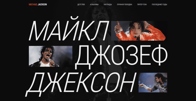
9. Black and white style
As you may have noticed, now everything is moving from one extreme to another, and we see now a bright, defiant design, now gray and inconspicuous, in black and white monochrome. So, the trend for black and white design began to appear just a few years ago and we notice more and more sites in this style.
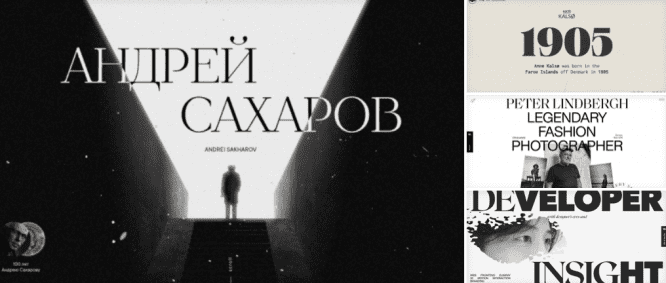
Black and white style is suitable for thematic sites, longreads related to history, biography and art. It conveys rigor and consistency, which also needs to be conveyed in some projects. Therefore, such works convey the spirit of the times well and immerse you in a certain mood.
10. Minimalism
Whatever one may say, now web design strives for minimalism and simplicity. A simple and straightforward site will always be pleasant to the user and will make good traffic. Despite all the trends that have been listed above, it is important to create a minimalistic site, not to put elements randomly, not to overload the style.
However, if we look at the minimalism of 2013 and 2021 and understand that they are different styles. In 2013, flat design, dull, expressionless colors, and stupid patterns were popular. And in 2021, minimalism has completely changed, the design is bright, not flat, accents on the most important and cool graphics. This difference of 8 years makes a monumental difference in the minimalism of different years. The most important thing is that the visual and functional of the site do not suffer from simplification, then minimalism will work as it should.
❤ If you liked the article, then support it with like, and I will continue to share useful information about the design 🙂
Source: vc.ru

