The future of web design is hidden in the history of architecture
The future of web design is hidden in the history of architecture
Mike Sall, Product Curator for the Medium blogging platform, shared his opinion in the article “The Future of Web Design is Hidden in the History of Architecture” on why the development path of web design is already known and will follow the path of development. architecture.
Below is the translation of his article and invite everyone interested in comments for discussion.
From the history of Western architecture, we can learn a lot about the evolution of web design. Both are art forms and are determined by several factors:
- They are the habitat of humans;
- They are created with pragmatic goals;
- They are highly dependent on the level of technology;
- Despite this, they are art;
Within these factors, they have evolved in similar ways, so if you want to know what will happen to web design, find out what happened to the architecture.
Neolithic
Simple, limited structures.
Apart from playing with size and position, it was an attempt to put things in their place.
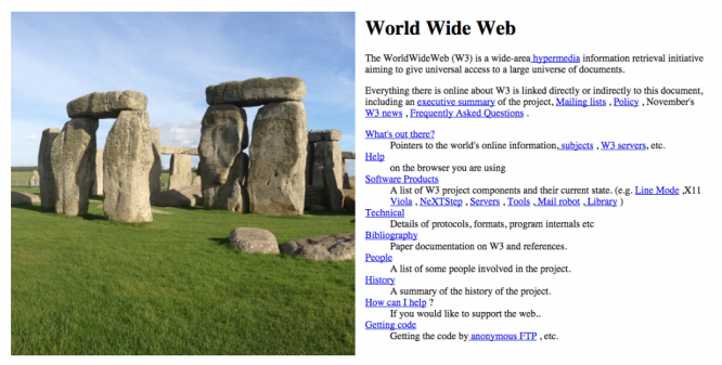
Classic
Order and proportion with some embellishments.
The classical period is characterized by proportionality and hierarchy, with the introduction of clearly marked sections serving different purposes. Materials (stone or pixel) were also stylized to resemble materials from the previous era: stone triglyphs pretended to be wooden beams, like 3D buttons pretended to be real.
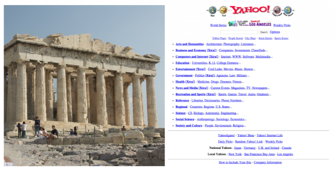
Romanesque architecture
Wider shapes and rounded edges.
By rounding the edges and thickening the walls and partitions (as well as the menus and buttons), the Romanesque style has received bulkier, heavier and more clickable forms.
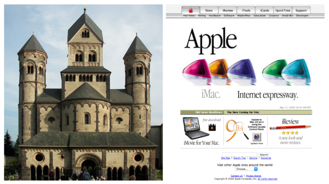
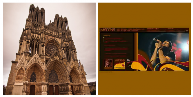
Gothic
Refined and mesmerizing.
CSS and Flash have become the stained glass windows of web design. Gothic, while retaining a solid foundation, began to move far beyond the limits, which until recently seemed inaccessible. Gothic architecture transformed stone into breathtaking gravity-defying structures. As well as early CSS and Flash sites, which are now hard to remember.
Renaissance
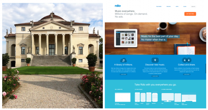
Clean, logical and accurate.
This is where we are today. It’s amazing how much the modern “flat design” movement is similar to what happened during the Renaissance. The Renaissance architecture returned to the logic of the Classics: simple geometric shapes replaced complex structures, the design became simpler and cleaner.
And now we go to the future.
Baroque
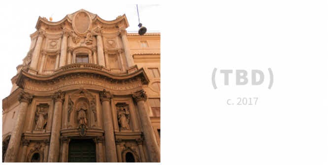
Turns everything upside down.
Sooner or later, you will get bored of being precise and accurate. One way or another, we all start breaking the rules. In architecture, this meant simply breaking down the forms of the Classics and mixing them into complex forms. Compared to the intellectualism of the Renaissance, the Baroque was more emotional and theatrical.
It is difficult to say how this will manifest itself in web design, but it will not be long to wait – just a couple of years.
Neoclassic
Back to the past!
Everything develops in a spiral. Once we have come a long enough distance, we will begin to celebrate the merits of the Classics and return to it. It’s just a matter of time. But that should be the wait – that old Yahoo site looks pretty shabby now. But in six, seven years? What if it becomes something cool?

What’s next?
It’s not hard to guess. It will be a neo-Romanesque style, neo-gothic and everything in the same spirit. A series of “neo” is waiting for us. Art develops in the form of awakenings of something from the past. New technologies and a new outlook on the world will bring us something that we cannot even imagine today.
And everything will be very strange.
Translated by: Vasily Fedotovsky
Source: Medium
…

