
Sense and Sensibility in Branding (Part 1)
Sense and Sensibility in Branding (Part 1)
Ulyana Kozhevnikova, head of the Nimax branding department, spoke about the stages of consumer interaction with the product, as well as what tools are most effective for managing consumer consciousness.
We all love to talk about the practical side of design, but we rarely think about the emotional one. How exactly does a consumer perceive our label color, graphic style or logo idea? How do the decisions we choose affect whether a person likes the packaging or not, gives the product a chance or not? The human mind, which contains the answers to these questions, is like a metaphorical black box: we send visual and verbal information about the brand to it without understanding how it will be processed.
Meanwhile, the transformation of an unknown product into a dearly beloved brand is a cognitive process in which attention, perception, comprehension and memorization play the main roles. Let’s take a look at how they work at each stage of the interaction between the consumer and the product – and what tools are most effective for managing the mysterious black box of consumer consciousness.
Stage one: attracting attention
The relationship between a consumer and a brand begins with a first glance at the shelf: if a product manages to fan a spark of interest, what happens is what marketers and brand managers call a trial purchase. The manufacturer and the agency can take a standpoint, stay out of the way and hope that the rich inner world of packaging will sell itself. But this does not happen even in relationships between people, and it certainly does not happen in the relationship between the consumer and the product.
On the shelves, everything is strictly according to Trout: be different or die
The competition is fierce here, and even unremarkable brands and mediocre packaging throw off focus and take away the consumer’s attention – an already limited resource. Every product wants:
1. Attract the attention of people scanning the shelf looking for something new;
2. To shift the attention of conservative buyers who choose familiar brands and are not particularly inclined to experiment;
3. Catch the attention of consumers who are just passing by and are not inclined to buy anything in your category.
Whichever category we belong to, our attention is almost always tied to the process of perception (when we look at something) or the process of thinking (when we think about something). Visual attention works like a spotlight: it helps to grab one object out of many and fix it on it. At this moment, we quickly and automatically evaluate the long-known features of the object: color, size, angle of inclination, depth, orientation of lines.
According to the theory of integration of traits, developed and tested by the American psychologist Ann Treisman, a kind of map of such traits is located in the human brain. It is along it that the “searchlight beam” moves, connecting individual signs into integral objects that we can identify – in order to then focus and study in more detail. (The cognitive psychologist Maria Falikman popularly talks about Treisman’s theory and the psychology of attention in general – for example, in the Digest of Psychological Research or on Colta; and on PostNauka, you can find a list of Maria’s recommended books on the topic. WTP).
To be different or to mimic?
According to Jeremy Wolf, one of the most respected specialists in the study of visual attention and the creator of the guided search model, a person distributes attention to objects according to their level of significance. This level is equally dependent on how similar the object is to its familiar environment, and on what the viewer gravitates towards in a particular situation. Simply put, people have an internal mindset to mark similar or different, and it is this that determines the order of enumeration of objects during visual search.
In the transfer to product branding, two equally effective, but completely contradictory strategies follow from Wolf’s theory: difference and mimicry.
Distinction strategy
Here we focus on buyers who are temporarily tired of familiar brands or are initially ready to experiment. These are the most grateful viewers: they themselves are looking for something new and unusual, regardless of attempts to control their attention. Our goal is to simplify and speed up this search by visibly highlighting the brand in the category.
As we remember from Treisman’s theory, people most quickly assess the basic features of an object known to them. There are five main attributes in product branding: color, style, shape, size and level of detail. Accordingly, a brand has five ways to visually differentiate itself.
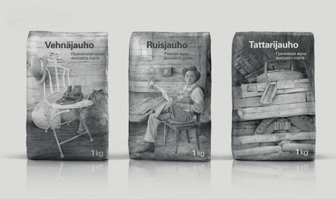
Method 1: differentiation by color. Color is the most commonplace and effective way to make a product stand out on the shelf. Of course, if the competitive environment is not yet full of all possible colors and their combinations.
") Myllyn Paras by Depot WPF
Myllyn Paras by Depot WPF
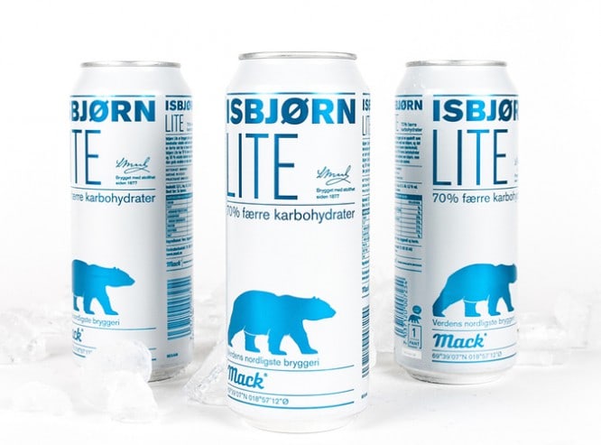 Isbjorn by North
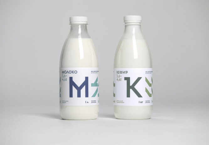
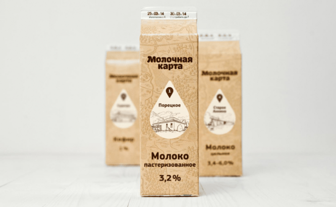 Milk card by Nimax Brands
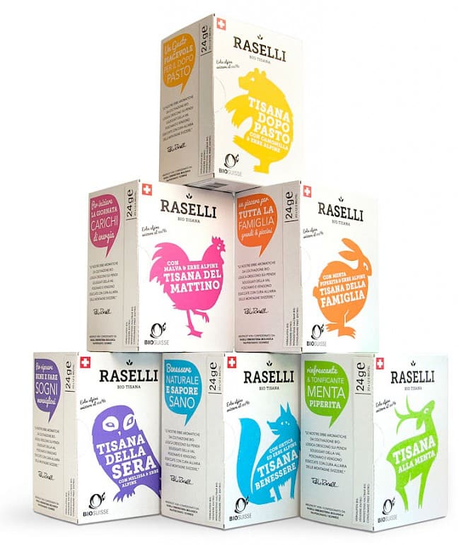 Raselli Tea by Plasmadesign
Interestingly, according to studies, for differentiation, it is much more effective not chromatic color differences (how much the color differs from the environment in the color spectrum), but light (how bright the color has in relation to its environment). So do not rush to make purple milk, try to work with the shade and saturation of the classic blue color for the milk shelf.
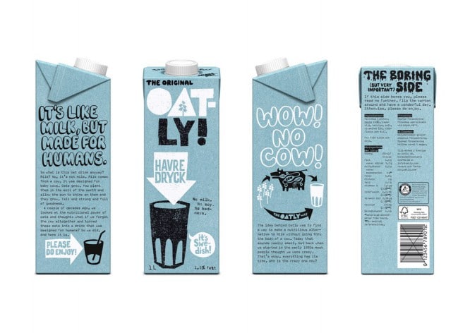 Oatly by Forsman & Bodenfors
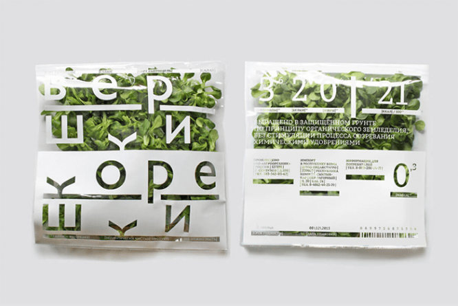
Method 2: differentiation by style. Albeit a little less effective, but no less our favorite approach at Nimax Brands, which, in addition to visual distinction, allows us to refer to the positioning of the product, and not just visually highlight it on the shelf. Due to the inertia of many product categories on the Russian market, work at the level of stylistic distinction is fraught with absolutely extraordinary possibilities and helps to make the packaging very expressive.
Do you want to talk about the quality of raw materials? Place a realistic meat slice on the label and, for other persuasiveness, draw it using craft, linocut technique with nice rough edges.
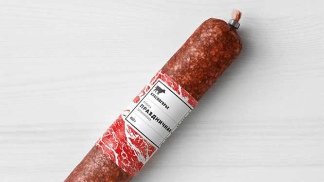 Redridge Mountains by Nimax Brands
Planning to make an innocent revolution on a retrograde wine shelf? And at the same time to tell that wine is not always ceremonial, but often just fun? Decisively abandon engravings, use photographs, exaggerate emotions. Wrap it up in newspaper layout.
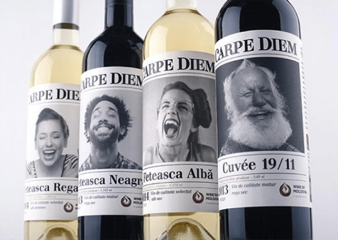 Carpe Diem by 43’OZ
Intending to talk about a manufacturer’s legacy? Just scan the old engravings here. And reflect the brand’s desire for experimentation, the eternal search for new forms and tastes through collage, eclectic typography and local use of bright colors. Surreal? Yes, but clearly in positioning.
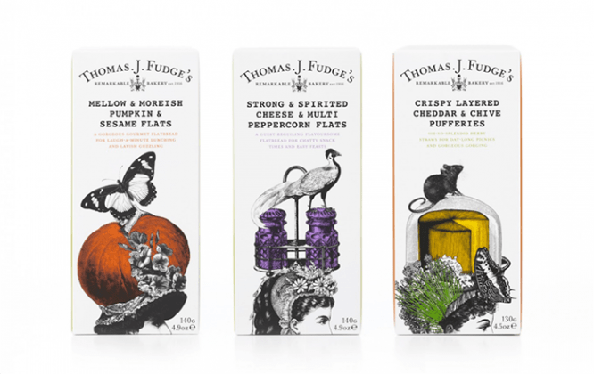 Thomas J Fudge’s by Big Fish
Aerobatics is the ability to skillfully fit a brand into a category based on one feature (for example, due to color) and, at the same time, uncompromisingly distinguish it from others (for example, a stylistic solution). Such a solution, if properly applied, works equally well for fundamentally different audiences of conservatives and experimenters.
 The Cheburashkin brothers by Ermolaev Buro
Method 3: differentiation by form. The most difficult, expensive, and therefore accessible only to celestials way of highlighting a product on the shelf. It requires money not only at the stage of developing the original packaging design, but also at the stage of installing the line for its production.
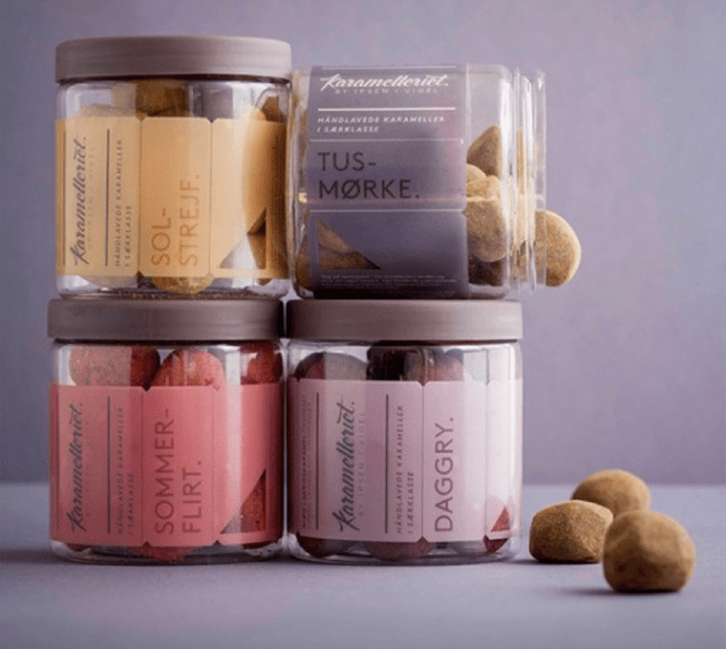 Karamelleriet by Bessermachen
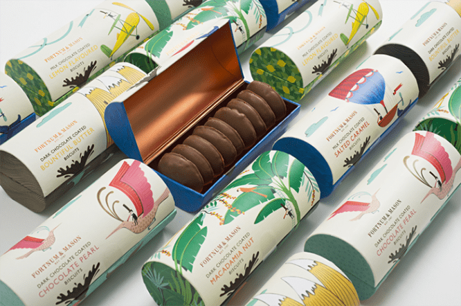 Fortnum & mason by together
Due to the tactile design and material features, shape differentiation works great not only at the stage of attracting primary attention, but also at the stage of subsequent study of the product by the consumer.
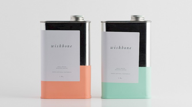 Wishbone Coffee by Also Known As
Method 4: differentiation by the level of detail. This method requires uniformity of the competitive field at the level of packaging detail, and therefore is not available in all product categories. Try to create minimalistic packaging and put it in an environment overloaded with fonts and graphics. Alternatively, make a deeply detailed, carpet label where everything is limited to laconic typography and color.
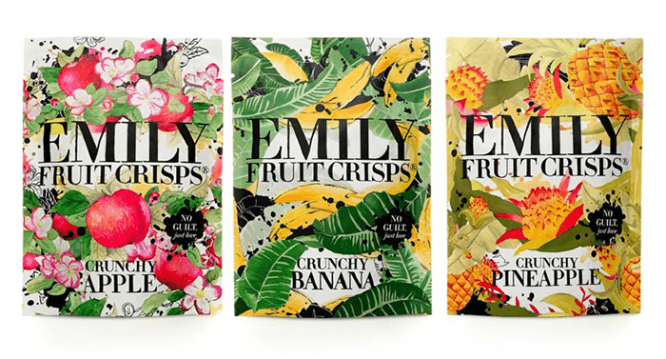 Emily Fruit Crisps by Big Fish
Labels with a variety of shapes, textures and image details – with a confident workmanship – are also good because you want to look at them. In some cases, this can be done almost indefinitely.
 Myllyn Paras by Depot WPF
Minimalist packages work differently: they save time and attention of consumers, for which the latter are often grateful in situations of excessive choice. But here, too, there are risks. Moving towards minimizing label elements, it is important not to cross the line after which the product will be on a par with faceless private labels of a low price level, which often also have a laconic design.
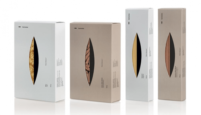 Harmonian by Mousegraphics
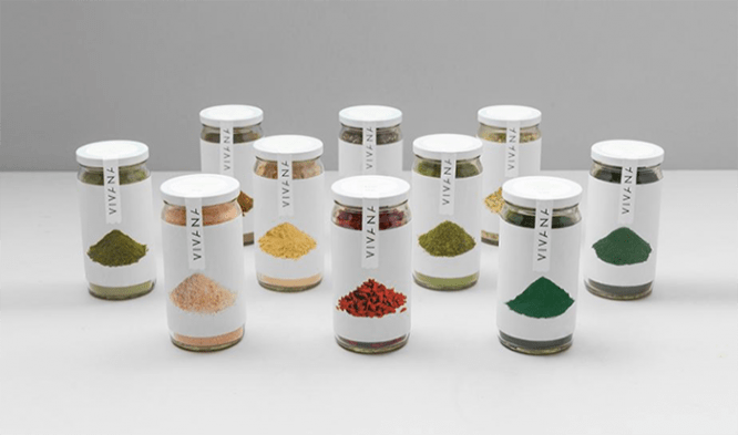 Vivana by Anagrama
Method 5: differentiation by size
This approach to branding is not often used and has understandable limitations: you cannot endlessly increase or decrease the size of the package and the volume of the product inside it. The main standard sizes of packages in the categories have been known for a long time and are directly tied to one or another scenario of product consumption. Of course, we can attract the attention of buyers with a ten-liter package of milk, but can we force them to buy it, while changing the usual format of consumption? Hardly.
Advertising Prill by TBWA RAAD
Experiments prove that a difference, even in one feature, already distinguishes an object from among many, regardless of the number of distractors (that is, additional plausible, but incorrect options that distract doubting respondents). However, our experience shows that in a rich shelf context, you can go further: in one solution and on one package, you can elegantly combine several ways of brand differentiation at once.
Mimicry strategy
A polarizing approach to customer engagement and an ideal strategy for working with conservative shoppers who are reactive and reject new. This is the case when people are purposefully looking for something specific, which means, first of all, they look at options similar to the desired object.
In the strategy of mimicry, we also rely on the basic features from the Treisman theory: color, style, shape, size, detail. Only if in the differentiation strategy we used them to stand out, now with their help we strive to become similar to our competitors – and for greater similarity we must work not with one, but with several signs at once.
Let’s omit examples of total mimicry (essential, communication, visual) for strong brands existing on the shelf. For the market and for us, examples of selective mimicry are much more interesting, in which a brand is visually – partially or completely – disguised as a competitive environment, but fundamentally differs in positioning or communications.
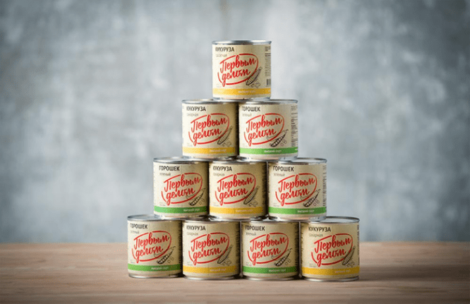 First thing by DDVB
The mimicry strategy is the perfect choice for the cautious. In doing so, we draw on the experience of trial and error from every manufacturer that has ever put on the shelf. At the same time, visual similarity does not at all imply a low level of design, even if all the packages in the category are on that. Understanding which techniques work in a category and which do not, and without going beyond the limits of recognition, we can always do better and be distinguished by the quality of performance.
 Tops and roots by Anna-Maria Kandales-Vorobyova
Research shows that when a person is looking for a certain object known to him (say, a pack of the usual Prostokvashino on the shelf), he automatically scans everything that falls into his field of vision – and moreover, continues to do this even when he finds what he is looking for. This instills hope and increases the chances of capturing the consumer’s attention, whichever strategy we choose to highlight the product.
What to do with this attention further, read in the next series. The second stage awaits us: we have to keep the consumer’s attention with the help of emotion and somehow influence his choice, which is far from always logical, balanced and expected.
Author: Ulyana Kozhevnikova
Source: book.nimax.ru
…

