
Polyformism: 10 facts about a new design direction
Polyformism: 10 facts about a new design direction
Designers have a new favorite shape – the polygon. They are starting to appear on websites, posters, and in print. This trend is different in that the designs in which it is applied are not alike.
Polygons are shapes that are defined in geometry as “shapes bounded on all sides by a closed polyline consisting of three or more segments.” This shape can have any number of sides, be flat or convex, and its lines can intersect. Typically, polygons are flat, two-dimensional shapes, although on websites, polygons are animated with motion and some three-dimensional characteristics.
Polygons are an interesting technique for new projects, but they can also breathe life into designs that seem outdated. Here are some polygon designs that will hopefully inspire your next project.

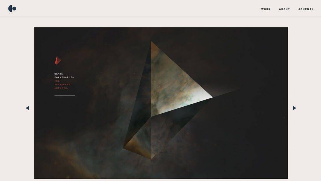
Create a vibrant background
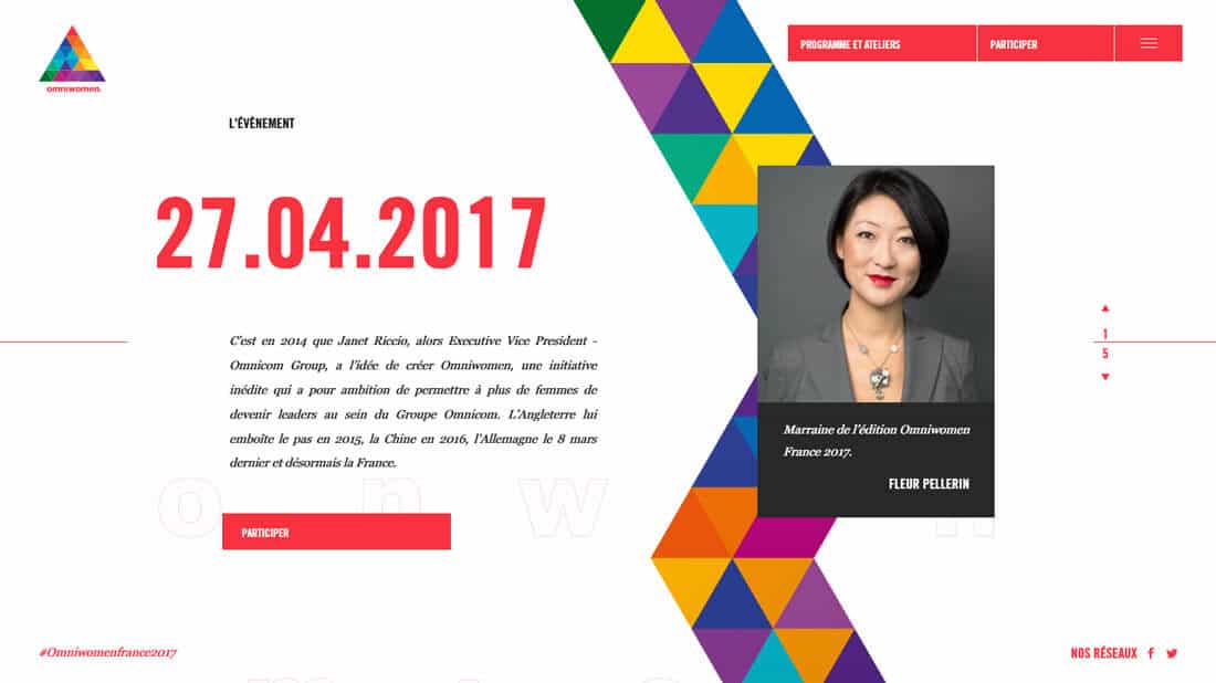
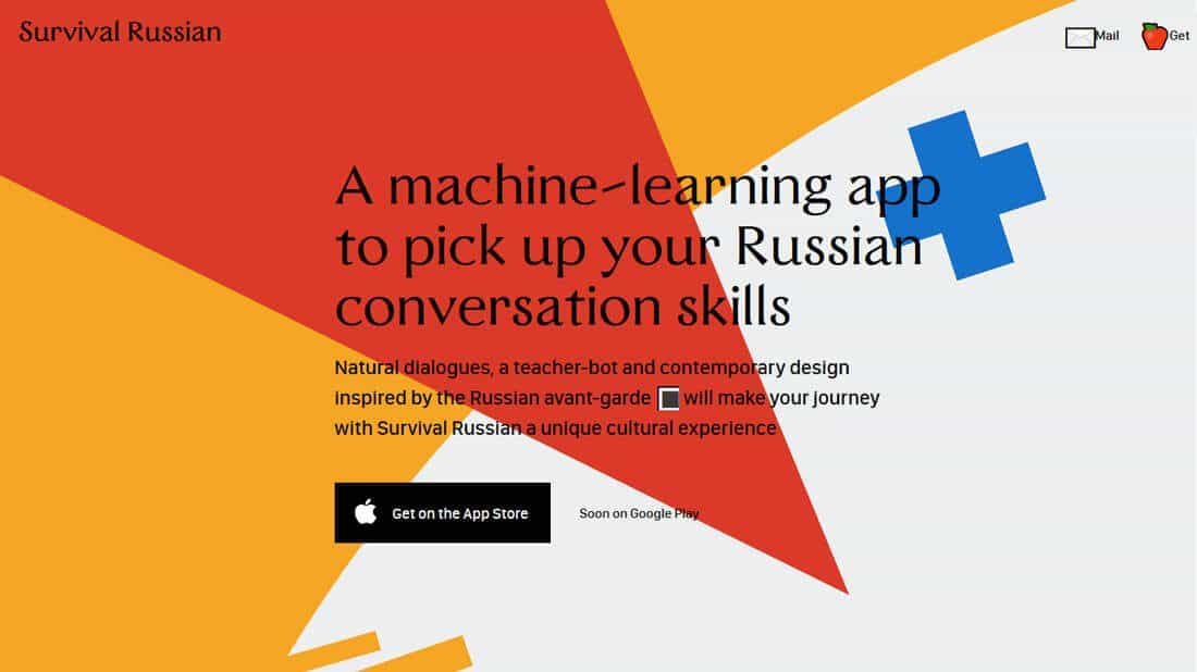
Polygons can come in very handy if you are struggling to cope with the dullness of the visual effects on your site. This trend can bring a “wow factor” into the design. Polygons look good alone or when paired with text.
Both of the above examples show polymorphism in different formats, but with the same result – visual intrigue. Shapes can add depth, visibility of movement, and even give users direction.
As a bonus for designers, polygons are not difficult to create and can be embedded in any style, and in almost any color or typographic palette. Also, this style gets along well with many different concepts – it can be applied equally well to minimalist or heavier, busy designs.
Create interesting icons or interface elements
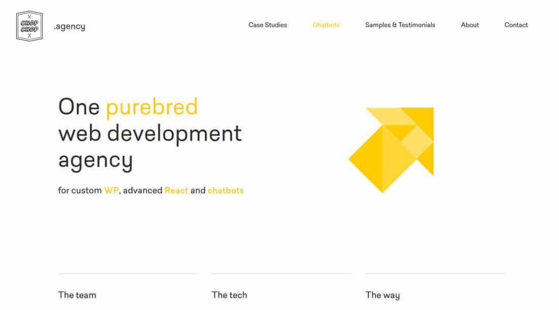
There are no rules in design that limit the size of polygons, so connecting even the smallest parts can lead to something interesting whole. Connecting shapes and lines can also lead to interesting combinations of depth and color that will grab the user’s eye.
Chop Chop Agency uses a yellow polygon to create an arrow that directs users towards the main navigation. A bright yellow icon set against a minimalist outline grabs attention and adds a simple visual element without cluttering the screen. Also, when you select different navigation elements at the bottom of the page, the polygons are collected in a completely different shape.
Show something to users
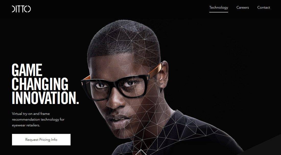

Polyformism can help when you need to explain how something works. Because of its roots in mathematics and geometry, polygons can be used to provide instructions and additional information to help users understand a subject. In design, this often looks like a tiling of an image with polygon outlines.
Thus, polygons are used by Ditto and Choudhary laboratories, but their approaches are slightly different. Ditto uses polygons to demonstrate how their eyeglass sizing tool works. Choudhary uses them to show what their company is doing.
What they have in common is that both examples use polygon outlines to better explain their content to users. Also, both of them use animation for this purpose. Animation brings the image to life and contributes to the user experience.
Add color
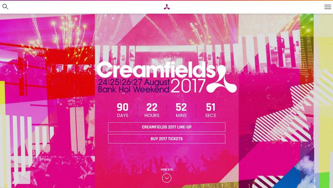
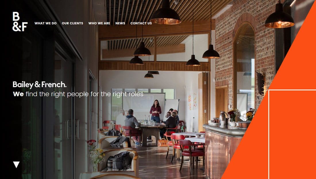
Polygons are a great choice if you want to create color-rich designs. From an overall vibrant color scheme to unexpected accents, polygons and colors work together perfectly.
At the same time, the possibilities of color combinations are unlimited. Here are a couple of ideas:
- Rainbow polygons
- Black or white polygons on a bright background (like Creamfields above)
- Gradient polygons
- Polygons as accent color (like Bailey and French in the example above)
Create an accent
Perhaps the best polygons are the smallest ones. While some of the examples above use polygons to create icons or interface elements, they can be an effective tool for creating emphasis on the smallest elements.
The two examples above use both large and small polygons to create accents. Regardless of size, this concept grabs attention. Moreover, it can be added to an existing design without the need to make any significant changes. This simple technique, without much investment of time or money, can add a modern look to a beginner’s outdated template.
Source: uxgu.ru
…

