Key web design trends in 2015
Key web design trends in 2015
The world of web and graphic design is rapidly changing. Trends come and go and, no joke, a number of them, like a car, burned out in the atmosphere before they made themselves felt.
Others turned out to be more viable, but the principle “everything flows, everything changes” still works like a clock. To what unknown is the visual world leading in 2015? Let’s speculate.
My affectionate, responsive design
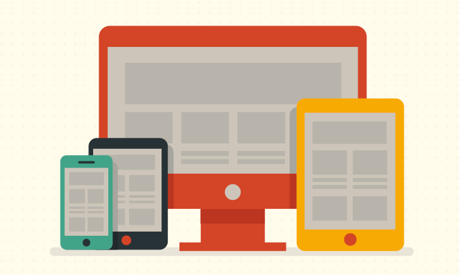
Unfortunately or fortunately, for the foreseeable future, mobile technology is likely to be at the forefront. Already now, at least they have to be reckoned with: the day is probably not far off when such technologies will be given an unconditional priority. When mobile versions of websites, together with the principles of responsive – not responsive – design, become mainstream.
The return of prodigal typography
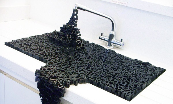
Gone are the days when commercially successful companies could afford professional, unique fonts. Services like Typekit handed the keys to Pandora’s box to almost everyone, and in general, with fonts, we stopped behaving like King Kong with Ann Darrow – not inventive.
Quality fonts are no longer an anomaly, but a familiar and natural precondition for good rendering.
Scrolling in the deep

You can remember the familiar mechanics of interacting with the interface right now: at least when it comes to the need to click. Just three years ago, sites with infinite scrolling could not boast of such popularity as they are today, and now Pinterest and Cute Paw changed everything: more and more site builders prefer to use this tool in their work.
Add to this the effect of parallax scrolling – this is how the transition between pages with a click becomes history.
Less is more
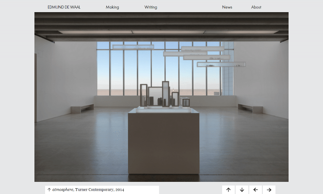
Following the cult of clicks, flashy design also goes into the category of anachronism. It would seem that the most inexperienced user is already fed up with cumbersome visual structures: modern people do not want to storm the interface, they need sincerity and functionality.
Efficiency and wide scope for imagination. Nude content and clear navigation, as well as the meditative silence between them, all form the basis of web design as it will be now.
Speaks and shows
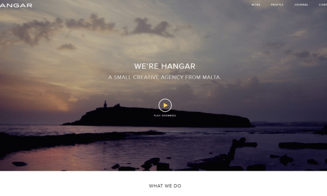
Speaking of content: more and more text blocks are being replaced by video production. This is especially true for resources whose target audience is smartphone owners: as practice shows, such users rely more on visual, non-verbal information. Both the procedure itself and the final result of web design become simpler, which is consistent with the previous remark.
Don’t assume that this trend will lead to a slew of heavyweight sites: after all, HTML5 Video is there for that.
Open & Co.
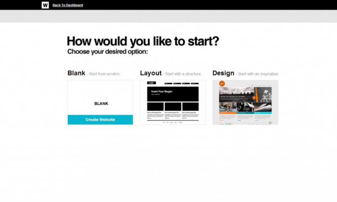
Of course, the changes will also affect the behind-the-scenes life of sites: this is evidenced by the growing number of open source sites. Okay, so far there are an insignificant number of them, but they are. This vector of development pursues, by the way, two very humanistic goals at once: education and self-realization.
So, open source allows beginners to touch the holy of holies – the internal principles of the functioning of a web product, and developers free their hands for new experiments.
Author: Denis Strigun
…


