Indentation in design: a systematic approach
Indentation in design: a systematic approach
Hello, we are Kelnik agency, and we often work with large projects – corporate websites, development projects and sophisticated touch-table interfaces. To speed up development, we come up with systems that help clean up the mess. One of such systems is working with indents between blocks.
Problem: the indentation in the layout doesn’t match the design
Designers often swear at laid out layouts. Differences of five pixels are essential for them, a little more leading, inaccurate fillets in the solid.
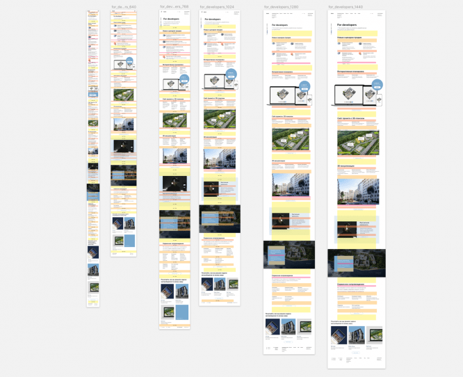
One of the most noticeable layout and layout inconsistencies is the spacing between blocks. It looks and really awful:

This happens for various reasons. And they are not always in the control of the designer or front-end developer.
Sometimes the designer decided to beat off the title a little harder, because the illustration was on top, not the paragraph. But the front did not understand the idea. Incidentally, this is not his job to know why designers do this.
Sometimes something flies in the layout: the block was changed without a layout on the battlefield, because it’s Friday, and the customer really needs to roll out the site before the weekend. All the designers went to the bar to drink mojitos, and only the intern from the support remained.
Sometimes it is difficult for designers to keep track of everything; inaccuracies appear in the layouts. Somewhere a hand will tremble, and the block will slide down. Somewhere in the already laid out page, edits are made, the designers do not document all the changes, and the fronts do not notice new connections between the blocks.
How we dealt with this problem
We didn’t have a systematic approach to the solution. If there were noticeable discrepancies with the layout in the layout, then the problem was fixed locally.
The designer made a bug report, the frontend ruled according to the checklist: here the text stuck to the illustration, but here they did not follow the label, which ran to another input. Often the designer would sit next to the front-end, and together they would adjust the padding of each block at each screen resolution.
Due to the fact that we did not have a coherent system, the same errors appeared in every new project.
Designers arranged educational programs about the importance of vertical rhythm, the rules of internal and external, the rules for placing basic elements on the page. Frontenders gave lectures about BEM, talked about leading on the web, and organized courses on “layout for designers”. But each of the departments talked about their own world, not the general one.
It became clear that an equally understandable tool was needed for both designers and front-end developers.
Solution: vertical padding system
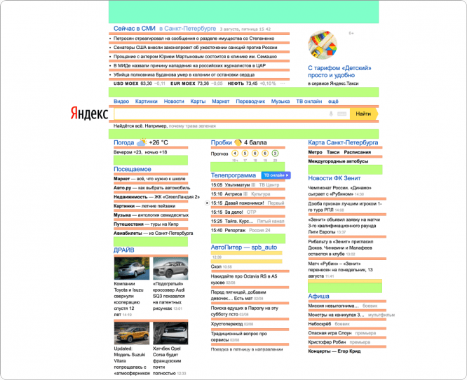
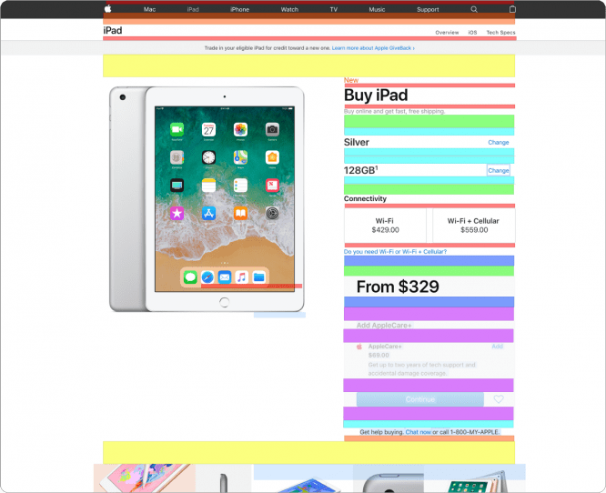
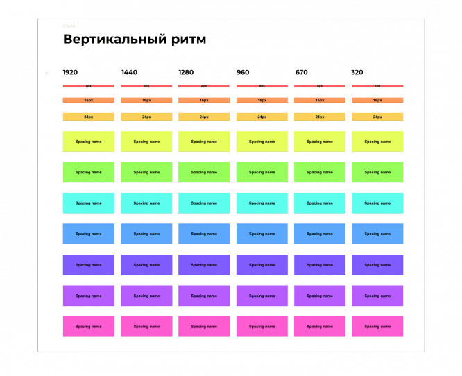
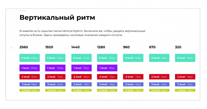
If you disassemble the layout or page of the site by elements and look at the vertical spacing between them, patterns emerge. There are not so many vertical indents of different heights on a single site. For example, there are only 4 of them on the main Yandex. On the Apple product page – 8.
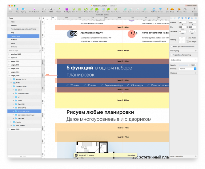
In the next project, we tried to visualize the vertical indents. We created a separate page in the guide, wrote about vertical margins and showed how they are applied.
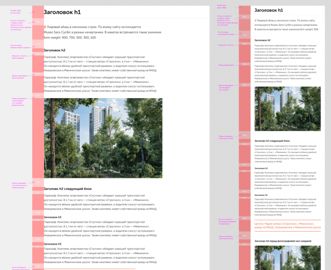
Frontenders have tried and approved this approach. This is how the vertical padding system was born. This is how our layouts now look from the inside:
After the first project, neither the designers nor the front-end developers realized how much the use of the vertical padding system would make the layout easier. But for several projects, we tested the system and made sure that it works. The system is especially useful on large sites where it is a question of a bunch of information pages, each of which must be built according to a template.
How the system works
All page elements are grouped into blocks. The blocks are lined up according to the rules that the designer came up with.
We have conditionally divided the vertical indents into levels. The first level is the lowest indentation. For example, it is placed between the heading h4 and the paragraph or illustration and the caption. The second level indent beats off two such blocks. Etc.
Blocks that are different in meaning, but of the same type, now always include the same indents. The interconnections between the blocks have become clear: the front-end looks at the layout and immediately sees the patterns that the designer thought. As a result, designers draw layouts more accurately, and it is easier for front-end developers to grasp the designers’ ideas.
How designers work with the system
We are working in Sketch. Symbols are suitable for vertical indents. We have a library in which the standard set of vertical indents is already hammered.
When a designer understands what spacing he needs, he takes symbols from the library and adjusts them to their heights and colors. Then he arranges vertical padding on the page and groups everything into the Vertical Rythm folder. For convenience, we have a small plugin that hides and shows the indented folder by hotkey.
Of course, indenting a page is not a quick matter. It’s dreary. But the profits are not acidic either. Layouts look neater; easier to draw after a break; the new designer, who is connected to the project, draws in the same coordinate system, there will be no surprise for front-end developers; project support is based on specific figures during development.
Plus, it’s much easier to create responsive websites. The indents change the height for each breakpoint. Each of them has predictable behavior. You can draw one page layout, place indents, and not draw the rest of the layouts – thanks to the guide, the frontend will understand how the distances change without the layout.
How frontend developers work with this system
A word to our front-end team leader Kolya Shabalin:
“In the guide, the designer collects a table that contains all the breakpoints of all the indents of the project. This table is a single point for the entire project. All experts know where to look. Conveniently.
There is an agreement with designers that in layouts they share all indents with color. Let’s say the green rectangle between the title and the text is 72px and the red one is 80px.
Our system allows us to know nothing about numbers. From now on we operate with flowers. Why flowers? Because you want to make up, not suffer. What color the rectangle is, I will see on the layout, and I will refer to this color.
Each color is a row in the table, or, more simply, one set of indents. Another color is a different set of padding.
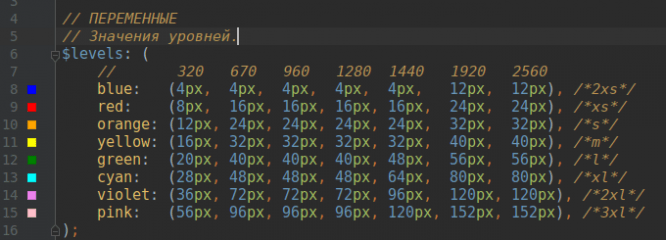
I wrote a mixin that can digest all these states. The mixin contains an array of states of all indents. It looks exactly the same as the table in the guide. Now we need to go to the mixin and tell him what color I see on the layout.
For instance:
@include margin-level (bottom, green); – this is the indentation below the “green” color. How many pixels it doesn’t matter to me anymore, the mixin will substitute everything for me. “
Result
Our front-end developers estimate that the time to work with indents is reduced by 90%. Frontender spends 5-10 minutes setting up settings in SASS and no longer worries about indentation. He does not need to measure anything with rulers – he sees with his own eyes what indentation the block has.
If you see a first-level indent, you apply a first-level indent.

There are also negative aspects. By making life easier for the frontend, the system places an additional burden on the designer – indenting, grouping, and guides take time. In order not to stretch the timeline, we place rhythms not on all pages, but on unique blocks. The rest are formed according to the pattern.
The benefits and harms of the system
Vertical padding works best on large projects with lots of layouts, responsive layouts, and a multi-person team. It helps keep layouts neat and predictable layout.
The effect is noticeable with large volumes of work. If you have a small project or one-page landing page, the system most likely will not work – firstly, it is difficult to maintain, and secondly, it takes more time.
Source: DesignKabak
…
