Icons: why and how to use them correctly in the interface
Icons: why and how to use them correctly in the interface
Icons are needed to speed up the perception of information. Let’s take a look at an example right away.
This is the site of a bookmarking program. The screen shows the functionality of the program.
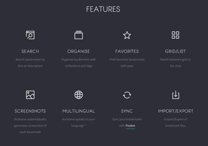
The designer used icons with familiar images. Magnifier – search. The globe is multilingual. An asterisk is a favorite. All the icons in this example help to easily read the information.
What happens if you remove them? Notice how the speed of perception has changed.
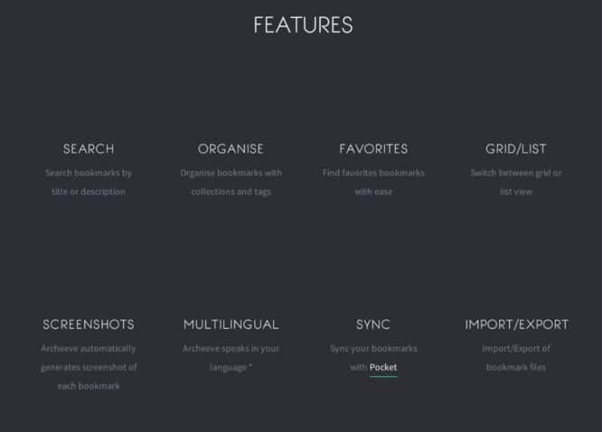
In the first example, it is enough to glance around the page to understand the product’s functions. We removed the icons and now you need to read every word in order to understand something.
This is because people have imaginative thinking. If we see an image, it is easier for us to understand the essence.
But this is not necessary
But the images should be obvious and familiar. Otherwise, nothing will come of it. See an example.
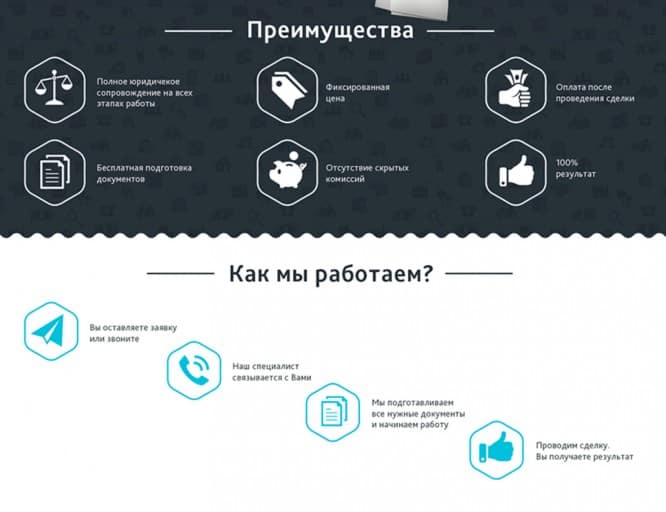
Icon with tags – it is not clear how it relates to a fixed price. The piggy bank icon does not in any way hint at the absence of hidden fees. Money in hand is also aggressive. So they say “Shut up and take my money”.
In this block, icons are used for the sake of icons. They don’t get the point across. Because the benefits are very vague and incomprehensible. These are rather principles of work. In this case, it is better to just write clear text with 3 sentences than to use inappropriate icons.
“How we work” – this block describes the process of work. The icons are incomprehensible. And they are not needed. The order is best illustrated with numbers and direction (arrows, lines).
One more example. It’s even worse here.
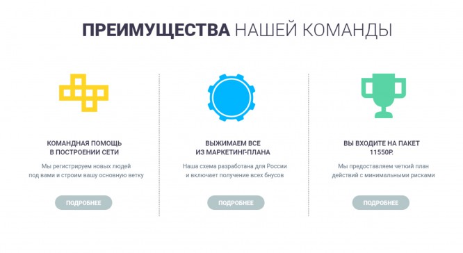
The icons here do not convey anything. They absolutely do not help to understand the essence. But in this case, even the text does not convey the meaning. He is incomprehensible. Because of this, it was not possible to select the icons and stuck in what was.
Remember
1. Icons should help perception.
2. They must convey clear images.
3. Use icons where appropriate. Don’t sculpt icons for the sake of icons.
4. If the image is clear, and the icon does not fit, the text may not be formulated accurately enough.
Where to get icons?
Is free:
1. More than 1,000,000 icons from designers from all over the world – https://thenounproject.com/
2. Almost 2,000,000 more icons – https://www.iconfinder.com/
3. 57,000 flat icons. You can choose a style and change colors – https://icons8.com/
4.540,000 icons – https://www.flaticon.com/
These 4 services can completely cover the need for icons.
Paid:
And if you want something special, then look at the paid icons. Websites where you can buy good icons for little money.
1. Graphicriver – https://graphicriver.net/category/icons
2. Creativemarket – https://creativemarket.com/graphics/icons
You can also draw icons yourself. Algorithm for drawing icons – coming soon!
Source: WDI Design School
…

