
3 Key Graphic Design Trends for November
3 Key Graphic Design Trends for November
Design trends appear and change so quickly that even solutions that are popular now may become irrelevant in a month.
This article has collected 3 trending trends in graphic design for November.
Each of the three trends this month is a topic of discussion. While they look great visually, are they readable and useful?
1. Underlined text and elements
This is not the standard underscore used for links, or the one found in every default text editor.
The underline trend for text and elements uses color and lines to highlight specific information and focus on specific content. The most advanced designers combine underlining with something else to make it look like an integral part of the design.
For a technique to look cool, it needs to look deliberate without getting in the way. Underlining is fine in many cases, but can make the text too stressful or overflowing. So it’s best to use it next to a lot of white space.
Example
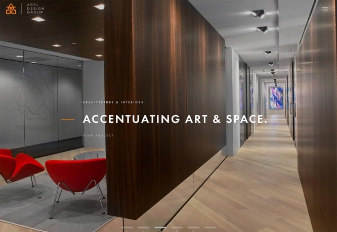
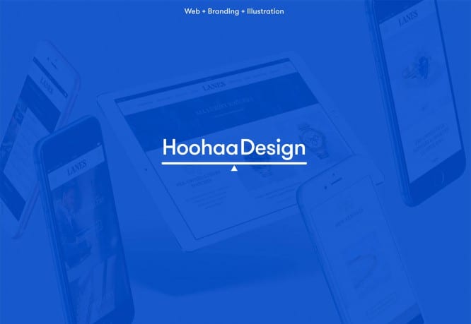
Simon Lee Gallery and Hoohaa Design use a simple underline against white space to draw attention to what is written. At Simon Lee Gallery, underlining helps users focus on the smallest text, and serves as a design break between slides. At Hoohaa Design, the underline is a balancing graphic element that emphasizes the site’s name. The Abel Design Group has a different approach using the orange line, which, while not like an underline, serves the same purpose.

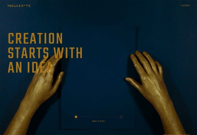
2. Obstruction of the text
Obstruction, or elements with obstructive and hard-to-read text, is probably not what you would like to see in trends, but designers somehow don’t care about your opinion.
This is a tricky technique that runs the risk of failing and becoming the hero of memes due to the random letter combinations that can result from overlapping. This becomes a real problem on adaptives – because of the different breakpoints and movement of such text.
An obstruction can be an element that obscures the text, or the lack of contrast between text and background, where elements almost dissolve into each other. If done well, this design can look very attractive.
To make the trick really work, there are a few things to consider:
- make sure that the word will not cause problems with understanding,
- don’t close the word too hard,
- remember that obstruction can lead to unwanted words,
- use a super simple font so the lettering style doesn’t compete with obstruction,
- Keep the design around the lettering simple so users can more easily focus on the essentials.
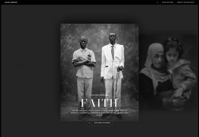
3. Black and white aesthetics
Sometimes designers try to reflect the mood through some trend, especially when it comes to color choices. The black and white color schemes that are now fashionable to use are darker, more minimalistic and less contrasting than they used to be.
The essence of the black and white trend is that now it can be used not only for photographers to design portfolios, but also for everyone else: whether it be a furniture design bureau, a website design agency, or resources with information about mental health.
Using this technique can cause problems with text placement and readability, as well as with the addition of color accents. Designers have a kind of struggle with the lack of color in order to create something attractive.
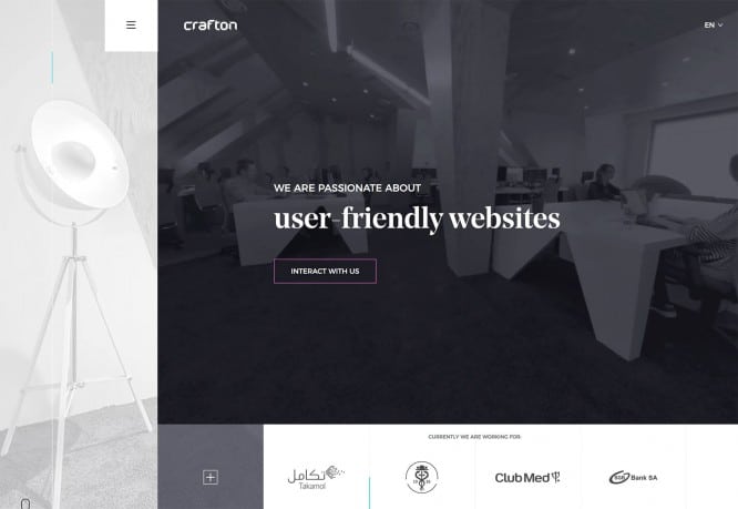
One technique that makes monochrome warmer is to use a brighter color mix for darker tones. Noble black can have red, blue, green, or any other undertone that helps create a slightly different mood. For example, in the combination # 000000 from the palette, there are no colors at all, it’s just black. And “rich”, noble black is already # 004040 and any other options.
The noble black has another advantage: it enhances the contrast between text and background elements, making the content easy to read.
Example
Crafton uses “rich” blacks combined with a subtle accent color around the button. The choice of this color makes deep blacks appear warmer and more attractive. Although the site is not full of colors inside, there are still a few bright design elements that are easily combined thanks to the richness of dark and color accents.
Noble black can serve as a transition between monochrome and more striking design elements.
All the trends of the month make the text more difficult to read, and this is somewhat unusual. These are design concepts that only work when perfectly executed and are only suitable for certain projects.
Output
Underline, overlay pictures on the text and repaint sites in black and white – and you will have designer happiness. Just make sure that nothing funny comes out of the text after all the overlays.
Source: blog.sibirix.ru
…

