
How to Use White Space Effectively in Web Design
How to Use White Space Effectively in Web Design
The Webest team has translated the article “How to Effectively Use Whitespace in Web Design” on the use of white space in web design to help focus users’ attention and place emphasis correctly.
When looking at a finished design concept, have you ever got the impression that something is missing? More specifically, have you come to the conclusion that the design is overloaded or empty?
It’s hard for us designers not to pay attention to such things.
One of the basic principles of our work involves the removal of voids with a creative approach. Despite the fact that he is the core of our activity, it is not so difficult to do it. How effectively do you use white space in your design?

Is there really an empty space?
Have you thought of gaps as spaces between designs? This is the most common line of thinking when it comes to discussing empty areas of our design constructs. But this approach is wrong. Gaps in design are not just fillers of space – they are its most important element in itself, which carries a semantic load!
Voids can be compared to mortar between bricks or glue in stained glass mosaics. Our eyes are trained to admire content blocks and stained glass. Whitespace is the filling between them that holds content areas together and helps shape the overall design direction.
Like a glue-free laid out mosaic, our designs without gaps will just be a color mess. When you understand the importance of so-called white space in design, you will be better equipped to use it in the most efficient way.
Focus
Now that we have figured out the importance of the gaps in our work, it remains to understand how to use them. To do this, let’s do the exercise. Open a new tab in your favorite browser and go to google.com. What’s the first thing that catches your eye? I bet you noticed the flamboyant Google logo, right? Where it is located? Of course, your eyes did not find it in the upper corner, although the search out of habit begins there. Why then did your attention immediately focus on the center of the page, bypassing the rest of it?
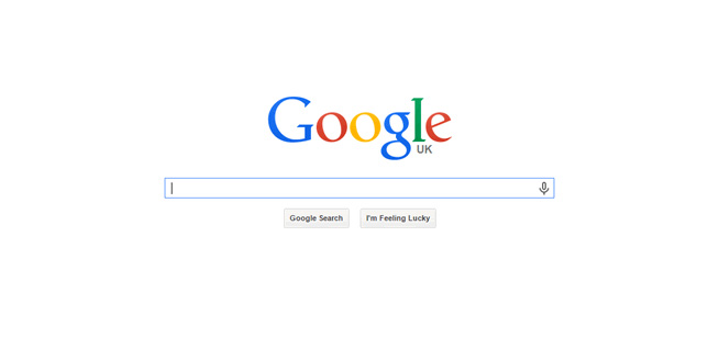
I’m sure you’ve got the point by now. Spaces. Google effectively uses white, white space to focus the visitor’s focus in the center of the page, where the gist of the page is. Whitespace is one of the simplest and most useful methods of manipulating your audience’s attention.
You can use them to place emphasis on the layout. By focusing the audience’s attention on these areas, we can highlight important content and more effectively convey its meaning to the visitor.
Organization
By directing the audience’s focus, whitespace gives designers an easy way to organize layout elements. Just as we use white space to separate blocks of text and improve the readability of important passages, we can just as effectively use them to highlight important blocks of a page template.
Here’s a handy tip for maintaining consistency when inserting spaces in your layout. They can be used to group content blocks. Make an effort to streamline, unify the use of spaces in indents, blocks, text, and graphics. Develop a single system of white-spaced content for all pages.
One of the nice things about spaces is that they are very easy to set up. In doing so, they can have an amazing effect. Don’t be afraid to experiment!
Accent
With the magical ability to direct the audience’s gaze to the right places, whitespace can really help highlight the most significant design elements. Based on the advice in the previous section, breaking up a continuous flow of content can quickly draw attention to the sections you need. Manipulate this property skillfully and accurately.
The systematic use of white space in your artwork will also help create style recognition in the eyes of your audience. As the visitor explores the pages you have assembled, they will develop a lasting impression of a branded, high-quality design. The hallmark of your work is the skillful use of empty areas to focus on the essentials.
A great example of the simplest implementation of this principle is to slightly change the spacing between the letters in the headings you want to emphasize. When you feel the effect, go further – try changing the amount of spacing between the sections of elements in your layouts. It will work.
The voids don’t have to be white
All of the above refers to the direction of the site visitor’s gaze. That is what using spaces is best for. Just because of the very name “space” does not follow the conclusion that it must certainly be white! There is no unwritten design law that enforces the use of one color, or no color at all, between key elements.

A great example to illustrate this is the Gucci Fashion Trend One Page. If you are limited to just one page of content, it becomes critical to make effective use of whitespace. This helps focus the audience’s attention on the product, as in this particular example. Blocks of content are often designed to create continuity between them – one flowing into the other in a logical manner. By changing the color of the empty space in them, you can achieve a selection of each area, while delimiting their significance.
But it already depends on the layout of the blocks and colors. This way you will achieve emphasis on the content of each block without mixing the entire page into a mess. Hopefully these tips will help you redefine whitespace in your design work and open up new perspectives!
Source: Spark
Original: Speckyboy
…

