How to make a million dollar logo if you’re not a designer
How to make a million dollar logo if you’re not a designer
What if you want to make a cool logo for your project, but there is no money for it? For the last ten years I have been designing, so I could always make a logo for my projects myself.
How can you make a cool logo if you’re not a designer?
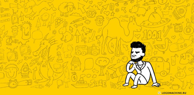
Most turn to the nephew of a distant relative who seems to know how to use Photoshop or is just good at drawing. But I advise you to take this issue into your own hands, and, even if this is your first and possibly the last logo, it will be on a par with Sony and Facebook! You will proudly put it on the site, and no one on the Internet will guess that you cat not a designer.
Here are two simple rules I came up with. They will help you make your own million dollar logo:
1. Start your journey to success with type logo
2. Focus on corporate identity, especially on a combination of colors
Let’s go in order. What is a type logo? This means that only the font part is used in the logo, without an emblem or symbol. Like Google:
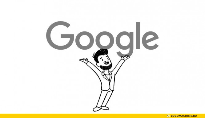
Why a font logo? But what about the badge? Doesn’t look rich somehow, won’t they laugh at me? Maybe add some squiggle?
Don’t panic! Using a type logo is like putting on a shirt and jacket for a business meeting. You can, of course, try to choose a sweater for jeans or come in polos and moccasins, but you need to have impeccable taste, otherwise you will look like a clown. The same is with the logo – if there is no professional identity designer at hand, it is better not to try to jump over your head. Just look at these pretty serious guys – they all use logos based on the same font, Helvetica:
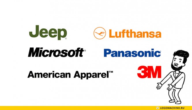
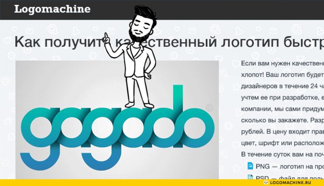
Maybe only large companies that already know everything can afford this? I don’t think so – in my opinion, the main thing in the logo is high-quality graphics and general impression. For example, Jeep and Lufthansa have emblems, but the font version of the logo looks solid. I sincerely believe in this and I myself used this approach at the start of my project. We started with this logo and it did not prevent us from receiving the first orders:
How to find the right font? You can go to wordmark.it and write in the field the name of your project – the site will show it with all the fonts that are on your computer. If that’s not enough, there are many free typefaces on fontfabric.com, including those with Cyrillic support. What’s wrong with free fonts? Nothing, use it for health.
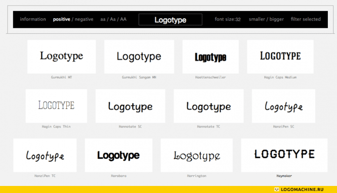
Which font should you choose? Here I also advise you to adhere to the rule “modesty adorns”. Look at all the options and try to get a feel for which one best captures the spirit and style of your project. Don’t look in the direction of unusual display fonts – they stand out from the rest, but more often than not they look out of place, like feathers from the Rio carnival on a morning run.
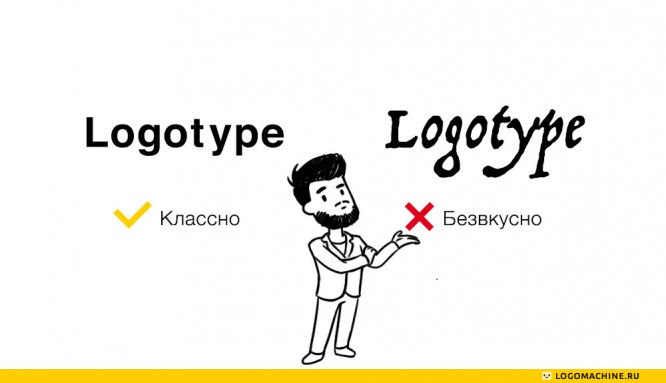
Resist the temptation to write the name of the project in CAPITAL. At first glance, such a spelling looks neater than lowercase, like a stable rectangle. But in reality, capital letters are perceived worse. If you still want to use only capital letters, increase the letter spacing – this will increase the readability of your logo, especially in small format.
The second important point for the design of any project, I called form style… What it is and how it will help your project become noticeable and recognizable, I will tell you next time. I can only say that the logo is not the main thing and by itself it will give little. No matter what marketers say, the formulas for a successful logo, which by its very appearance will lead a crowd of customers, have not yet been invented.
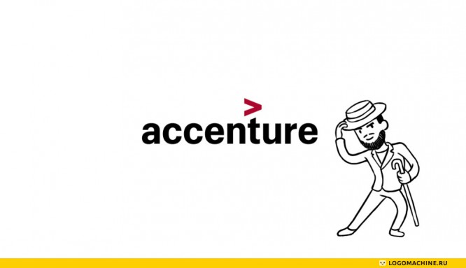
I have described a simple approach that will help you create a solid and neat logo and avoid vulgarity. Of course, to make a high-quality type logo, you also need a designer, but at the start of the project you can do without him – then you can play with fonts and come up with an emblem. And if it seems to you that the type logo is somehow not rich and the boys from the area will not understand, look at the logo of the Accenture company, which invests millions of dollars in its corporate identity:
Happy design to your projects!
Source: habrahabr.ru
…

