
How not to screw up the design
How not to screw up the design
Translation of an article by Mark Hemeon, founder of the design job search platform Design Inc.
The principles of good design can be learned and used by anyone. This guide will provide you with basic design knowledge and practical design tips that you can immediately apply (and impress your design friends).
If you don’t believe you can easily learn design like this, remember what Foo Fighters vocalist Dave Grohl said about learning new things: “I’ve never taken drum lessons. I never took a guitar class. I just got it all by myself. It seems to me that if you like something, you are motivated and focused on what you want to achieve, then you can do anything in your life. “
Let’s keep these words in mind. Well, are you ready for the intensive? All the rules below are given in no particular order.
1. Use more contrast
The background color and font color should be contrasting enough so as not to strain the eyes. The most legible combination is black text on a white background. Stay away from light gray, yellow, and green colors. Keep in mind: if you squint to read the text, you have a problem.

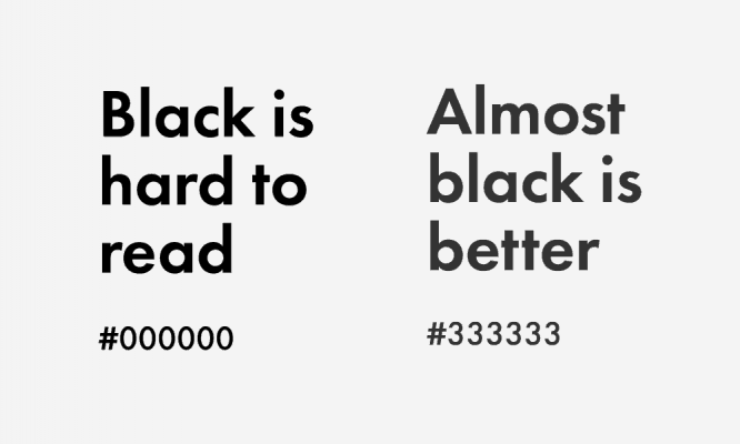
2. Almost black is perceived better than black
If you have a choice, try using # 333 333 RGB (51,51,51) instead of pure black for your text font. It’s just that black text on a white background is a little dazzling in the eyes, as a result, it is difficult to focus on the letters.
3. Important content – to the beginning
Place the most important information at the very beginning to immediately indicate the purpose of your site or application. Everything should be clear to the user without zooming, scrolling or clicks.
Let’s take a look at some examples of good hierarchy.
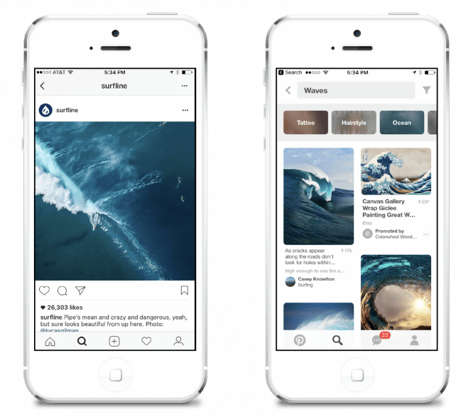
Instagram clearly focuses on a photo or video posted by a user.
Pinterest creates a visual hierarchy by pinning the search bar to the top of the page, followed by their nice grid of pictures. Pinterest deliberately places the search bar at the top – this is the very first thing a user sees.
Search is the main function of the service, as people use Pinterest to learn new things and see results.
Let’s look at two more examples.
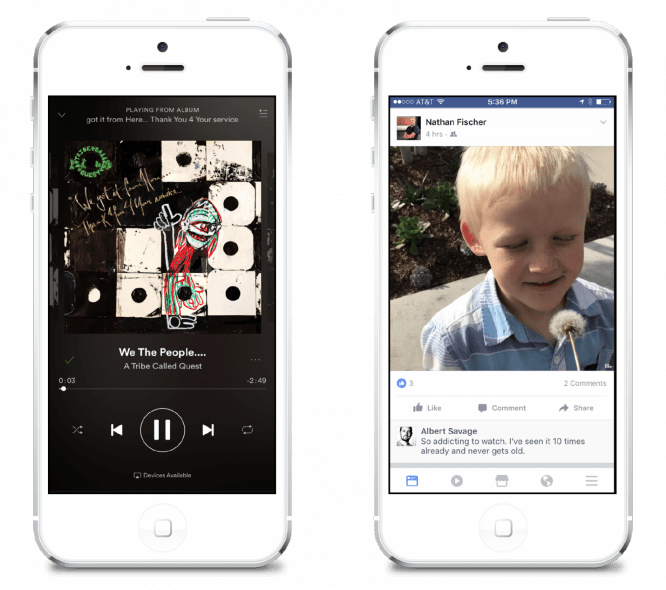
Spotify clearly pays a lot of attention to band covers, and also shows the song title first and then, just below, the control panel. And even here – in the control panel – there is a hierarchy. The play and pause buttons are highlighted in the background of rewind and fast forward.
Facebook uses the same tactic as Instagram – it shows content from your friends in the middle and full screen.
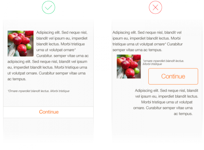
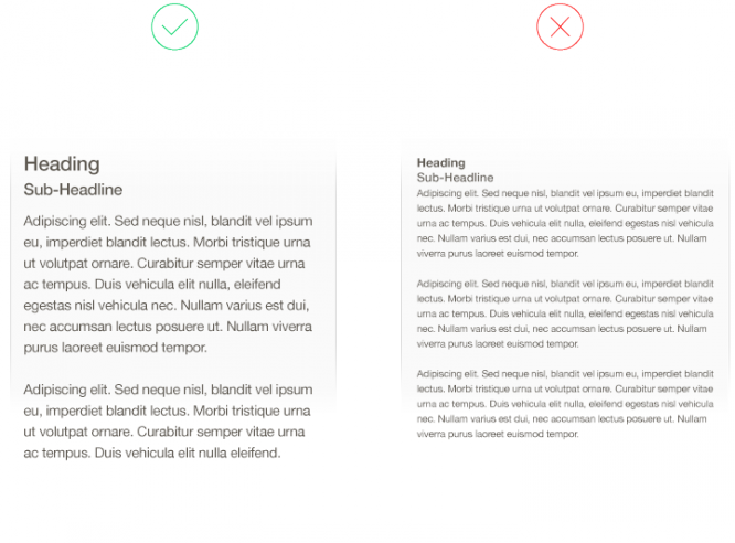
4. Align everything
The quickest way to fix what looks bad on your site is to make sure everything is aligned. When designers talk about the need to use a grid, they are trying to alert the team that there is an alignment problem.
Align Content is one of the fastest improvements and applies to any application or site. Everything will look 10 times better at once.
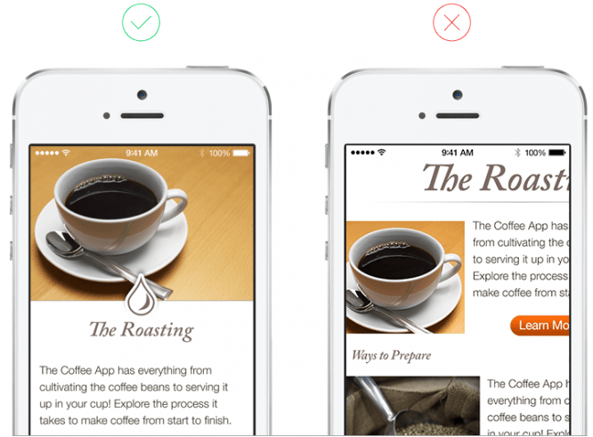
Let’s take a look at another example of alignment, this time from Medium.com. This web layout I borrowed from Medium.com – how do you like it? Don’t you have the feeling that something is wrong with him?
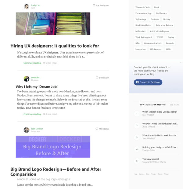
Hint: Notice how the text is aligned to the left. What do you think it looks like?
Below on the left I marked the “visual river” – all the bends that resulted from misalignment. On the right, I just moved the main blocks to the left.
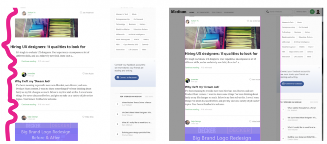
The shaky alignment on the left creates a river effect, while the alignment on the right is more stable.
Bad alignment on the left, corrected version on the right.
5. More air in the text
We are not building websites for ants. If you increase the font size and line spacing, the text on the site will be much easier to read.
Good font size and bad.
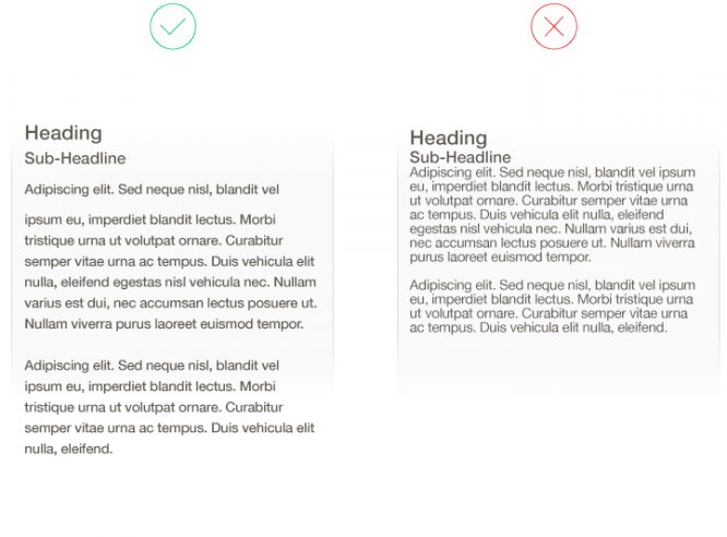
Good line spacing and bad.
6. Use a list to show results if order is important
Most mobile applications and websites have some form of search, and there is always a lot of controversy in the design – how best to display the results.
If hierarchy is important in SERPs, a list is the most effective solution.
If order is not so important and you want to inspire people to learn more (like Pinterest or AirBnB), then the grid results are better perceived by the eye and motivates to search for more.
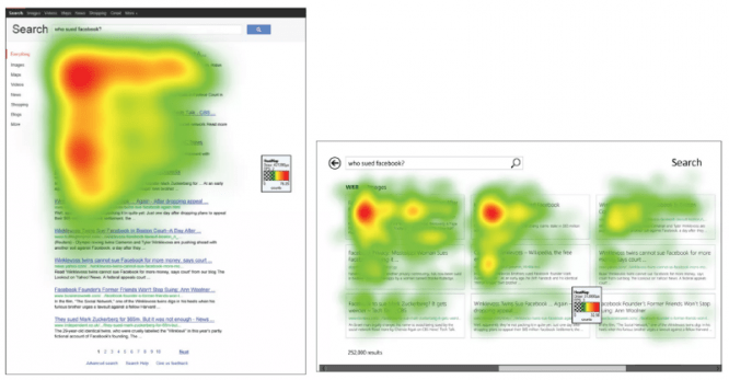
How users view search results in a grid.
7. Design black and white first, add color later
When you design in black and white, you focus on solving problems and designing a product that the user will interact with.
Color elicits strong emotional responses and often interferes with our ability to focus on design issues.
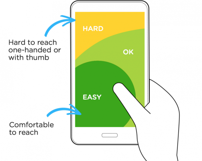
8. Create a comfortable design
The strain on the hand of smartphone users (that is, almost all people) is a real problem. Take a look at the graphic from Luke Wroblewski’s article below.
Luke points to an area of the smartphone that is easy to reach with a finger and where it is difficult – at least for a right-handed person. By the way, I really like the apps where you can switch the interface for right-handed and left-handed.
Many popular mobile apps put navigation and main functions in the bottom third of the phone.
9. Borrow color palettes
Colors are practically black magic. I highly recommend heading over to Dribbble and looking for color palettes there. Or use palette generators like Coolors or Color Claim.
Save your time from endless discussions and blind guessing.
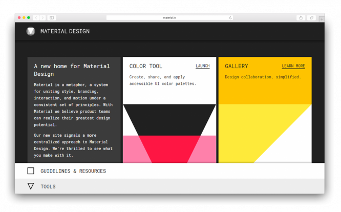
10. Use resources from Apple and Google
Apple and Google have created an incredible amount of resources for anyone building software on Android or iOS.
For example, Google Material has guidelines, resources, colors, icons, and other elements to help you build your app. Apple has their Human Interface Guidelines, which has all the information you need to know when building an iOS app.
Remember, design is practice
It takes time and practice to train the eye and learn to see controversial points in design. But you will notice that these 10 tips will go a long way with you and help you design your website or app better.
Source: tilda.education
…

