
Designing for the Web: What Colors Should You Avoid?
Designing for the Web: What Colors Should You Avoid?
Color is a great tool for grabbing users’ attention, providing visual interest and creating contrast (for readability). Color is at the center of many design trends, including flat and material styles.
But you may choose not quite the right color. Are there any shades or combinations that you should avoid? In a word … yes! Today we’re going to take a look at colors or color combinations that you should avoid when designing websites and applications. (But chances are that you have already made one of these mistakes and we want to make you alternative suggestions.)
Neon web colors

Neon colors can be interesting and very vibrant. Unfortunately, they are incredibly difficult to perceive by sight, it happens that the user feels that it hurts him to look at all this.
The problem with neon is that it is too bright to read and causes problems with dark or light background combinations. When used in text, neon colors tend to bleed into the background as it reads. A neon background often overpowers and distracts attention from the main message in the design.
Instead, try lowering some of the brightness of the neon colors so that they appear darker or lighter on the screen.

Orange does a great job of incorporating it into a series of “near” neon colors in your home page design. A common theme is that neon colors are used for smaller elements and subtle color changes that are easier to see.
“Vibrating” Colors

When brightly saturated colors are paired, they create a “vibrating effect” where colors almost seem to move in a blur or luminous motion. You don’t want it to be like this, do you?
This vibration can be unsettling for users, as outlined by theorist Josef Albers in his classic guide “Interaction of Color” – On the surface, this is an exciting effect, but later it feels aggressive, which often irritates our eyes. “Vibration effect” is rarely used in advertising, as most people do not like it, they try to avoid it. “
- High saturation of each color
- Complimentary colors on the color wheel
- Spaced 180 degrees apart on the color wheel
- Converting colors to grayscale, resulting in very little contrast
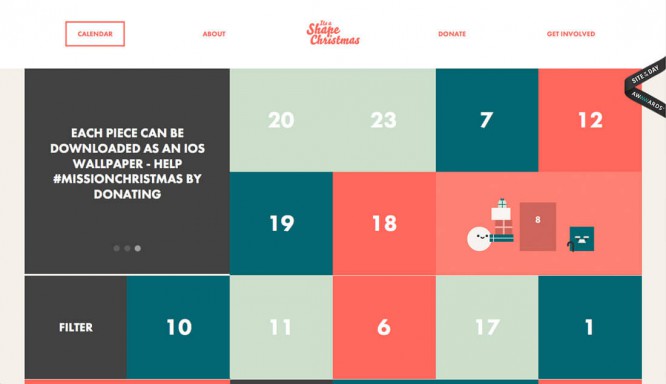
A classic example of using bright red and green. The popular Christmas combination is one of the biggest (and most widely used) color combinations. These combinations present an “accessibility” problem because they are illegible.
Try this instead: If you must use vibrant color combinations, separate them with something else (preferably neutral) and insert that in between.
Light on Light

This is one of those very common mistakes. Maybe it’s because of certain screen settings that make it usable, but light color combinations are just barely noticeable.
They are difficult to read.
This is where the biggest mistakes seem to be found: the Hero headers of this pair are the image and the white text, but the text falls through the lighter part of the image. At this point, the words are becoming unreadable. This happens more often than necessary. If every letter is not clearly readable, then you need to rethink it.
Fortunately, there is a fairly easy way to fix this problem:

Select a new image with a consistent color background.

Use a colored border for text over images with lots of color variations.

Consider a full color overlay on an image to increase the contrast between the background and text elements.
All the colors of the rainbow

While that goes without saying, rainbow sites just don’t work. Think about how many rules of color theory you break simply by imagining a rainbow.
Rainbow – Its color combinations are overwhelming. They can only attract the user’s attention at first.
Try this instead: If you want to use a large-scale color palette – and this tends to be – choose blocking colors or style maps where colors can be associated with elements. This container-type design will allow more flexibility with color, creating a sense of organization and flow.
Bright on bright / dark on dark

Just like light on light, a combination of such color saturations will cause problems. But this can be avoided.
If you think this won’t happen to you, be careful when using solid color schemes. This is where designers tend to make mistakes. (When in doubt, use more contrast.)

Try this instead: If you want to use some bright or dark colors, consider these as options for site scrolling screens. You can use whatever dark or bright colors you like and keep the site readable and usable.
“K” Black

In particular, if you cross between print and web projects often enough, as many designers do, pure black can slip through a web project by mistake. Known as “K” black in print projects because it uses only one plate or “pure” black (# 000000) in digital projects, this color is simply flat.
Think about reality, all black combinations are actually filtered with other colors to give it a rich hue. (Even raven feathers often appear bluish or more purple in the right light.) Use a black mix that includes other colors to create any rich dark color and keep pure blacks for printing.

Try this instead: Try adding shades and colors to the black that match your brand, or add just the right color shades. The more you add light to black, the faster it goes from black to gray. Consider black in combination with other colors, and think about the composition of each of them, and how they relate to each other. (For example, you can use black with a slightly bluish tone to compensate for orange or yellow tones for text or other elements.) For example, the color for miracles above is # 0a0a0b.
Cover photo: ShutterStock
Source: colorsweb
…

