Clarity, readability, brevity: seven principles of good icon design
Clarity, readability, brevity: seven principles of good icon design
Creating a high quality icon family requires thoughtful thinking, watching, a little repetition, and hours of practice. The material contains seven principles for creating high-quality icons and many examples.
Clarity
The main task of an icon is to quickly convey an idea.

Which of this group of symbols do you understand? Over time, drivers will be able to learn them, but some of these icons are not intuitively clear and will need instructions.
Let’s arrange them according to the level of clarity:
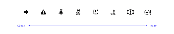
When an unfamiliar metaphor is used in an icon, it is difficult to understand. The seatbelt reminder symbol (third from left) literally represents the action, the user can quickly read it. The “signal from the electric power steering system” (far right) is much more vague.
The often confusing icon is simply frustrating. Misinterpreting warning symbols can be hazardous to driving.
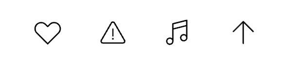
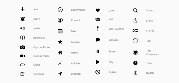
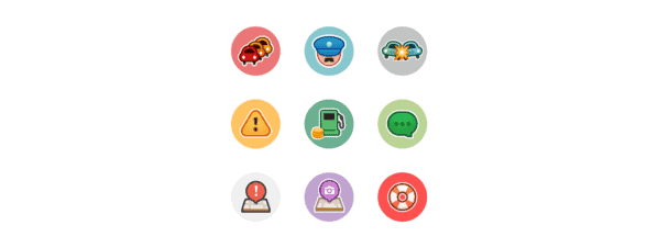
Here are some of the icons that seem the most familiar – Love, Warning, Music, and Up / Forward icons:
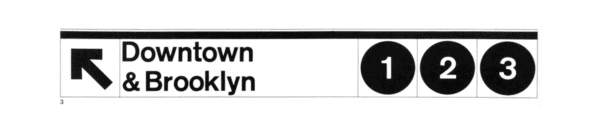
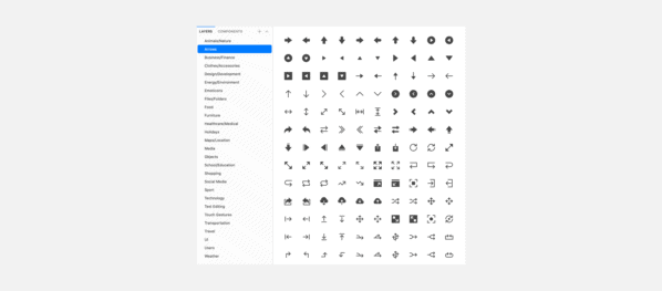
An arrow is a strong symbol that is used to show direction:
The most successful icons are easily understood not only by a separate group of people, they are universal for different cultures, ages and backgrounds. Study your audience and use metaphors and colors that resonate with them.
Remember that the icon itself may not be the most understandable solution if the idea being presented is too abstract. In this case, you can add a text label or find an alternative.
Readability
When there is a readable symbol, you need to make sure it is human readable:
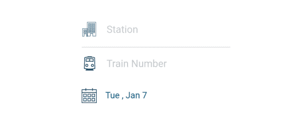
The Station icon in the Amtrak app (first line) is difficult to see because it has a lot of small details.
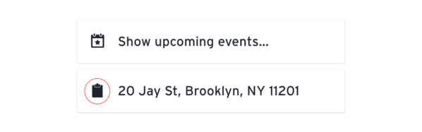
The Transit app has a similar problem. The clipboard icon reads like a smudge because the space between the tablet and the clip is too small:
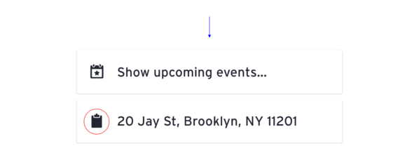
A small tweak will significantly improve the icon:
When working with multiple shapes, leave enough space between them. The large number of thin lines makes the icon cluttered and difficult to read.
Google Maps did an excellent job – the travel time icons are easy to read at a small size:

Alignment
To make sure each icon looks balanced, optically align its elements:
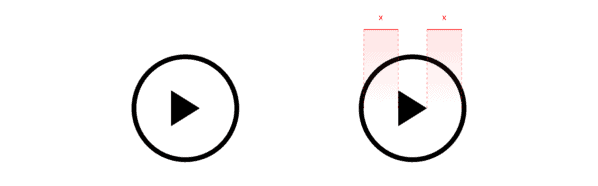
In this Play icon, the triangle is in the center of the circle, but to the user it appears to be offset. The left side of the triangle appears to be “heavier” and shifts to the left.
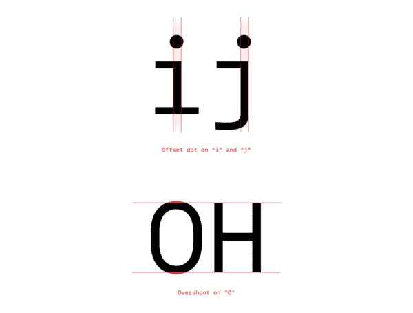
Likewise, type designers fine-tune the optical balance in the typeface (note the off-center dots above the i and j and the indentations at the o):
Icon designers make similar adjustments to balance the icon. To fix the above example, let’s move the elements a little:
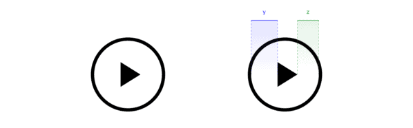
Lesson: do not blindly trust the numbers, but check your work “by eye”.
Brevity
An idea expressed in a few words looks more efficient and elegant. Look at the statement, “Teaching others what you know strengthens your own understanding of the subject.”
You can put this idea more succinctly, as the writer Robert Heinlein did: “When one teaches, two learn.” Perfectly.
Material Design shows the principle of brevity well in their icon guide. Instead of saying:

Simply put:

Conciseness is needed in icon design, as designers often work with small spaces. Use the details in the icons correctly and do not overuse them.
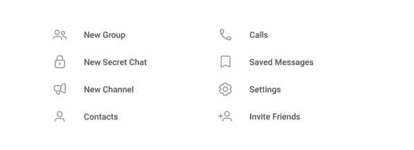
In user interfaces, simplification helps clarify meaning and make room for content. Telegram icons are laconic and nice:
Sometimes icons in interfaces are more like illustrations. Yelp’s multicolor icons are delightful images of popular products. The shrimp in the Thai food icon is adorable:

Icons for mobile, desktop, or tablet apps can be used to add more depth and color to icons. Because users understand context on a screen or in an app store, icons can be more expressive.
Sequence
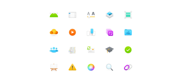
To achieve harmony for a family of icons, follow the same stylistic rules. Apple used all sorts of strokes, fills and sizes for iOS 13:
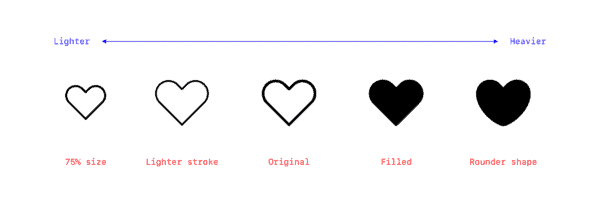
Take a look at this set. Do some icons feel “heavier” than others? Any icon has a visual weight, which is determined by parameters such as fill, stroke thickness, size, and shape. To achieve consistency, these parameters must be kept the same.
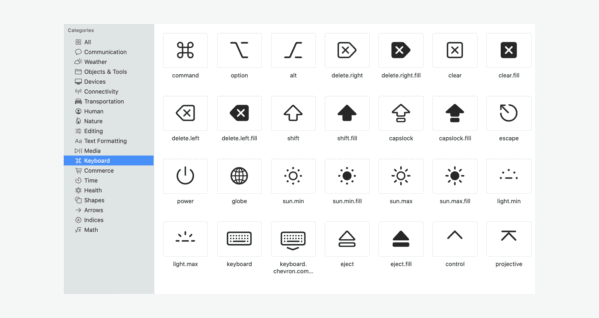
Apple recently released an introduction to SF Symbols, which includes an icon style in nine weights and three scales (a slightly complex but detailed guide, perhaps). The icons look more harmonious.
Keeping a large family of icons consistent is not easy, especially when multiple designers are working on them. With this kind of work, it is important to have clear principles and rules to be followed.
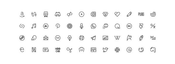
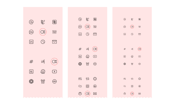
The Phosphor Icon Set, designed by the author and Tobias Freed, includes over 700 icons. Although they each have a different shape, the icons have the same weight and look good together:
Individuality
Each icon set is different. What makes it unique? What can he tell about the brand? What mood does it create?
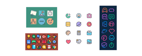
Waze’s interface relies heavily on icons. These colorful icons seem to say, “We’re freaky!”
Twitter icons are soft, light and crisp:

Sketch icons are subtle and airy:
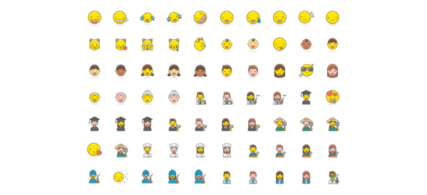
Freemojis icons are cute:
Android icon packs are designed for different home screen themes. Below are the icons in Abstract, Pixel, Bubble and Neon styles:
Ease of use
The process of creating icons does not end after they have been perfectly drawn. Further testing and post-work is needed so that designers can easily create new icons and use them in their projects, and developers can code.
A quality icon set is organized, well documented, and tested in context. It is good if it is supported by special tools such as an icon manager.
Organization
Keep the main file “clean”, name assets correctly, and place them in a way that is easy to find. Consider the best way to create categories. Alphabetically? To size? Type?
Document creation
Formulate the basic principles of the icon family. For example, the principles of Phosphor icons:
- Comprehensibility. First of all, the idea must be clear. Make icons recognizable and readable. Never sacrifice clarity when naming a symbol.
- Brevity. Use as little detail as possible. The Phosphor style simplifies. Be concise and count every stroke to convey the message.
- Form. Be quirky. Add unique details carefully to liven up the icons without being overly restrictive.
List the technical rules. For example, for Phosphor it is:
- Canvas 48 × 48 px.
- 1.5 px center stroke.
- Rounded ends.
- Continuous lines, except when broken segments are necessary for understanding.
- Straight segments, perfect bends and 15 ° increments where possible.
- Adjust curves as needed to follow design principles.
- Use whole, even numbers whenever possible, reduce to 1 px and 0.5 px if necessary.
- Stick to the outline of the lines: 28×28 px circle, 25×25 px square, 28×22 px landscape, 22x28px portrait.
- Keep the crop area 6 px thick.
You can make the documentation publicly available, for example:
- Material System icons.
- IBM Icon Guide.
- Shopify Polaris icons.
- Atlassian Icon Guide.
Testing
Check the sequence. Make sure the icons work in context, they are the same size, and that they blend in harmoniously with the visual system.
It is helpful to place icons next to each other to test the principles outlined above: clarity, legibility, alignment, brevity, consistency, and personality.
Special tools
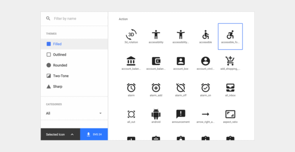
Finally, if you can, create tools to make icons easier to use. Material Design makes icons easily accessible with its own library. Find the icon you want and load different styles, colors and sizes in the selected file format:
A set of icons – a living creature. Give him the love and tools he needs to succeed and grow.
Resources
Icon Libraries:
- Feather is a set of over 200 minimalistic icons that scale well.
- Material system icons – over 1000 utility icons for the interface in five styles.
- Nucleo – a set of over 30 thousand icons in three styles.
- Streamline is a beautifully drawn set of over 30 thousand icons in three scales.
Icon aggregators:
- The Noun Project is a great way to find inspiration in different styles and metaphors.
Icon managers:
- Nucleo is an application with which the user can import, view and perform other actions with icon sets.
Source: vc.ru
…

