
Brand like a grown-up: 5 tips from Chris Moody
Brand like a grown-up: 5 tips from Chris Moody
Wolff Olins Creative Director and 2015 Brand Impact Awards Judge Chris Moody, to whom the world owes brands like Skype and Sony Ericsson, shared five principles of effective branding.
The power of incompleteness

In the modern world, the best work is those brands that leave the target audience room for maneuver, are unfinished. A good illustration of this is the current Virgin Media logo, reduced to a stylized infinity symbol. The effectiveness of such a solution is explained by the widest possibilities for the unhindered reproduction of such a logo with minimal means, including children.
In addition, a dedicated smartphone app reveals the interactive side of the brand, allowing consumers to customize the visual as they see fit. Do not underestimate the pragmatism of such a measure: among other things, using the application, the company receives feedback from users, incentives and ideas for new achievements.
Don’t be arrogant

Gone are the days when an advertising agency could go into the shadows for several months, resting on its previous laurels. With the development of social media, their integration into the everyday life of more and more people, the threshold for stimulating customers to perform targeted actions is constantly increasing.
More than ever, designers and representatives of related professions in the current conditions need to stay in good shape, be flexible enough and to a certain extent dodgy to be successful.
Context is key
Yes, branding is an industry with very blurred boundaries and functionality, even in relation to one or another narrow specialization, the interpretation of a brand as a product of labor may differ. This is why the first questions a branding professional should ask should be “Where is the brand located? Is it a thing in itself? Does it affect the surrounding space? “
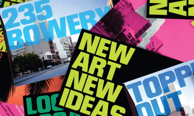
Looking ahead, it affects. An example is the work done for the New Museum of Contemporary Art in New York. The task of the animated logo, by the way, close in scale to the installation, was to attract new residents to the museum – representatives of art, artists – and, of course, visitors.
The brand more than coped with its mission, thanks to its contextualization, turning the site for a rather limited circle of people into a cultural center of the city.
Follow the butterflies

In our work, it is fundamentally important to combine our own capabilities and talents with the actual needs of the outside world. At Wolff Olins, such a compromise, in every sense a good one, is called a “butterfly.”
When working on a brand, you must understand its purpose. There are many great projects, but do they all bring something valuable to our lives?
Element hierarchy
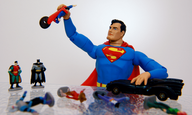
Brand consistency should be achieved early on. So, if the key characteristics of a product are globality and versatility, and the corporate identity is tied, say, on the image of a hero, general and specific color solutions fade into the background and should be completely subordinate to the question of practical application. Think of the brand as a mixer: you won’t get high-quality sound by turning all the sliders to the limit.
Author: Denis Strigun
…
