Behance_vs_Reality
Behance_vs_Reality
If you’ve found your niche in design and the crowds of customers want to buy exactly what you do, congratulations! Then I have to disappoint you: this post will not be very useful to you. This will be a very controversial opinion of a guy who, during his modest career as a designer, made a couple of conclusions for himself.
But, if you are at the very beginning of the path or unexpectedly for yourself at some point realized that you are doing something wrong, then you can learn something useful.
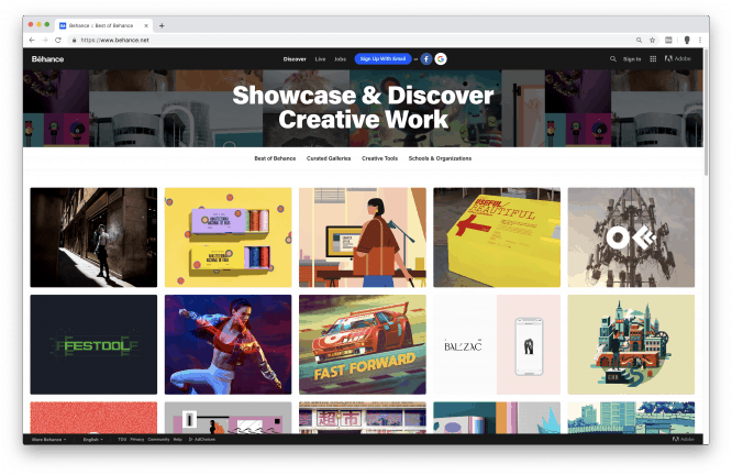
Two years ago, when I was just starting to do commercial design, Behance was a design mecca for me: I considered the top works posted on this resource, the ideal to which everyone should strive, and everything else was hopeless shit.
I succumbed to the most important deadly sin of a graphic designer – to consider beauty and aesthetics as the only quality criterion. How badly I was wrong!
Having worked with fifty clients from various fields and businesses, I realized that design is not divided into high-quality and low-quality. There are only two types: selling and fashion. For making money or for show-off. To sell a product or flaunt a presentation on Behance. And only in the second case, beauty is a significant criterion.
Earlier, when I started working on the next project, I did everything except the main thing: I did not put myself in the shoes of a potential consumer. But it is for the consumer that the design is created. Not for my portfolio, not for the medal on the bihanse and getting into the “popular” on dribbble. And for the consumer. Who is this consumer?
A consumer is a person who has something wrong: his back hurts and he wants to buy a remedy for suffering, he is tired of the hated job and he longs to take business courses, feels a sense of loneliness and will gladly attend the seminar “How to find your second half”.
The consumer is not interested in the aesthetic component of the design: he is impressed by the smiling people from the photo-banks, he considers the contour icons from flaticon to be original and, perhaps, deep down he even loves Comic Sans. He’s not interested in parallax, sliders, Swiss typography, animation, and other fashionable bullshit.

The consumer does not fall into wild ecstasy from huge negative spaces and a subtle gray headline against a white background. The consumer is much more happy to “swallow” white text with a black outline against the background of a translucent photo than a strict welcome screen with a uniform fill. The consumer would rather understand the primitive heading “We create and promote websites” than “Digital production”.
He doesn’t care much about trends in graphic design, he doesn’t see the difference between flat and isometric. 90% of the efforts of designers go unnoticed by everyone except the designers themselves.
All that is really interesting to the consumer is to understand as soon as possible whether the site will solve his problem or not.
The designer in this case acts as a translator between the business owner and a potential consumer, a person who, using visual means, helps the visitor to solve his problem. That sympathetic guy who will help the murky guys near the garages to find the bookmark, that good Samaritan who, at the right time, will get a passport at the checkout and buy teenagers alcohol.
I will not provide figures showing how design affects the purchase abandonment rate. I just do not own such data, but I can say for sure that if the design confuses the consumer, then the probability of a purchase is low.
When the task is to make a selling design for a mass audience, it is important to be able to kill the “designer” in oneself and learn to see the product through the eyes of an ordinary person who watches TV, drinks beer and swears at Obama on the rear window of his car bought on credit. A person who does not put spaces between em dashes and drives the site not in the address bar, but through a Google search.
This does not mean that you do not need to be creative. A lot is needed. It is important that the desire to do something creative does not conflict with the goal of making a working product.
Source: DesignKabak
…


