
How to enhance attention with color contrast
How to enhance attention with color contrast
Contrast – the fundamental foundation of web design. The difference between two or more elements is called contrast. Contrast can be created using the following techniques:
Today we will focus specifically on technology. color contrast. The combination of different colors will help to visually divide the page into blocks and create a contrast of the key elements of the site.

The main purpose of color contrast– user attention management. Color will help strengthen important elements, and at the same time muffle minor.
It is important to make yourself a rulehighlight only those elements on which we want to focus the attention of the site visitor.
If you select a lot of elements, then defocusing will occur, and your eyes will have nothing to catch. Thus, the user will start to get lost in the information provided.
As an important element, you can highlight the call-to-action button:
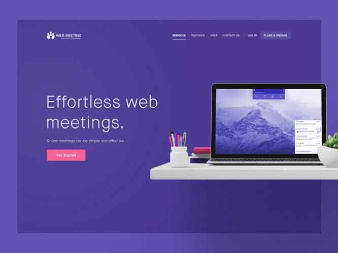
Color contrast allows you to build a hierarchy on the site and helps to switch attention between blocks:
What does poor color contrast lead to?
- Deteriorating website perception
- Loss of visual hierarchy
- Difficulty reading page content
- Loss of focus on key elements
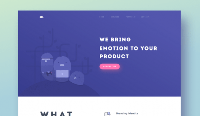
Let’s consider the problem of insufficient contrast with a real example:

In this example, an aspiring designer decided to make a website in calm, neutral colors. As you can see, due to poor contrast, the site’s responsiveness has worsened and attention has been lost on the main elements.
What can be done?
To begin with, let’s highlight the important elements of the site on which you need to focus.
In our case, these are the menu, text links, and a call-to-action button. It is these elements that should contrast with the main background.
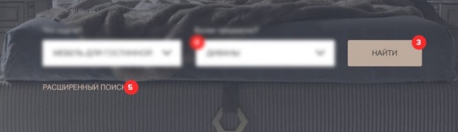
In this screenshot, I have highlighted the points that can be improved:

The main contrast must be created between background menu (1) and background of the main screen (2), that is, visually separate these blocks.
Alternatively, you can darken the background of the home screen and lighten the menu. Thus, we will improve the readability of the text in two blocks. Another option is to make a dark menu with white text.
An example of good contrast between menus and main content:

Button color (3) and text links (5) you need to make them bright in order to create maximum contrast with the background and make them stand out from other elements of the site.
An example of background and button contrast:

Selection fields (4) in this case, they create the same contrast with the background and take all the attention, although these are secondary elements. Therefore, it is better to dim the color towards gray or try to make the margins a stroke.
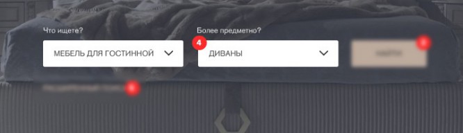
Example of select fields:

Concerning header (6), then here you can also add contrast, and change the color to white.

Concerning header (6), then here you can also add contrast, and change the color to white.
An example of the contrast of the header and the main background:

Outcomes
Color can be a great tool for achieving various web design goals. Thanks to the correct placement of color accents, you will be able to control attention and build in the user’s head the correct understanding of which elements are important and which are secondary.
Source: Medium
…

