
Balance in composition: how to balance the design?
Balance in composition: how to balance the design?
An unbalanced design subconsciously annoys users. How do you create an attractive balance?
Balance is one of the most important elements of a composition.
Balance is the juxtaposition of elements that creates balance and harmony. The state of balance is intuitively comfortable for the viewer.
The human body is symmetrical vertically, and our visual perception corresponds to this. We like objects that are balanced around the vertical axis. We always tend to balance one strength with another.

In a design context, balance is based on the visual weight of the elements. Visual weight is the amount of attention the viewer gives to the image. If the site is balanced, visitors subconsciously feel comfortable. The balance of the site is perceived as a visually proportional arrangement of its elements.
How do you balance your website?
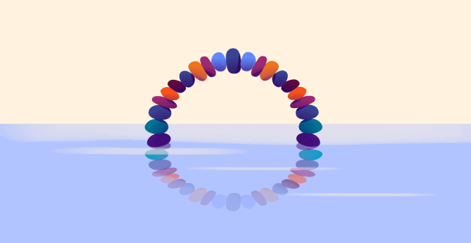
1. Symmetrical (static) balance
The most common example of balance is symmetry.
Symmetry is visually pleasing on a subconscious level as the composition looks organized and harmonious. Symmetrical balance is created by placing elements evenly on either side of the horizontal or vertical center axis. That is, both sides of an imaginary line through the middle of the page are actually mirror images of each other. Some people think symmetrical balance is boring and predictable, but it has stood the test of time and remains one of the best ways to create a sense of comfort and reliability on a page.
2. Asymmetrical (dynamic) balance
A composition with unequal side weights has an asymmetrical balance.
Dynamic balance is always more interesting than static balance because it stimulates the mind. In the absence of balance, our gaze begins to reflexively seek a counterweight, and this is a great reason to draw attention to that part of the page that could go unnoticed. An emphasis should be placed here, then attention will grab onto it, like a lifeline.
Often this counterweight is a button and / or heading.
Important information (or a call to action) should be used as a counterweight.
The sharper the asymmetry, the more the viewer seeks to find out its cause (to study the counterweights). People instinctively study such an image more closely. However, a sense of proportion is needed here – too eccentric composition is not always well received.
3. Radial balance
A type of balance in which visual elements diverge from a common center point. Radial balance is rarely used in design. Its advantage is that attention is easily kept in the exact center of the composition. This is usually the most visible part of it.
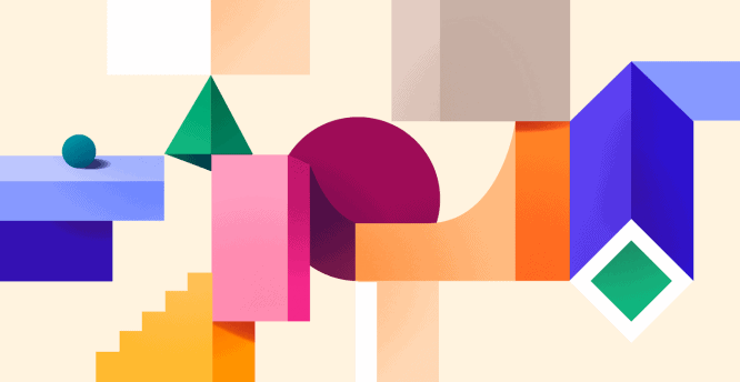
4. Mosaic balance
It’s balanced chaos, like in Jackson Pollock’s paintings. Such a composition does not have prominent focal points and all elements are equally responsible. At first glance, the lack of hierarchy creates visual noise, but all the elements are combined and form a single whole.
Secrets of Visual Balance
When talking about the balance of forces in a composition, they are often compared to the forces of the physical world: gravity, levers, weight and fulcrum. Our brains and eyes perceive balance in a form very similar to the laws of mechanics. It is easy for us to imagine a picture as a flat surface, balanced like a scale. If we add an element to one edge of the image, then it will upset the balance, lose balance, and we will feel the need to fix it. It doesn’t matter if the element is a group of hues, colors, or dots. The goal is to find the visual “center of mass” of the image, its center of gravity.
Unfortunately, there is no exact method for determining the visual mass of an object. Typically, designers rely on their intuition. However, there are useful observations that can help with this:
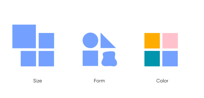
- The size
Large items always outweigh.
- The form
Irregularly shaped elements appear lighter than regular shaped elements.
- Color
Warm colors are heavier than cold colors.
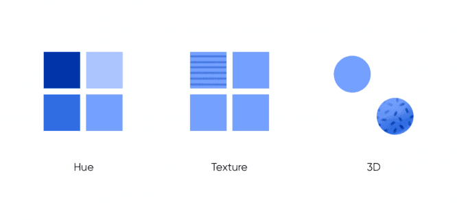
- Shade
Dark objects weigh more than light ones.
- Texture
Textured objects appear heavier.
- 3D
3D objects appear heavier.
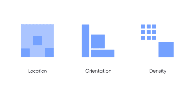
- Location
The further the object is from the center, the greater its visual weight.
- Orientation
Vertical elements seem to be heavier than horizontal ones.
- Density
Many small elements balance out one large one.
- Internal interest
The complexity of an object gives it more visual weight.
- Filling the space
Positive forms weigh more than negative space.
- Perception physical weights
The drawn kettlebell seems heavier than the drawn pen.
Let’s summarize. When symmetry is used, the result demonstrates professionalism and a serious, sustainable approach. Asymmetry techniques attract interest, express individuality and creativity, and focus attention.
Source: ux.pub
…

