Anchor objects: balance in composition
Anchor objects: balance in composition
Balance composition is a requirement that forms the correct focus of the user’s attention and clearly conveys meaning and information. There are several ways to achieve balance in a composition, one of which is anchor objects.
So, anchor objects are the logical arrangement of visual elements on the page, or they are a way to highlight an object using its location.
 https://dribbble.com/shots/2830781-Giant-Store
Anchor objects, or more simply – “anchors”, from the first seconds of studying the site help to catch our eye on important elements. It is they who form the initial level of perception of the site for the user and help to find the necessary information natively.
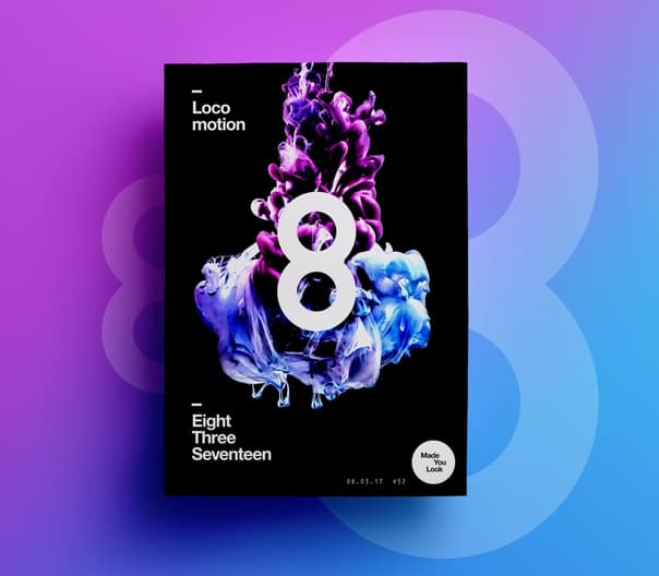 https://dribbble.com/shots/3345010–Made-You-Look-52-Locomotion
Any objects can act as such elements: graphic (illustrations, pictograms, factoids, logos, etc.), text (headings, subheadings, body text, tags, etc.) or the images themselves (photographs, geometric elements, etc.). P.)
Location of anchor objects
Since our screen sets a constraint for modular layout (rectangle), the placement of “anchors” should visually support this format. There are two main ways to create this effect.
“Placement by points”
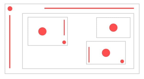
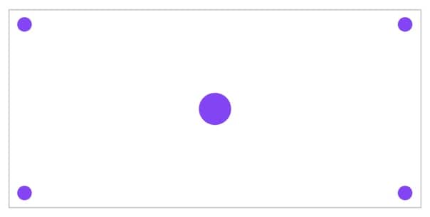 Anchor objects are anchored to one of the corners of the rectangle or its visual center
The name itself speaks for itself – visual objects are placed at certain points in the workspace. This method is good when you need to place point objects.
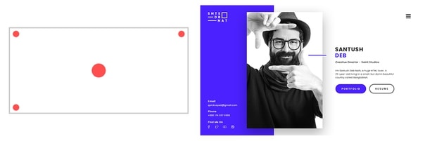
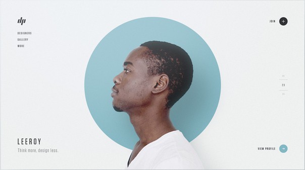 https://dribbble.com/shots/3299965-Designer-Profiles-Part-3
Elements are located at all anchor points.
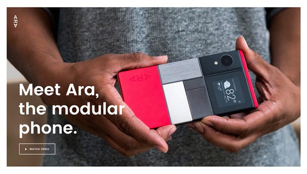 http://atap.google.com/ara/
This composition uses the lower left and upper left corners.
 https://dribbble.com/shots/2566950-Hello-Dribbble
And here are the upper left and lower right corners.
One of the important points in the placement of anchor objects is the presence of “air” around them, that is, visually separating them from other elements. This is achieved either by counter-space (there is a lot of empty space around the “anchor”), or by using “less dense” objects (which are visually weaker: smaller size, weaker in color, thinner style, etc.). Now analyze the top examples again.
There are a few examples in which the rule of anchor objects is not fully or partially fulfilled.
 UI marathon educational work
In this example, the main screen was not designed according to the “anchors” rule. The title should be placed in the center of the screen, the menu – in the upper right “anchor”. And the signature inside the button should be made smaller.
 vk.com/UI-marathon educational work
And this is a vivid example when the placement of elements is done in an arbitrary order. How easy is it to perceive information in this format?
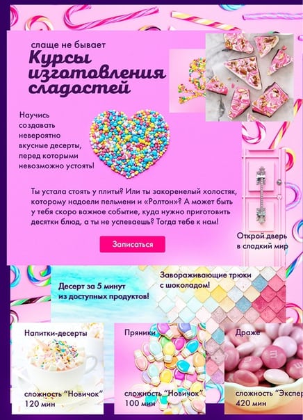
 https://www.behance.net/gallery/28952225/Leading-celebrations-Abramovich-landing-page
In this example, the errors are more than obvious. The main problem is that the author tried to highlight all the elements of the screen, to make them visible. And because of this, there is little “personal” space between the elements.
“Placement on the sides”
 Placing items on the peripheral sides of the rectangle
The second way is tied to the placement of elements on the peripheral sides of our format. This placement is great if you need to place emphasis in the center of the screen.
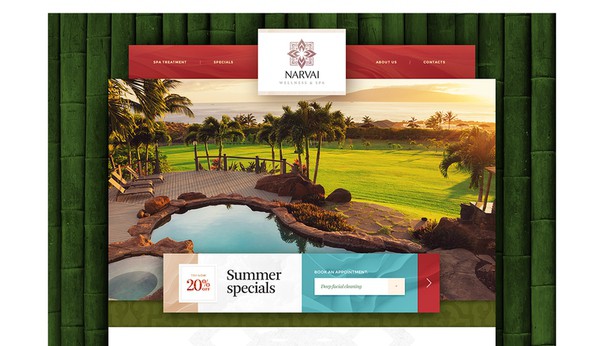 https://dribbble.com/shots/2233029-Narvai-Wellness-Spa
Top and bottom of the screen. Main focus on photography.
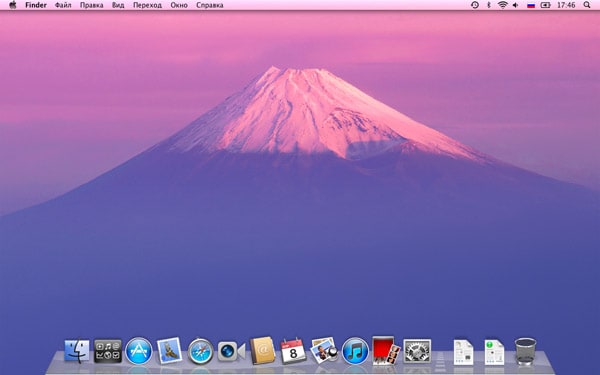 http://macdaily.me/news/ brief- review-mac-os-x-lion-developer-preview-install-loading/
An example of using the rule in everyday life. Mac OS desktop.
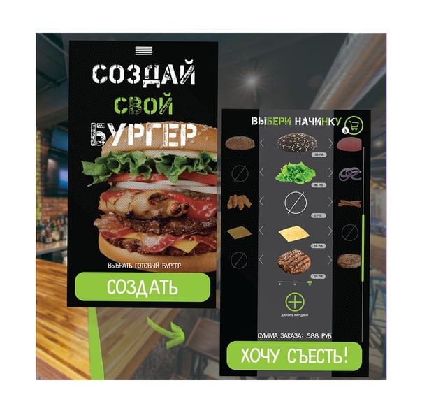
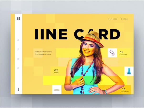 https://dribbble.com/shots/3408507-iine-card-landing-page-concepts
Navigation elements are located on the sides, which does not distract the user from exploring the main screen.
A little practice
 “Location by points”
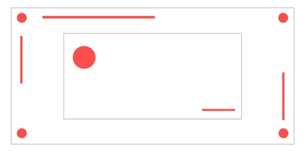
The main anchor is the image based in the center of the screen. The rest of the elements are distributed in the corners, thereby visually forming the screen format – a rectangle.
 “Location by points”
Central composition and additional “anchors” in the corners of the format. The absence of an element in the lower right corner does not interfere with visually drawing the rectangle.
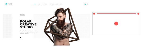 https://dribbble.com/shots/2253726-Polar-Creative-Studio
This example shows a combined placement of the main center anchor, top corners, and side of the screen.
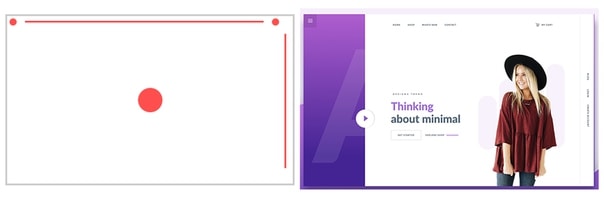 https://dribbble.com/shots/3514360-Minimal-Concept
The same combined option. Navigation is located on the right and top side of the format.
By placing the elements in the anchor places, the composition looks visually “correct”, more professional and perfect. Our consciousness feels comfortable when it finds a pattern in the arrangement of elements.
After mastering the basic ways of placing anchor objects, you can move on to more interesting combinations.
At first glance, the logic of the arrangement of the elements is not clear. Let’s see and try to apply our rule.
A complex combination of “anchors” is used here. At the same time, the general sensations from the screen will be: professionalism, confidence, rigor, ideality. That is, in addition to the above properties, our rule is still capable of creating a mood in the composition.
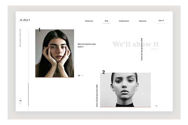
In this example, the pattern is much clearer. The description, together with the tag, forms the main “anchor” and is located in the upper left corner of the inner composition. Additional elements define the geometry in the format.
When creating any composition, it is important not to forget about the geometry of our format. In any work, this “thread” should be traced, even in the most non-standard ones.
 https://dribbble.com/shots/3142179-Apollo-11
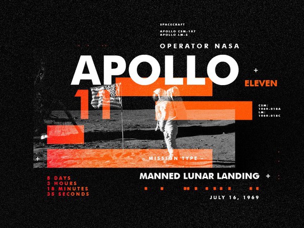
 An example of creating an indoor unit using “anchors”
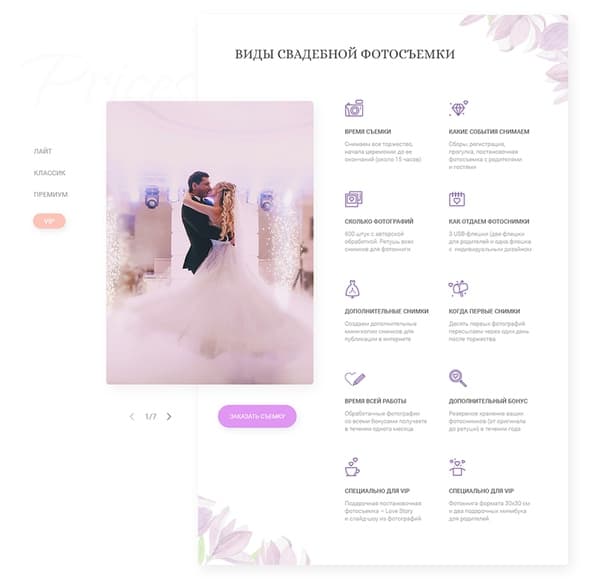
Improving work with anchors. It was, it was
 It was
So, the main mistake is that the size of the date is close to the size of the title. In addition, attention is defocused due to the arbitrary placement of elements. Let’s start with a prototype.
 Became (educational work of Alexandra Karnevich)
What changes were made: highlighted a clear “dominant”; added contrast between headline, caption (which became a tag) and main information; placed the elements in place of the “anchors”. The information on the banner has become simple and understandable to study.
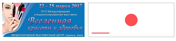
 Academic work of Alexandra Karnevich
The main information of the event is not readable due to semi-transparency. The image is taking too much attention. In addition, the elements do not respect the hierarchy (that is, the importance of the elements).
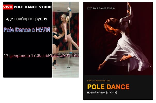 Educational work of Varvara Panyukova
All elements are at anchor points. Additionally, through the contrast, the importance of the elements was determined, the main and secondary information were highlighted.
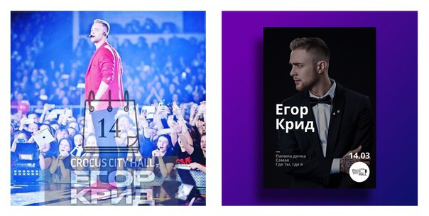
It was: all elements are of the same size, due to the “random” arrangement it is difficult to study information.
Became: The first thing we notice is the girl, the second is the headline, then additional information. A sequence that allows you to understand what the poster is about in the first 5 seconds.
…
Anchors should be used to make it easier for the reader to navigate. With anchors, it is easier to find information and perceive it.
Highlight essential information in your layouts. Decide what is important for the user to see first. Place these elements in the “anchor points”. And don’t forget about the normal level.
Source: vk.com
…
