Adobe Muse vs Webflow
Adobe Muse vs Webflow
You already know about the visual layout trend, right? If not, then read a short introductory article on this topic.
For everyone else, let’s just say: if now you do not learn how to make up sites on your own using all available methods, then you will greatly lose your position as a web designer. Technologies do not stand still and we need to develop to match them.
Today we’ll talk about the two most interesting (from our point of view) products that offer the above-mentioned visual layout of web projects: Muse and Webflow.
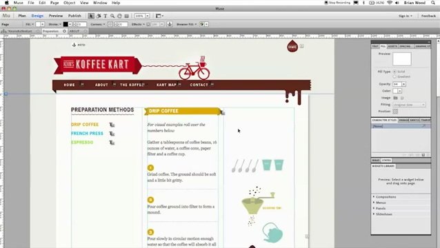
Muse
An Adobe product that contains all the standard features and bugs supplied in all Adobe products. But a single creator is not always a bad thing, because it will be as easy for you to master the Muse interface as if you have been using Photoshop all your life, and then decided to open Illustrator – you will not see anything super-new.

Today, so many widgets have been written for Muse that a very lazy web designer will not be able to make up a web project with absolutely any animation and interactivity effects on it 🙂
We won’t talk a lot about widgets, just leave these links here: 22 widgets, 48 widgets.
Applications
As mentioned above, Muse can be used for the layout of absolutely any project: from the simplest landing pages to complex websites with different subscription forms, pop-ups, a shopping cart and a personal account – for each of the listed items there are separate plugins that will not give you dive into programming your own elements.
Plugin benefits
A large number of plugins means that most of the popular tasks have already been solved, for example, you can add Yandex.Metrica or Google analytics with one click of the mouse, and goal tracking is another click.
It couldn’t be easier to create 2 pages for A / B testing! Again, a separate plugin will allow you to do this quickly and without problems.
Thus, we can say that today Muse is almost an ideal tool for creating landing pages and connecting all the necessary analytics collection functions.
Disadvantages of Muse
If there are no complaints about plugins written by third-party developers, then Muse does.
Firstly, it’s worth noting that if you first create a project in Muse, export the finished site in html format, and then try to ask a third-party developer to modify the resulting code without having a project in the .muse format on hand, it will be very difficult for him to understand the code.
Yes, projects created in Muse are not intended for revision by web developers: the Muse code generates, as they say, “for itself”, but it works 🙂
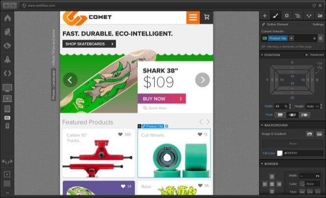
Webflow
Now let’s turn not to a direct competitor, but nevertheless a service that also provides good visual layout options.

Immediately, we note that Webflow, unlike Muse, generates html in the best quality, so a web developer with a 95% probability will be able to figure it out and complete everything necessary.
Applications
Webflow, like Muse, is mainly used to create not very complex web projects consisting of several pages. However, Webflow has much more ability to animate elements. The team even created a special promo page dedicated to the service’s capabilities for animation and interactive creation.
Lack of plugins
Yes, Webflow is a “closed” system that does not allow third-party developers to create any add-ons. All available functionality was developed exclusively by the project team. However, Webflow allows you to embed your own code on the project pages, thus some “flexibility” still has a place to be.
Disadvantages of Webflow
The main drawback of the service, perhaps, can be attributed only to the increased complexity of working with it.
In Webflow, the concept of “layout” materializes and you literally have to assign each element on the page properties that define it:
– position on the page
– position relative to other elements
– parent element (if any)
– child element (if any)
– interaction with other elements on the page
– animation when appearing / scrolling / pressing, etc.
However, such meticulous work with each element bears fruit – in most browsers your web project will look 100% the same, the same applies to mobile layout, which, by the way, is easier to create in Webflow than in Muse.
Webflow vs Muse for landing pages
If your main activity is creating landing pages, conducting A / B testing on them and collecting analytics, you should definitely choose Muse.
With it, you will not experience difficulties, whether you are working in Photoshop, Illustrator or any other graphic editor to create page layouts. And using the right set of plugins will save you tons of time implementing all the analytic functionality you need.
In Webflow, it will take more time and nerves to solve problems with connecting analytics, setting tracking metric goals, and conducting correct A / B testing, but it cannot be said that the same result cannot be achieved. Everything depends only on your perseverance and patience 🙂
Webflow vs Muse for promo pages
In this comparison, Webflow takes the lead by a small margin. Why a little?
In our opinion, working in Webflow is about 2 times more difficult than in Muse, however, the result is better, cleaner and more stable – in terms of animation of elements, for sure.
The fact is that the built-in animation functions in Muse are very scarce and offer a choice of only the movement of objects along the working field from point A to point B.
This problem is solved by the additional plug-in Animate 3.5, but the result of its work cannot be described as “Wow!”, But rather as “Well, yes, not bad.”
In conclusion, we note that both tools are good and both can be used in any case. But for some, Muse is better, and for others, Webflow.
Good luck with the visual layout!
…


