
A very simple color matching algorithm that works
A very simple color matching algorithm that works
Mikhail Anikin told in an article on Medium how he and his colleagues choose colors to highlight information blocks, object responses; to manage attention and create visual hierarchy.
Various Yandex services work with color to solve interface tasks: highlighting information blocks, object responses; to manage attention and create visual hierarchy.
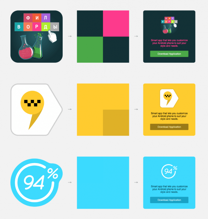
 Examples of using color matching algorithms in Yandex.Music and in search
Color matching can be complex calculations depending on the application. But it happens that getting the desired result is much easier. This is the story.
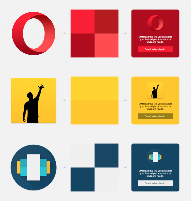
In Yandex Launcher, we have application promo cards: rating, description and the “Install” button. These are contextual recommendations — open on top of the application list or in a folder on the desktop.
Initial implementation
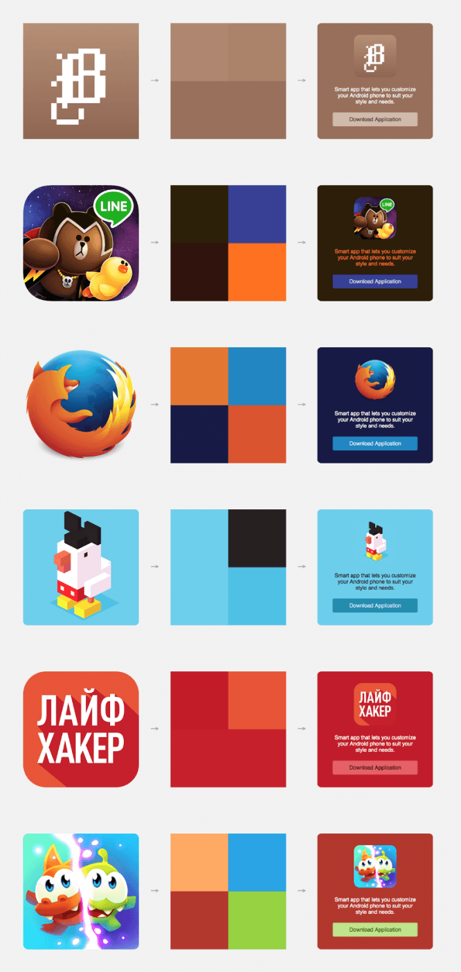
The color for the background of the card was selected automatically based on the icon, the button was translucent white. The algorithm tried to determine the main color of the icon by sorting pixels by hue. This approach did not always give a beautiful result, it had drawbacks:
● incorrect color definition,
● “dirty” colors due to averaging,
● dull buttons, boring cards.
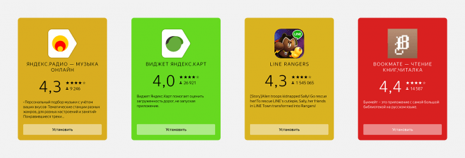 Examples of problem cards
What I really wanted
The card was supposed to be a real continuation of the icon. The colors are rich and vibrant. I wanted to create the feeling that the card was carefully made by hand, and did not slip something casually generated automatically.
I always want to make it more beautiful, but the resources are not limitless. It was not planned to allocate a team to write a miracle library for defining colors. So, the task:
With the minimum of effort, improve the algorithm for determining colors, figure out how to paint the card beautifully, without inventing a spaceship.
On Saturday, I blew the dust off the code editor, uncovered HTML5 and Canvas, and began to invent. On Monday I came to the team with a proposal.
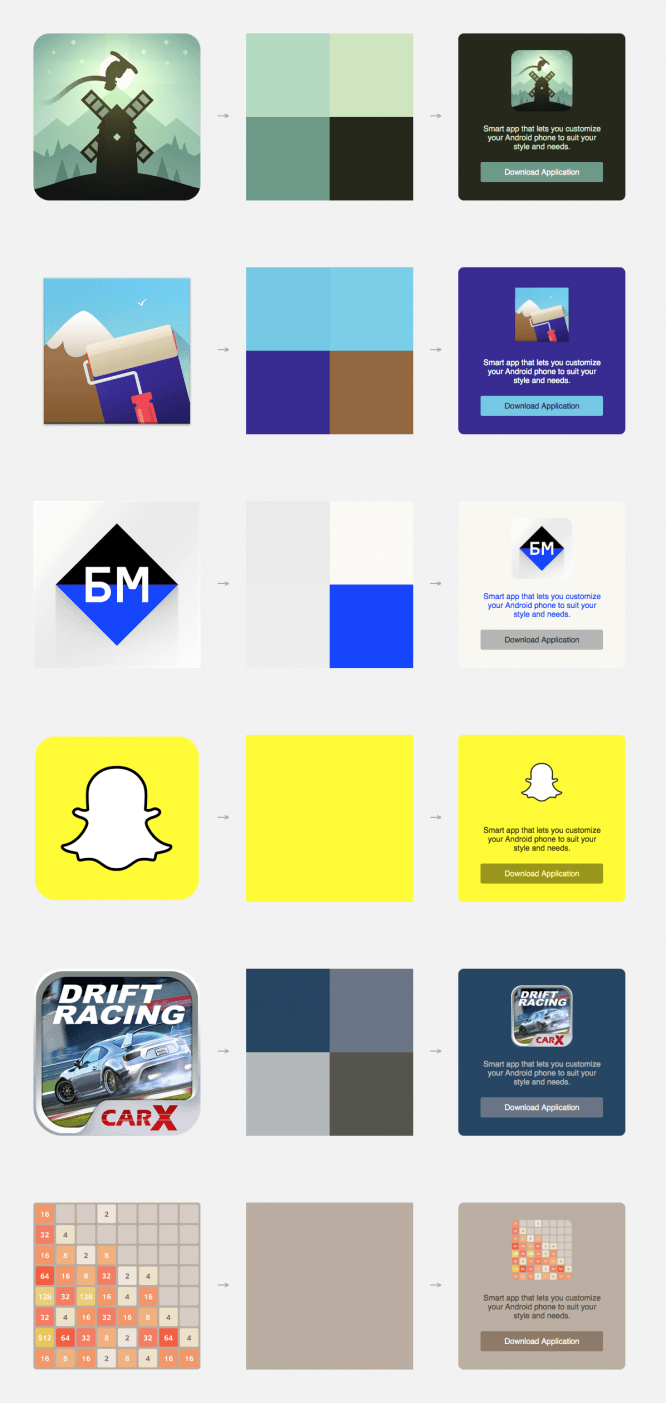
New color detection algorithm
Step 1.
We take the icon. Throwing out white, black and transparent pixels.
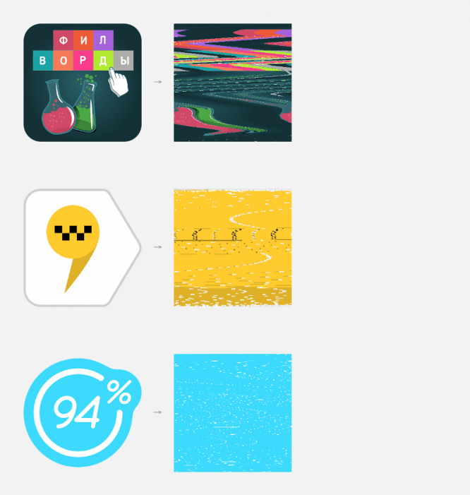 Original Icon → Filtered Pixel Square
Step 2.
Reduce the resulting image to a size of 2 × 2 pixels (with anti-aliasing disabled). As a result, we get four colors of the icon. In the case of a uniform initial picture, they can be repeated, no big deal.
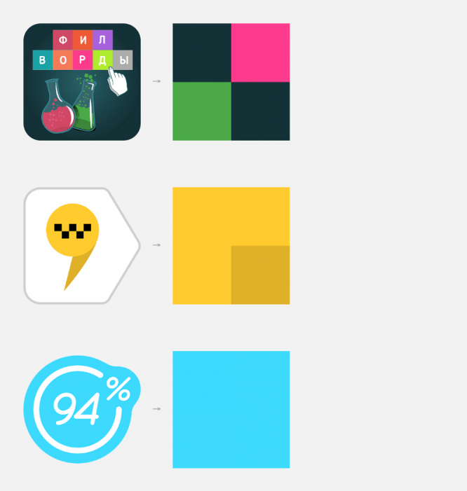 Result after the second step. Original Icon → Colors
We have disabled anti-aliasing so that the colors do not mix, do not become “dirty”.
 In fact, it turns out like this:
the square is divided into four parts; we take the middle pixel from the top row of each quarter.
In the implementation, everything is simple: we don’t even need a real downsemp of the image and, in general, work with graphics.
We take the pixels with the desired position from the one-dimensional array obtained after the first step.
Step 3.
Almost everything is ready. Just a little bit is left: get the resulting colors, translate them into HSL, sort by lightness (L). We paint the card.
Light scheme:
● background – the lightest color,
● button – closest to light,
● the text is the darkest.
Dark scheme (if 2 or more colors are dark):
● background – the darkest color,
● button – closest to dark,
● the text is the lightest.
Applying colors, we check the contrast: Lightness difference between the background and the button ≥ 20; between the background and the text ≥ 60. If it does not match, we correct it.
And a few more cards for example:
Result
We have got colorful cards, from the real colors of the icon, without “dirty” impurities. By using multiple colors, the card looks much more lively. It is especially pleasant that with a uniform background of the icon, the card becomes its direct continuation: the border between them is not noticeable at all.
And the most important thing:
2 days after the new algorithm was proposed, the first implementation was already available in the dev assembly. We tested it within the team, set the filter thresholds in the first step, provided for special cases:
● an icon of one color – we make the background a little darker so that it does not merge,
● icon with background — look at the pixels at the edges, if all are the same, set the same background of the card.
The modified algorithm was included in the next release.
Special thanks to Dima Ovcharov, head of the Yandex Launcher development team, for his interest, desire and patience.
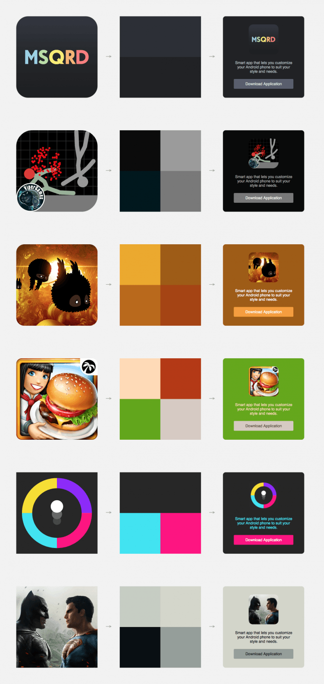
Finally, more examples
Source: medium
…

