7 web design trends that set the tone in 2016
7 web design trends that set the tone in 2016
Sergey Popkov, managing partner of AIC, wrote an article for the “Secret of the Firm” online magazine, in which he assessed the trends in web design that set the tone in 2016 and will develop in 2017.
AI, neural networks and VR are the most interesting and not yet fully developed technologies of 2016. There were no revolutions, but the year was not boring: visual trends replace one another, there is a natural development towards service design.
Integration of all areas related to web design continues – advertising, branding, print design give the web their findings and trends, while simultaneously absorbing the best of digital.
Interfaces are still moving away from the “picture” towards the “interaction” – for this reason, motion design in terms of the amount of information conveyed to the user today is practically equal to graphic design.
The mobile Internet is taking the lead, and the process of adapting sites for mobile devices is ready to be replaced by the opposite process.
The standardization of interface design continues, with component design coming to the fore. The quality of mockups, UI kits, ready-made animation scripts, color palettes and other components has grown significantly – this helps designers create a harmonious and effective interface, spending a minimum of resources on developing a visual style.
The popularity of new design tools is growing
What now
The Sketch App began its triumphant march in 2010, but in Russia it became a massive phenomenon just a couple of years ago. Specialized web design tools are gradually replacing traditional ones.
High-value commercial solutions get competitors in the form of high-quality, but less expensive tools (Affinity Designer). At the same time, the platform exclusivity of such products is gradually fading away – Affinity released its product for Windows in November 2016, ceasing to be “only for Mac”.
What to wait
The market will continue to get complicated – there are already functional SaaS solutions for UI design (Figma), which are almost as good as native applications.
The Affinity Designer step will not go unnoticed – more multi-platform products are worth waiting for. Will Sketch App take this step?
High-resolution screens set qualitatively new requirements for graphics: vector graphics will continue to displace raster graphics, and vector editors – the usual Photoshop.
Interactive prototypes
Users get out of the habit of static, and site design ceases to be just a “picture”.
What now
The interface today is 70% interaction and only 30% composition. UX designers want to design both without the help of programmers – and services like UXpin or Marvel give them this opportunity. Interactive mock-up presentations are already good form in the industry.
What to wait
The value of prototypes for interface development will be recognized by the majority. Presentations will become more effective: from the usual slideshows with comments in InVision, they will turn into a full-fledged demonstration of the service logic and possible scenarios.
The same applies to guidelines – the trend was set by material design, but today interactive animated guidelines have become an obligatory part of commercial projects. Interface designers who do not yet use them in presentations should start doing this in 2017 in order to keep up with the trend.
Intelligent algorithms in design
What now
So far, this influence in the digital sphere is negligible. For example, the emergence of VR devices was massively expressed only in the addition of 360 ° videos to sites, and neural networks provoked the emergence of entertainment applications like MSQRD and Prisma.
What to wait
The trend will be projected onto web design, which will soon lead to the formation of the exoskeleton paradigm – the collaboration of machine learning algorithms that perform routine work and a product designer. Such technologies are already working – for example, Yandex Launcher analyzes the application icon and generates a harmonious banner based on it.
Neural networks also perform editorial work: they recognize faces in a photo, frame images, generate a magazine layout – this will eventually lead to the fact that real specialists will be needed only in leading positions. For example, the online magazine Flipboard is created.
As for virtual reality, the main barrier to the penetration of technology into all spheres of life is its cumbersomeness and the scarcity of the devices themselves. However, we should expect an increased interest in technology from advertising digital, because such campaigns represent the closest interaction between the brand and the consumer in the digital environment.
For those who want to delve into the topic, UX developer Max Glenister has collected interesting reports and articles on the topic of VR and UI on the website of his special project.
Winning mobile traffic
Mobile devices are becoming the main tool of Internet users, which means that the web will also change in favor of mobile traffic.
What now
If in 2012 the share of mobile traffic barely reached 30%, today it has already caught up with the desktop one.
Data Insight research predicts an increase in mobile e-commerce sales – about 30-40% of the total by 2018. This figure has already been reached by individual retailers – for example, mobile sales of the M.Video network amounted to 38% back in 2015. This only confirms the forecast once again.
Such changes also affect the interfaces of sites – in 2010, a hamburger icon appeared in the Facebook mobile application to denote the menu. We are increasingly seeing side menus, which until recently were considered bad manners.
What to wait
The trend will continue – interface elements and mobile interaction mechanics will penetrate the regular web. Web design is gradually moving away from the conventions of the classic model: arrows on sliders, underlines on links, and other interface tips for inexperienced users disappear.
As for responsive sites and mobile first – in the design environment, conversations begin about a new paradigm of mobile native, which involves setting a low priority for updates to the desktop site and focusing on the capabilities of the mobile version (application or site). In the coming year, this paradigm is unlikely to replace the existing one, but it is at least curious.
Adaptability of everything
Not only layout can be responsive, but also content. The behavior of mobile users is sometimes fundamentally different from the behavior of desktop users – for example, the mobile browser is more often used as a tool for instant problem solving. The purpose of visiting the site may differ, which means that the content should be adjusted to this.
What now
The sanctions of search engines on sites not optimized for mobile devices, the general increase in the number of such devices, the increase in the speed of the mobile Internet – these factors pushed the web towards adaptability. Almost all digital productions develop responsive websites, even free templates for CMS are released responsive.
As for the adaptability of content, personalization services have become a mass phenomenon – they recommend the user the most relevant site materials depending on the context: device, location, previously viewed pages and dozens of other parameters.
What to wait
As usual, a strong trend from one sphere penetrates into adjacent ones – already now we are seeing examples of adaptive branding, which breaks the classic ideas about the inviolability of a single logo outline.
Content can also be responsive – for example, when the font size and text length of headings adjust to the device’s screen size (responsive typography).
Content responsiveness is something to really look out for.
Another interesting trend related to responsiveness is parametric fonts, which have a variety of programmatically generated intermediate fonts. The standard black, bold, semibold and others are likely to be superseded by parametric fonts soon.
Author’s photos and illustrations
The era of photo stocks is heading towards decline, and we are witnessing the emergence of a new trend – copyright graphic content.
What now
Harold, who hides the pain, has become the personification of all photo stocks – such photos are less and less in demand today. The consumer requires natural postures, lifestyle environment, familiar images.
Specialized banks of such photographs appear:
– Gratisography
– Negative Space
– Stocksnap
– Life of Pix
– Death to Stock
– Picjumbo
– IM Free
– New Old Stock
– Getrefe
– Freestocks.org
– MMT
The same reason for the growing popularity of author’s illustrations. Monotonous landing pages with large background photos have flooded the Internet. To distinguish favorably from them, you need to use a different style.
What to wait
Graphic design becomes cramped within the familiar web, so it absorbs everything that is fashionable from adjacent areas.
Sketch art. Crafting has captured the minds of business, and hand-drawn illustrations have conquered the modern printing industry. And this trend will continue to take root on the web.
Line art icons. The technique of drawing with contours will continue to find application on the web: for example, as now when creating patterns and complex icons (they outperform stock ones in terms of visual performance).
Another likely turn is a change in the approach to photo content on e-commerce sites, a move away from identical images in stores towards unique copyright photographs. Curiously, all the prerequisites are obvious: 63% of users believe that photographs are the decisive factor in buying, and shops have long been paying maximum attention to photo content.
Visual design
Everything is as usual here – several new (actually old) trends are gaining momentum.
What now
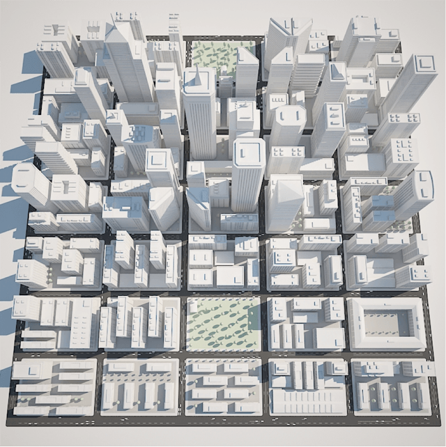
2016 can be called the year of neo-retro – style manifested itself in everything: from calligraphic logos to duotone and neomemphis. The design tends to be minimalist. Curious new shapes such as “white objects with shadows” appear, which, however, are just a fashion trend.
The trend has infiltrated the web, presumably from the realm of 3D visualizations – very much like rough renders of objects without textures.
At the same time, the primacy of the principle remains: design is a functional tool, and any visible play with colors is a tool for creating an effective interface.
What to wait
Service (or conversion) design remains the main vector for the development of our segment.
Being just a “good web production” is no longer profitable – clients require expertise, analytics, KPIs. The tasks of the level “need a new site” are solved by modern SaaS-designers. To start a small e-commerce business, you no longer need an online store, you can start on Instagram. Complete blogs with great designs are created at the click of your fingers on Tilda or Readymag.
The value of design as a tool for giving a modern look to a typical solution is questionable. The further, the more clearly the value of service design will be expressed – the design of complex interfaces that fulfill the tasks set by the marketing department.
Finally: animation, motion, interactive
The trend to replace any statics with dynamics is one of the most stable in recent years.
We see animated objects everywhere: icons on websites and applications, transitions between states of objects in material design, cinemagraphs in social networks.
Even mailing lists are getting interactive: they are overgrown with background videos, an integrated checkout process, and full-fledged menus.
Banal GIFs got a new round of development with the advent of their aggregators like Giphy. By the way, recently it opened a NASA account, which once again confirms the popularity of the format.
Vertical microparallax has become a distinctive feature of the last year – it replaced the classic parallax.
Source: secretmag.ru
…


