6 mistakes that turn presentations into a murder weapon
6 mistakes that turn presentations into a murder weapon
And it’s not just about the wrong design of slides in PowerPoint – we need to learn how to communicate correctly, regardless of whether there are slides behind our backs or not.
1. Instead of telling stories, we make slides
Preparation of the presentation begins with the fact that we open PowerPoint and fill the slides with content, and only then come up with what we will tell.
Think of a presentation not as a set of slides, but as a movie that has a plot, drama, story development.
2. Preparing a little
The Amazon founder wrote in a letter to shareholders that instead of PowerPoint, boards of directors will use the 6-page text format. In his opinion, it takes at least a week to prepare a good story!
Now think about how much time we usually devote to preparing a presentation. Most often, the presentation is done on the knee the night before the performance, and we do not conduct a rehearsal at all.
3. Making slides when you don’t need them
Your presentation can have either 50 slides or one. It’s okay to give a presentation without any slides at all.
The slides follow your thought, not the other way around. Remember how Steve Jobs introduced the iPod — he just took it out of his pocket.
4. Mixing presentations for speaking and for reading
People believe that there is no fundamental difference between a presentation for reading and speaking, although they are different types of communication. In a speech, the main emphasis is always on the speaker – slides fade into the background and should support his speech and in no case replace him. In a presentation for reading (sending by mail, posting on the Internet), the words spoken by the speaker become the headlines of the presentation.
five. Using too much text
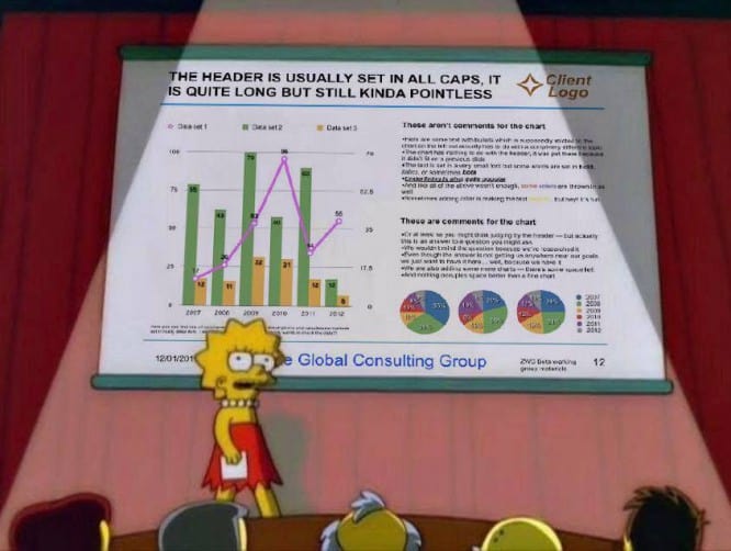
Text is one of the key elements of a presentation, but most often the slides are overflowing with unnecessary information, which, instead of helping us to figure it out, on the contrary, prevents us from getting to the point. The most valuable skill for presentations is shortening, keeping only the essentials. People will read the text on the slide much faster than you speak it.
Therefore, you will turn into an unnecessary and boring application for slides, although it should be the other way around!
6. We are decorating
Free space on the slide is perceived as a place that must be filled: insert a picture, add an icon. But free space, on the contrary, helps you manage the audience’s attention so that the eye quickly finds the most important thing and is not distracted by unnecessary things.
All the design and presentation elements should help you tell the story, immerse your listeners in the universe you are creating for them.
Output
A presentation is primarily a communication tool, not slides. We need to learn how to tell stories, and for that, we don’t need to start with PowerPoint.
…


