
How to Choose the Right Typeface: The Complete Guide
How to Choose the Right Typeface: The Complete Guide
Choosing a typeface is one of the most important design decisions after choosing an illustration.
There are a lot of guides for choosing a typeface, so in this guide we will look at the most accepted methods of selection and give an overview of typefaces: categories, uses and sources of free fonts.
Headset functionality
Personal preferences should not interfere with the selection of a headset – it should be consistent with the purpose of the project. Thus, any design decision in choosing a headset must be the result of effective design thinking.
Mixing different families of typefaces
The process of mixing typefaces occurs by defining the purpose of the project along with the message that needs to be conveyed. The overall result should look harmonious and contrasting.
Headset testing
You won’t know if a font is right for a project until you test it. Check if padding, strokes, number styles are right for you.
Life hack: type a capital letter Z and number 3 next to it – if they look exactly the same, your readers will be unhappy.
…
Font or typeface?
The two terms are very similar. But how can you tell them apart? A headset is design; the font is how this design translates.
typeface + style + size = font
…
The font is what you use. The headset is what you see. The unique style or design of letters of an alphabet with a specific name, say Helvetica or Arial, will be considered a font. A typeface defines an entire font family.
When letters differ in size and style, it’s a typeface. So, 10 pt. Helvetica light and 24 pt. Times Helvetica Medium are 2 different fonts, but the same typeface.
Classification of font types
This guide will focus primarily on the 4 main categories of fonts that will be useful to know about when choosing a font.
Serif
Serif fonts have small “tails” or dashes attached to the main vertical and horizontal lines of some letters. It is believed that long texts with this typeface are easier to read. Typical examples of serif fonts are Times New Roman, Trajan, Georgia, and Garamond.

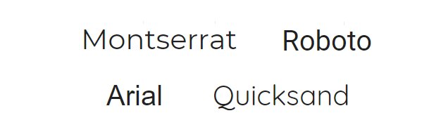
Sans serif
These fonts do not have “tails” or other lines at the ends of letters. This font family is commonly used on the web. They also adapt well to small screen resolutions.
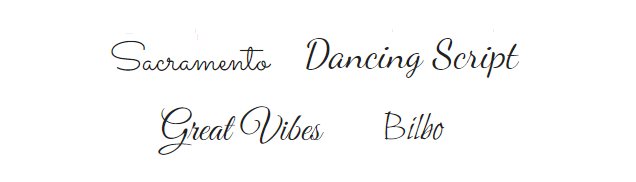
Handwritten
The characters in these fonts are similar to handwritten ones. Handwritten fonts come in a variety of styles: elegant, fun and casual, and even actually hand-drawn.
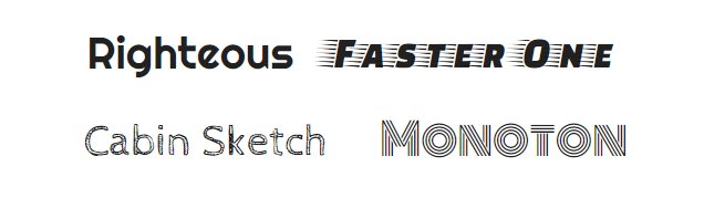
Decorative
The fonts in this category are designed to grab attention. They have an unusual appearance and are only used to achieve a specific effect or purpose.
Why font choice is so important
For different situations, you need your own clothes. You will be uncomfortable at an interview in a swimsuit, as well as on the beach in a business suit. Based on your clothes, a certain opinion about you is formed about people: about the desire to impress, your socio-economic status and style.
The choice of font also sets the tone for the entire design and affects the feelings of the readers. The headset gives the first impression of the design, and it also sets the feelings with which people evaluate the rest of the design. How do your fonts look next to each other, do they complement each other or, on the contrary, oppose? Are they effectively communicating the idea of the project?
How to choose a font
Headset basics
Each headset has its own mood and personality. She can be serious, casual, playful, or elegant.
If the font does not correspond to the general idea of the project, users can simply “unsee” it.
To understand which typeface is more appropriate for the context, define the characteristics that the design should convey as a whole. In case of difficulty, ask yourself: Does the typeface complement the overall design or does it reveal the qualities of the brand represented?
Context and audience
A rule to keep in mind is not to be guided by personal preference. A font that looks cool may not be useful or appropriate for your project or audience.
Consider the medium – for example, when designing a business card, the font should be readable at a small size, and for social networks, you need a font that is perfectly readable on small screens. And by the way, who is your audience: business men or golden youth?
Functionality
The specific situation is even more important than the context. One of the most common mistakes newbies make is not knowing what to do with different categories of fonts. For example, fonts for printing on paper and fonts for screen readers.
Body typefaces
Used for typing body text in books, magazines on websites and in any long articles. These typefaces are easy to read and don’t pull the covers over themselves. Common options are Times New Roman and Arial.
Display headsets or decorative headsets
They are not suitable for long texts and attract attention. They range from flashy typefaces with exceptionally capital letters suitable for headlines to extremely pedantic and trite.
Life hack: in doubt – choose a more neutral font. Remember that display fonts can be powerful when used correctly and, conversely, can make text virtually unreadable.
…
Readability of the font
If you want to convey your message to people, then you need to think about the readability of the selected font. How can you define this criterion? There are some tips:
The size
Choose the size according to the media (remember the business card example).
Letter height
The average height of lowercase letters in typed text determines how much lowercase letters differ from uppercase letters (this can impair readability).
Interval
Try fonts with different indents. Correct indentation can dramatically improve readability.
Font flexibility
The most used fonts come in many different styles: standard, lightweight, bold, and so on. Different styles of the same font work well in one design and look cohesive.
These can be serif fonts: Georgia, Crimson Text, Droid Serif, Merriweather. Or sans serif: Franklin Gothic, Clear Sans, Roboto, Lato, Source Sans Pro.
Font compatibility
Look for font families known as “superfamilies,” which include serif and sans serif fonts that are designed to complement each other and have a variety of styles to choose from.
Assign a task to each font. There should be a clear visual hierarchy – what each font is responsible for.
Fonts should tell the user what is important and where to look for it. Usually, using one serif font and one without them is sufficient. Fonts that look different but have something in common are more likely to blend well.
Where to find free fonts
There are many websites that offer free fonts. Be sure to check the license before using fonts.
- Google Fonts. This is probably the best resource for free and licensed fonts for commercial use.
- 1001 fonts. There are currently over 10,000 free fonts available in 9,000 families. The quality of fonts varies greatly.
- Font Squirrel. Was created as a directory of free fonts for use on websites and includes a set of high quality fonts that can be searched by classification or tag.
- DaFont. Archive of over 25,000 free downloadable fonts.
Takeaway: Choose the right fonts or users will eat you up. And the headset is not only audio.
Source: Sibiriks
…

