Pictogram design
Pictogram design
A few tips from The Noun Project, a large collection of pictograms and symbols. The peculiarity of the service is that everyone can add a pictogram that one way or another met in an urban environment. But how do you recognize a good pictogram from a bad one? Here are some tips:
1. Your pictogram should reflect only the most important facts and characteristics of the object or thought that you turn into a symbol.
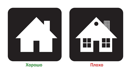
The purpose of these two symbols is to represent the house, but the symbol on the right contains additional elements that divert attention from the general essence of the house. The symbol on the left is correct, as it is devoid of “distractions.” All to the point.
2. The design of the symbol should be uniform and constant for all components of the symbol.
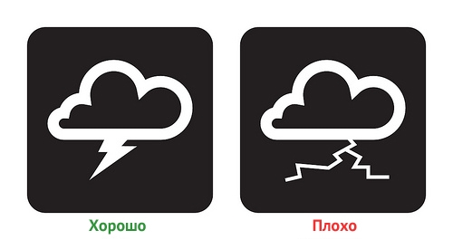
Both of these signs symbolize a thunderstorm. The symbol on the left is made in the same style (in fact, it is an addition of thunderstorm and cloud pictograms). The symbol on the right also consists of a cloud and a lightning, but in this case they are made in different styles. Visually, on the right symbol, the lightning looks dirty and incomprehensible.
3. The symbol must not resemble a drawing or illustration. The symbol must have the characteristics of a road sign
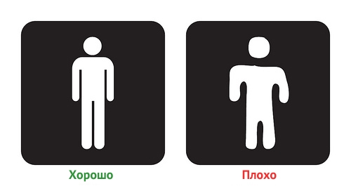
Any character should be done like the example on the left.
4. When developing a symbol, you should avoid a subjective glance in relation to the depicted object.
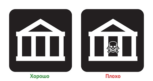
Both of these symbols denote a bank (for Russia, of course, this example can cause a long chain of associations).
The symbol on the left is neutral, while the one on the right is trying to associate cans with evil. Of course, the opinion included in the pictogram helps to give artistry, but the effectiveness of such an icon decreases.
All these rules do not guarantee that your pictogram will turn out to be excellent. However, rules can be helpful when designing symbols.
Original
I would also supplement this list with 5 rule, which states that when developing a symbol, the peculiarities of national consciousness should be taken into account. Let me explain. In rule 4 (right pictogram) in the USA it will be read as bank = evil. Let’s place it in Russia and we have the designation of the mausoleum, or, what else can our person think of;)
PS – When translating, I tried to adapt it to Russian. Hopefully the meaning is conveyed.
…

