Interview with Low-Poly Illustrator
Interview with Low-Poly Illustrator
Interview with illustrator Mark Kirkpatrick posted on fotolia blog in 2016.
Low poly style is one of the brightest trends of 2015, which has every chance to continue in 2016.
Mark Kirkpatrick’s portfolio is an exemplary example of graphic art, filled with bold colors and austere style. We spoke to him to learn more about him and his wonderful visualizations.
> Tell us a little about yourself: where are you from and how did your creative journey lead you to sell your work on Fotolia?
My name is Mark Kirkpatrick and I am a graphic designer and illustrator based in Seattle, Washington. A few years ago, a friend of mine suggested Fotolia as a place where I could sell some of my 3D illustrations. I decided to give it a try, and here I am.
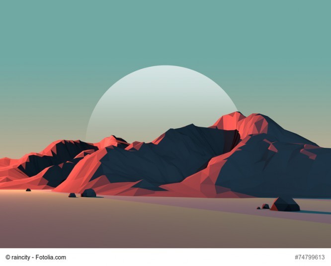
> There is often a rule in stock photography – the more work you have in your portfolio, the more sales. However, your portfolio can be described as “less is more”, there are not many works in it, but at the same time, sales are high. How do you do it?
I try to focus primarily on quality over quantity as much as possible. I would rather have fewer works in my collection, but know that they are my best creations. But with the small size of my portfolio, I try to show different color palettes and moods in it.
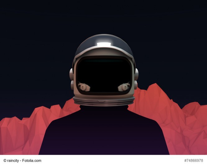
> The theme of space and landscapes runs through your entire portfolio, why? And what do you think your work is used for?
There is something about barren landscapes that appeals to me. How light plays on objects. When I create them, I feel like I’m there. We live in a world where there is so much information, and I love that my worlds are pared down and minimalistic. I want the viewer to be interested in what is around the corner. I’m not sure what my work is used for, but I hope it makes the right impression.
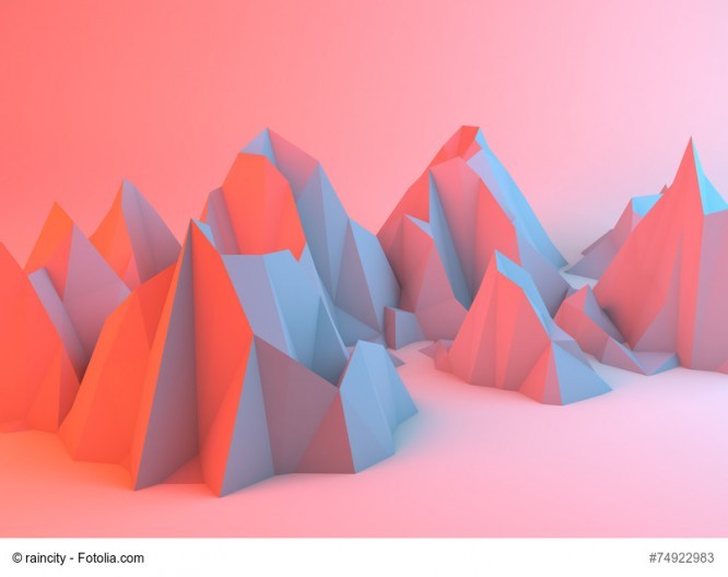
> The colors in your artwork are very unusual and bold. How do you find color schemes like this?
A color scheme is usually born through trial and error. It seems to me that my mood at that time is also reflected in the resulting colors. I spend most of my time trying to catch the right mood and balance of light.
> Tell us a little about your creative process, what tools and software do you use?
I usually start off with a rough sketch to get an idea of how I want to compose the composition. Then I open up Cinema 4D and simulate a 3D scene. This allows me to try different camera positions and get the angle I want. The next step is texture assignment and light placement.
This is the funniest but also the most time consuming part. I sometimes spend hours tweaking the lights and colors before I get what I want. Then I render the scene and move to Photoshop where I merge the components together and add the final touches.
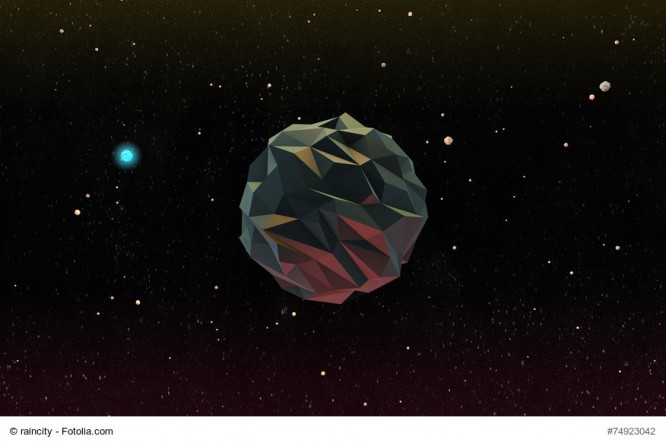
> How have your works developed since the start of cooperation with stocks, or perhaps you think that they have remained unchanged?
I still enjoy creating landscapes. I have a Tumblr page where I post new work regularly. In the near future, I have plans to do animation projects and virtual reality. There will be many interesting things.
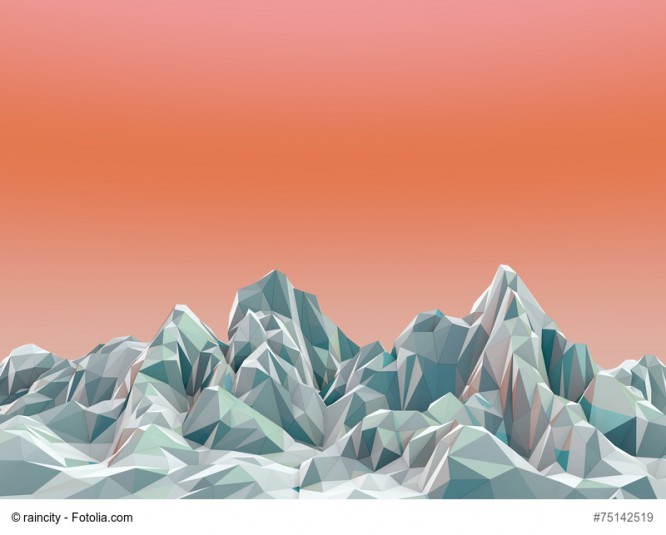
> Do you have a favorite job in your portfolio and why is it?
My favorite picture in my portfolio is this low poly mountain landscape in the moonlight. I really like the way the shadows play in the mountain relief.
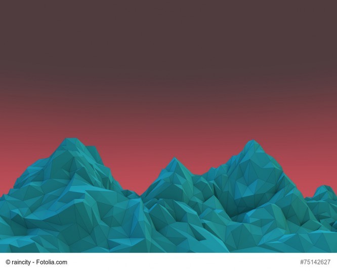
Many thanks to Mark for the interview. You can find even more of his work in his portfolio on Fotolia or on his Tumblr page.
…

