
9 graphic design trends that are going out of style
9 graphic design trends that are going out of style
When looking at old trends in graphic design, it feels like looking through an old photo album. You flip through and think: Was there a need to wear faded jeans with a turtleneck, and an unsuitable flannel shirt in 1994?
Or what did people think when doing chemistry in the 80s? We question the fashion of the past, but some design trends are just a product of their time.
They are not necessarily good or bad in and of themselves. Many of them are misused or misused.
We’ve already written about graphic design and logo trends for 2016, now it’s time to look at the flip side – trends that are becoming a thing of the past.
Visual Styles
1. Complex compositions with many details
For the past few years, design has been dominated by richly detailed, complex compositions. This is partly due to the popularity of the retro style.
If you look at advertisements and illustrations from the late 1800s to around 1920, you will notice the impressive attention to detail and a sense of craftsmanship that has inspired many designers.

While vintage and retro styles will continue to be popular, they are shifting towards the last decades – a style that some forecasters call “Modern Retro”, using techniques characteristic of the 1970s and 1990s.
Another reason for this shift is the rise of material design from Google, which became popular with designers in 2015.
_____________________
Where the big brands go, others will follow. This means that the design will move towards simplicity and minimalism.
_____________________
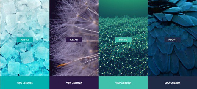
2. Muted, neutral shades
Each year, Shutterstock publishes shade trends by analyzing the types of photos and graphics uploaded. In the reports for 2014 and 2015, blues and greens were dominant.
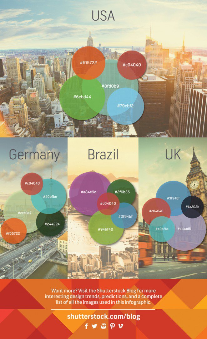
_____________________
But now brighter, richer hues are being used, thanks to the growing popularity of both material design and retro-inspired visual trends.
_____________________
3. Mixed typography, variety of fonts
The technique of combining different fonts has been widespread recently. You’ll see it on websites and social media, on logos and branding, on book covers and posters.
Combining fonts is sometimes done casually, without proper consideration of which ones will work well together. But it can be done efficiently when fonts are merged together to create a visually coherent whole.
For example, as on these labels: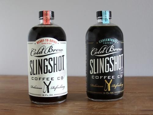
By all indications, this trend is giving way to a more restrained (but still visually striking) approach to typography, using a single font.
Logos & Branding
Logos tend to reflect fashion trends the most, but designers need to be careful about using current trends when designing any branding element. Customers want a sign that is serious and lasting, and many fashion trends are going backwards.
So let’s take a look at a few trends that are already passing by.
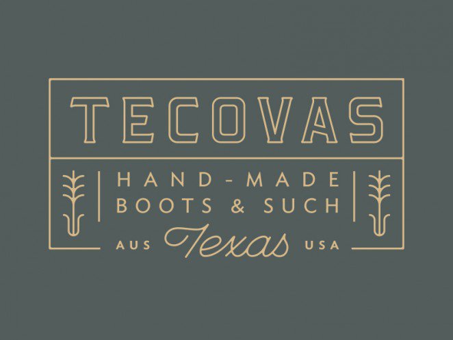
1. Single-line
Single line logos – the kind where graphic elements are shown in a single line – have been in vogue for a while, and still appear quite frequently. This versatile style can be applied to minimal or sophisticated, vintage or modern logos.
_____________________
But despite (or perhaps because of) its versatility, this trend is too often used, and already tired of it.…
_____________________
2. Tokens and emblems
This logo style can be found all over the place. You can even buy templates where you plug in your own text and voila – an instant logo that looks just like any other.
For example, these are the templates. Looks familiar, doesn’t it? This is just one of many similar pre-made logo kits available for download or purchase.
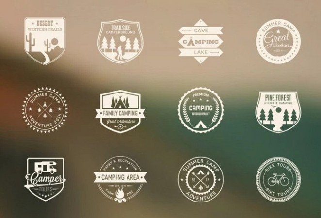
Yes, a logo like this can be very good, but this is a trend to avoid. If only due to the fact that there are a lot of such logos.
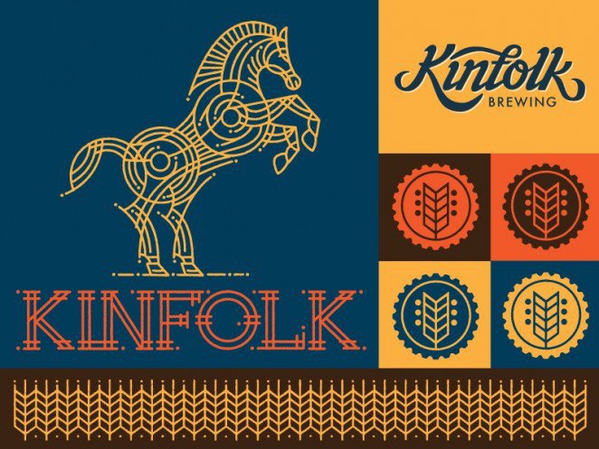
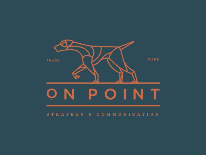
3. Shaped typography
This trend is inextricably linked with handwritten fonts. Feature – letters and inscriptions are placed in the form of an image (be it a circle, or something more complex, like the silhouette of an animal).
_____________________
This illustrative style may be interesting, but not applicable to a wide variety of businesses and clients.
_____________________
Also, as you’ll see in the examples below, many of these types of typographic illustrations end up looking like ordinary, familiar objects, and you won’t be able to create a specific visual image.
Websites
Here we take a look at websites that have already ditched outgoing trends in favor of new ones.
1. Traditional images and common typography
If some time ago sites used stock photos and a limited set of fonts, now they have access to technologies that allow for a more creative approach to work.
Now more and more often you can find sites that have implemented a creative approach to design.
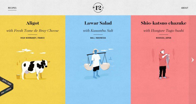
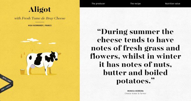
This site, developed by Elespacio, uses author’s illustrations to demonstrate how each recipe is prepared. Bright colors and non-standard fonts are used. But at the same time the site cannot be called flashy.
2. Static graphics
In addition to distinctive imagery, many web designers are increasingly incorporating video and animation.
We’re all used to seeing still images and static backgrounds, so a little movement can grab visitors’ attention and get their interest.
This site by a French filmmaker uses whimsical illustrations with vibrant colors and patterns that move across the page.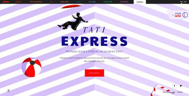
3. Template layouts
Partly because of the prevalence of themes and patterns, and partly simply because designers share ideas with each other, there are many perspectives in this direction.
Some general layout trends include carousels on the homepage, or a large image with three columns of content below.
But some sites don’t follow the crowd. Large images are used here, but in an atypical way: they are practically turned into collage.
Virgil Pana also uses large images, but mixes the content below them, presenting it in a checkerboard pattern: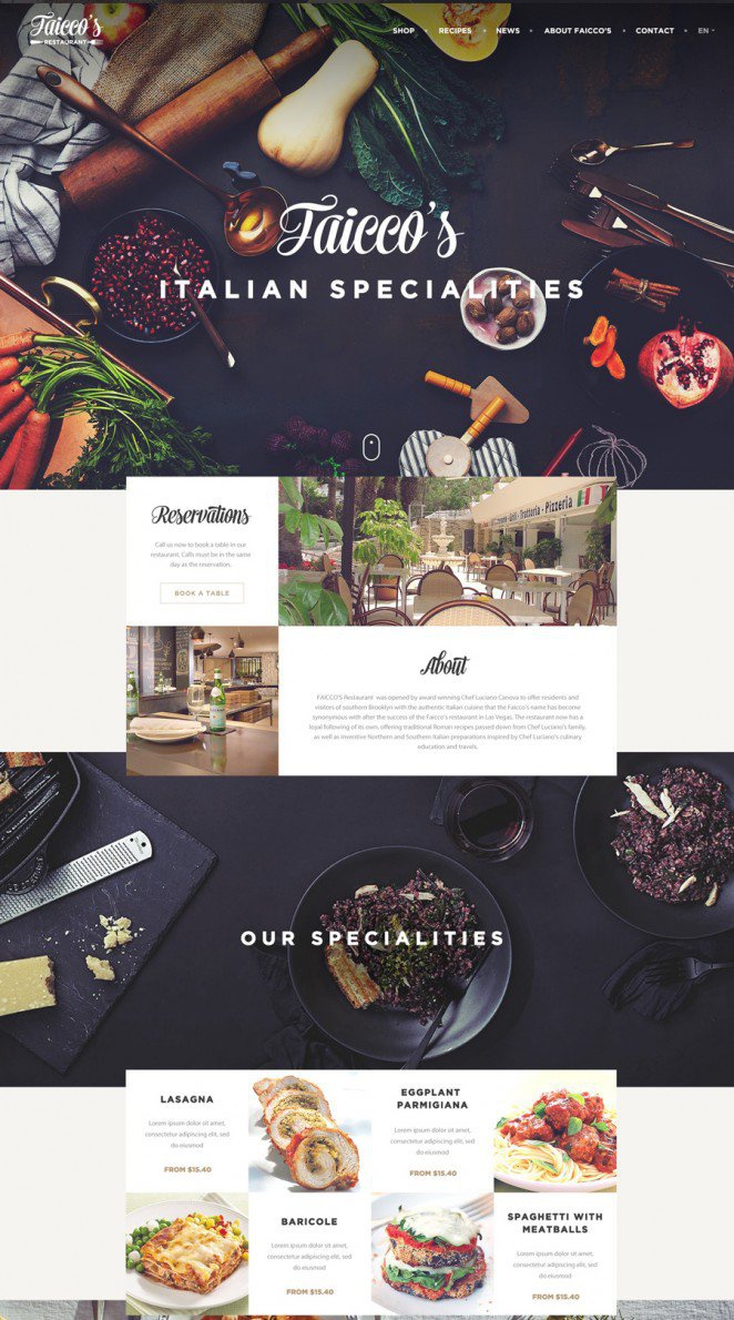
Every designer should be aware of trends in their industry, both new and those that might fall out of favor. Pay attention to all of the above, think about how not to miscalculate with the trends in work on a new project.
Source: freelance.today
…
![Scene Creator [Front View]](https://infogra.ru/wp-content/uploads/2016/04/presentation-1b-min-o-666x443.jpg "Scene Creator [Front View]")