
8 tips for designers to create effective landing pages
8 tips for designers to create effective landing pages
Landing page design requires a little selflessness from the designer. After all, all talents and abilities in such work are subject to a single goal – to increase conversion. The following guidelines will help you find a compromise between quality design and marketing effectiveness.
Remember the logo

Include your company logo in the body of any landing page you create. A user who has visited the site should always understand where he is and what company is behind it. It’s good if the logo and main menu are fixed in the header of the page, as, for example, Zendesk did.
Get rid of excess
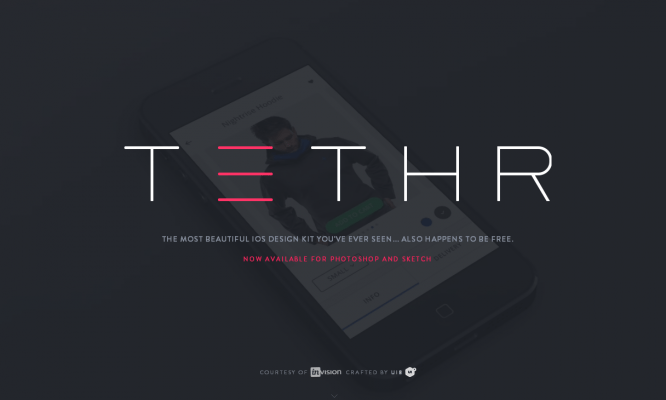
An ideal landing page should have no secondary elements, no room for meaningless text or graphic blocks and things that overload the perception. Avoid overly exotic design that can distract the user from performing targeted actions.
Contrasting colors
To highlight the information you need, play with contrast in a specific color range and don’t forget about color theory. By the way, yellow and orange colors against a dark background are actually a win-win option, since it has been proven that they are the ones that most easily attract attention.
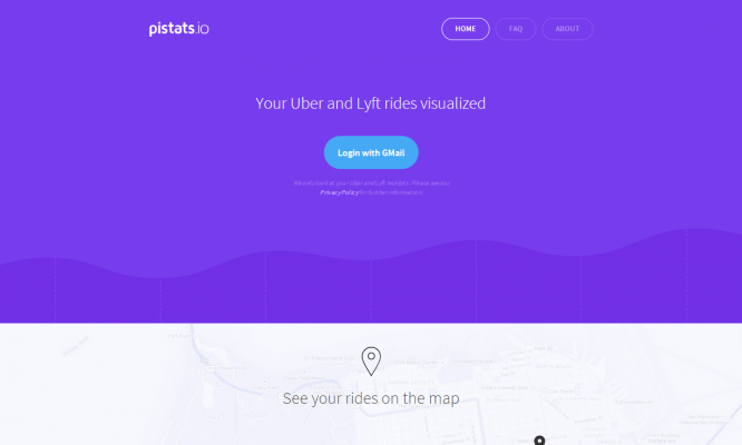
Size matters
The elements of the page with which the user must interact first should be made not only brighter, but also larger. However, do not forget about proportionality: an excess of such elements makes a repulsive impression.
Encapsulation
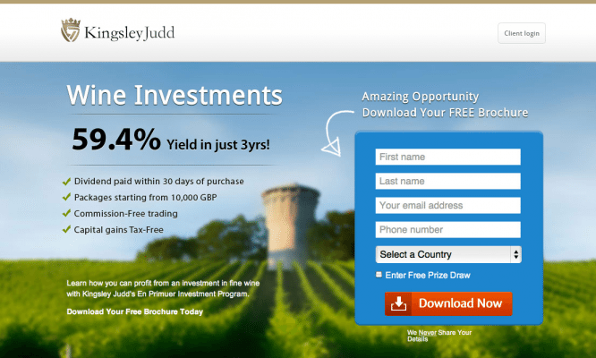
The tunnel effect helps to liven up the landing page and draw the user’s attention to the desired element. A great example is the Kingsley Judd website: thanks to the blurring of the background image, it is not only appropriate, but also useful in terms of encouraging the user to download the brochure.
Sequence
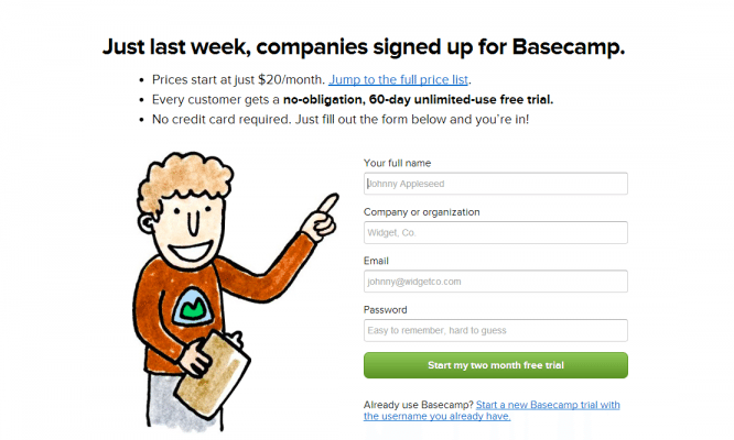
The task of the designer designing the landing page is to make it as consistent and logical as possible. A user who is forced to wade through a poorly thought-out design to achieve the goal will sooner or later leave the site and will not go to it again.
Direct pointers
Arrows, triangles – these and other shapes directly point the user to the target element. The latter deserve special attention, since they are less intrusive and can be organically integrated into the main composition of the design.
More air!
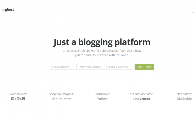
If the structure of the landing page is thought out and implemented, and there is too much free space on it, this does not necessarily indicate a designer mistake. Moreover, sometimes empty fields just need to be used to draw the user’s attention to certain elements, in particular, they facilitate the perception of text blocks.
Author: Denis Strigun
…